I’ve been making “tunnel” or theater cards off and on for well over 20 years. I think I received one in a swap in the early 2000’s and later used the idea with this clown set for another swap. Fortunately, Beate Johns, who was very active in stamping site Splitcoaststampers in it’s early days, was also in the swap and she posted my card on the site and then created a tutorial for the fun fold.
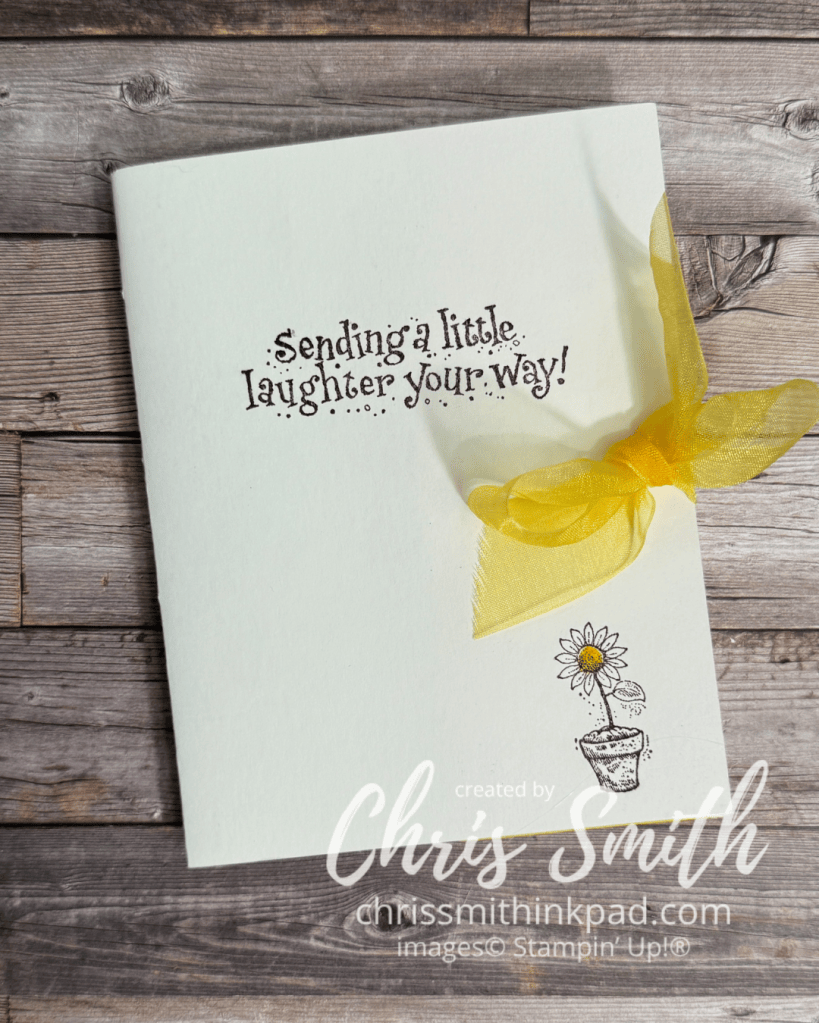
- I did this with a set called Jest Between Friends and I believe that the swap was for that set. Circa 2004.
- At the time I made this Stampin’ Up carried glossy cardstock that was glossy on one side and mat on the other. I used the matte side for the outside of the card on the glossy on the inside.
- This is the only tunnel card that I used a bow on but I think I should try that again sometime.
- The yellow in this card was Summer Sun, the first yellow Stampin’ Up had in their original color families. I still think it is the best!
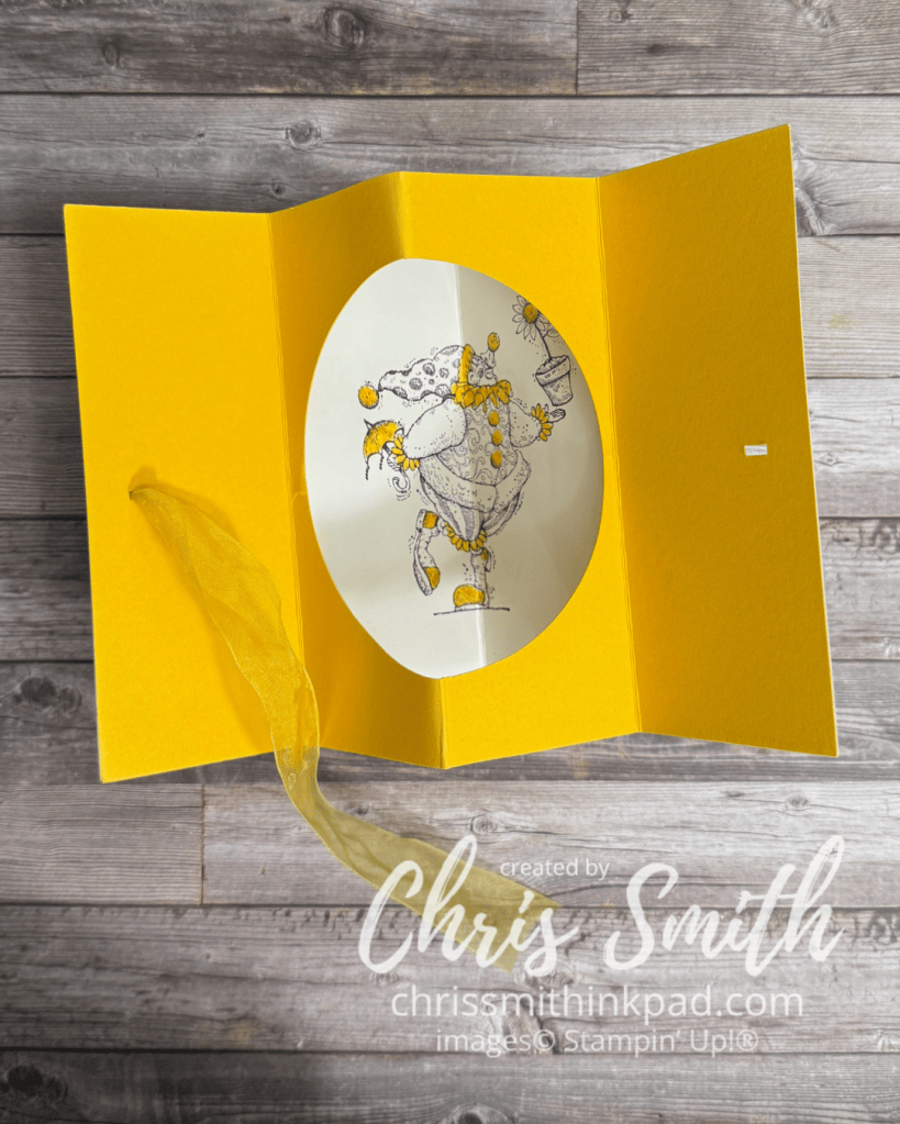
- Note the finely detailed image. Beautiful artwork! But I was doing 10-15 of these for a swap and there was no way I would color all of it in. So, I kept it monochromatic and only colored in those things that I decided would be Summer Sun yellow. I think you see more of the actual artwork this way too.
- Scoring was simply 2 1/8″, 4 1/4″ and 6 3/8″ on a regular 5 1/2″ x 4 1/4″ size card. You could make the inside card a little smaller and have a border. Then you would adjust the measurements making sure the middle one was half the width and the others were a quarter of the width from the outside edges. thus making all four of the resulting sections the same size.
- Making this is so much easier using circle dies, but this first one was made before I had any die cutting supplies. I think it was a circle cutting on glass set-up.
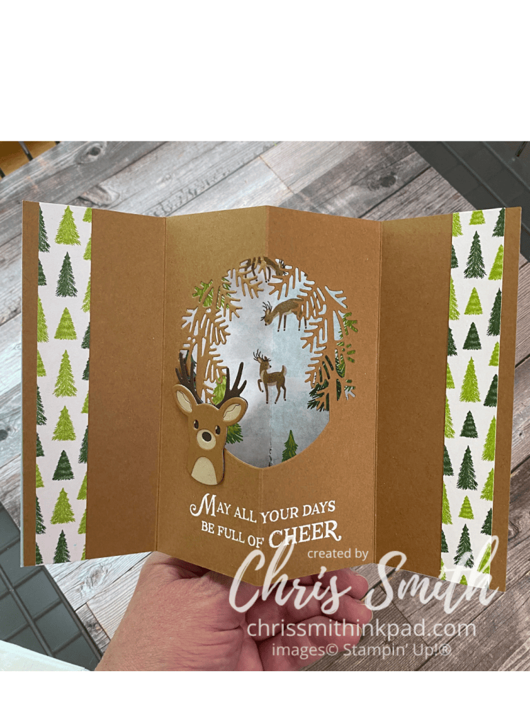
- This fun fold works with more than just circle dies as this card shows. It’s best that the die is less than 4 1/4″ wide.
- I had so much fun making this one with a teammate’s Reindeer Fun Bundle I had to get my own set of the dies.
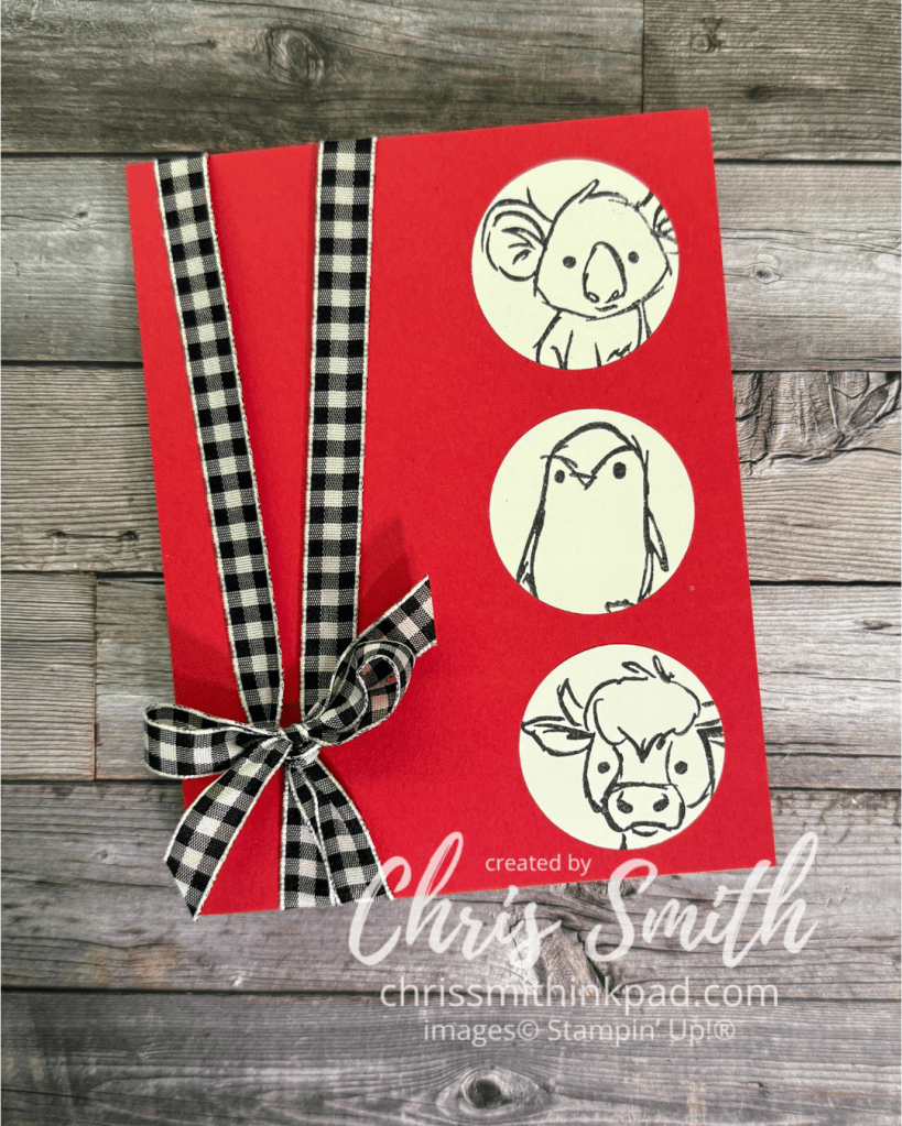
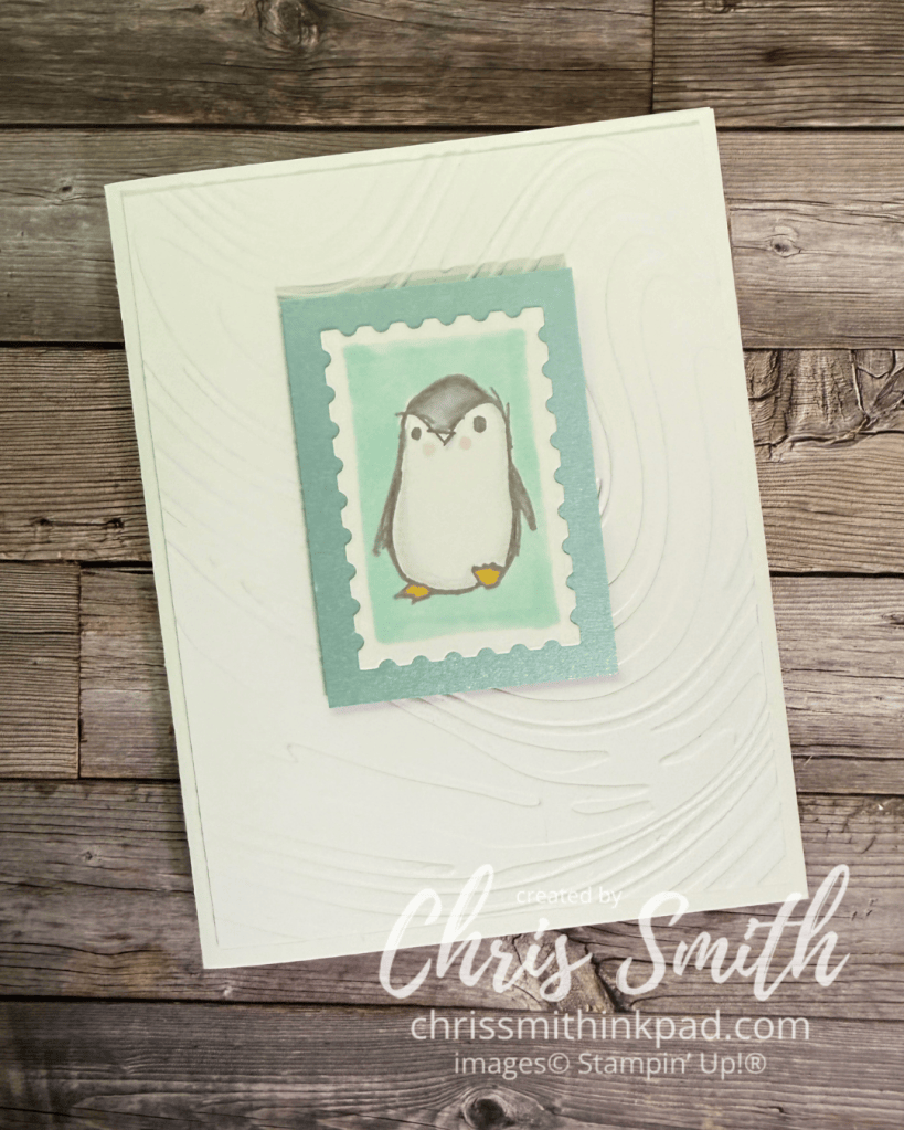
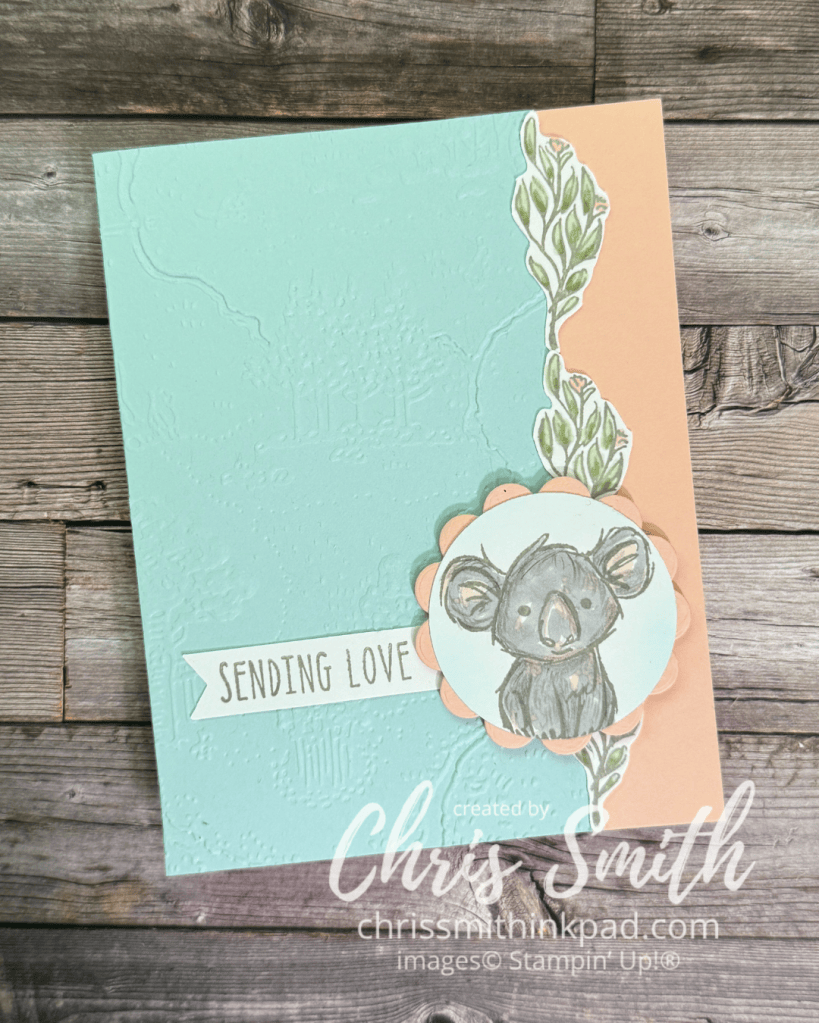
I did several of these when I presented this Musical Jamboree set for a new catalog class put together by Kevin Theesen. I loved coloring in these animals but that’s not always what works best for a class.
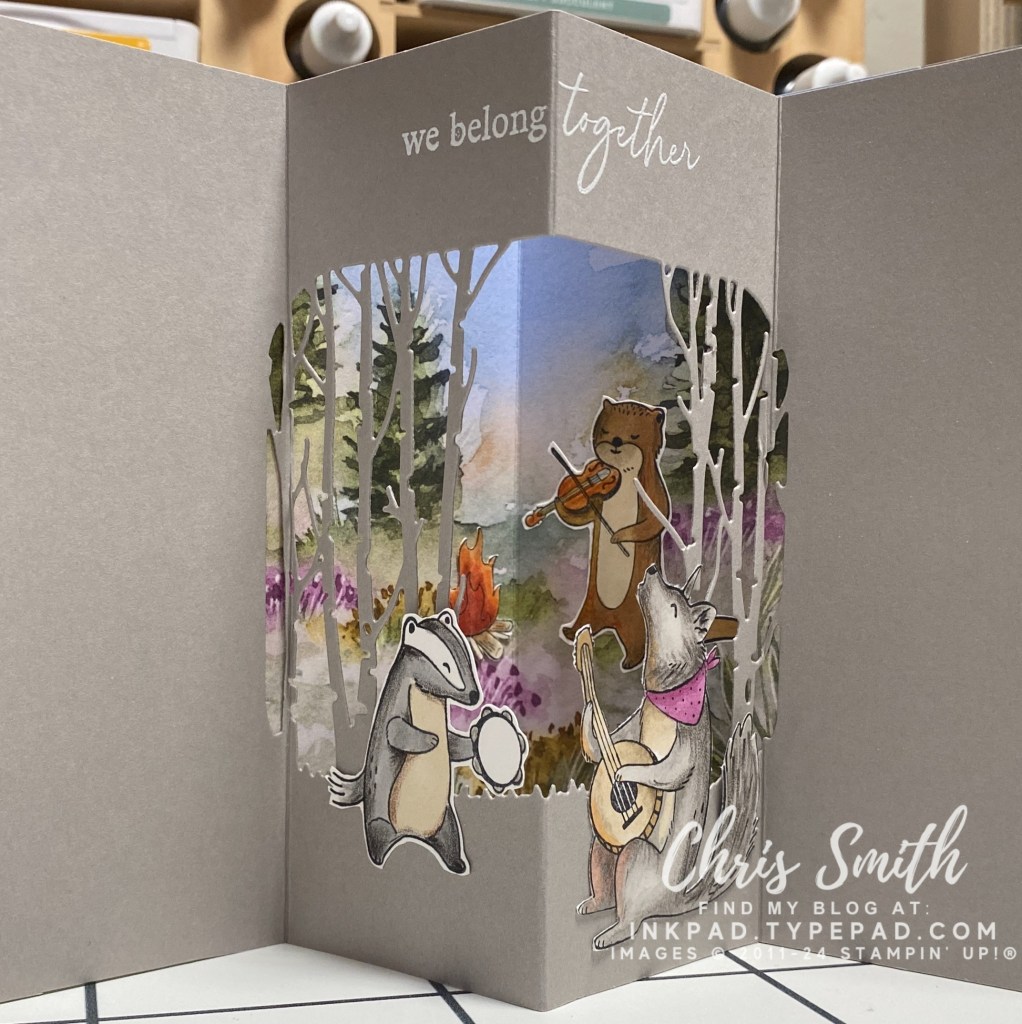
- Can you see how much I enjoyed coloring these critters? I used a base of blends and then added detail with watercolor pencil – but never added any water.
- This is also the first time I tried something other than a circle for my frame. I think this die was from Grassy Grove. It isn’t ideal for this kind of card but the look was worth the experimenting I had to do to get there. This card taught me that you need to score your fold lines before doing any detailed die cuts. It’s much easier to use die cuts that don’t go over a fold. BUT, it’s doable!
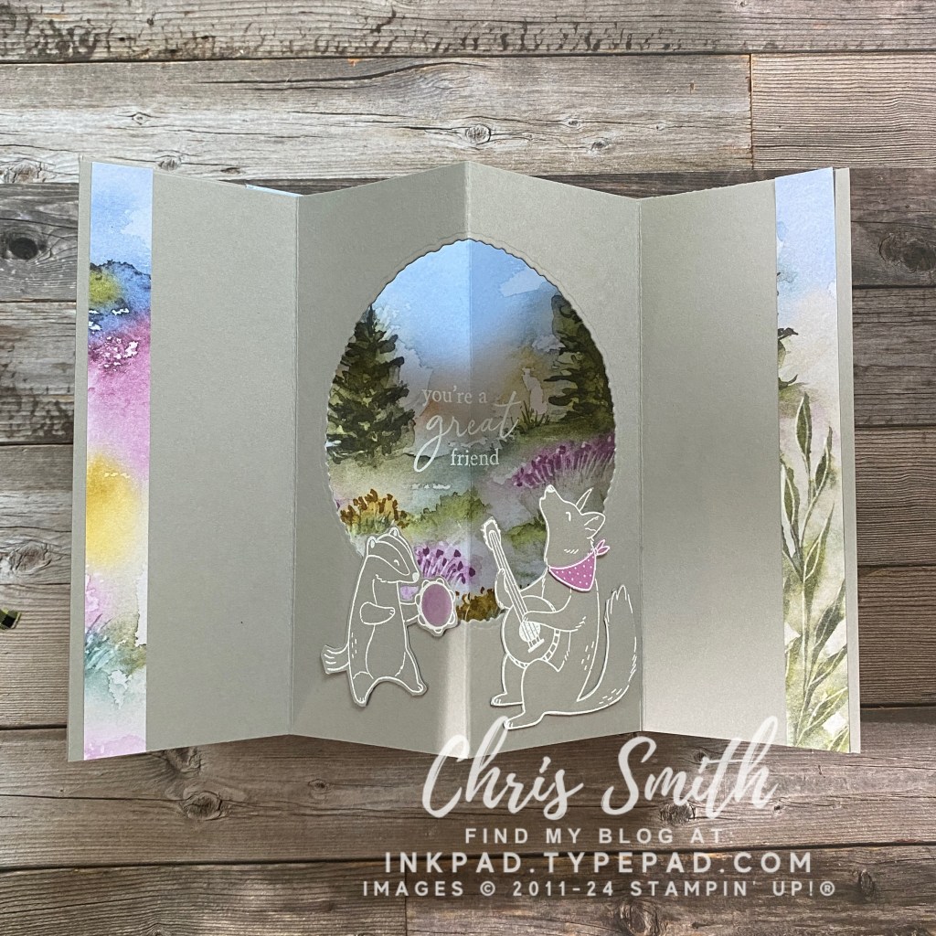
- I know some cardmakers just don’t do coloring and that’s fine. To eliminate the coloring on this card I white embossed that animals on Gray Granite cardstock and added some Petunial pop in the tambourine (Blends) and the coyote’s bandana (cardstock). There weren’t any dies to go with Musical Jamboree so these were fussy cut.
- Deckle circle die gave it a little more rustic feel and was much easier than the trees.
- This was the first time I used left over designer paper to dress up the sides.
The Cute as a Bug Suite with the Sweet Bugs Bundle was kind of a no-brainer to try a tunnel card:
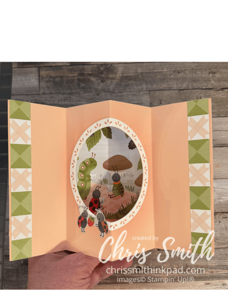
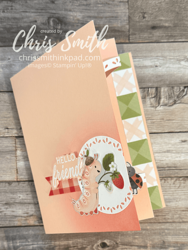
- Normally I put something very simple on the front of a tunnel card so that it is a little more of a surprise when you open it. While this Sweet Bugs card still has a lot of white, ahem – Petal Pink, space on this front, I did make it just a little bit fussier to take advantage of the cute papers. It also gave me a chance to repeat the fancy circle design I used to frame the inside frame. It was the first time I added this and I don’t think that it will be the last.
- Also note that I used a blending brush to add shading on the from and inside of the card. When you are adding it to the middle you need to make sure you do the shading before scoring or the shading will emphasize the score line.
- I’ve also learned that the smaller designs in designer series paper packs, often about 4″x6″ often work really well as the background in the frame.
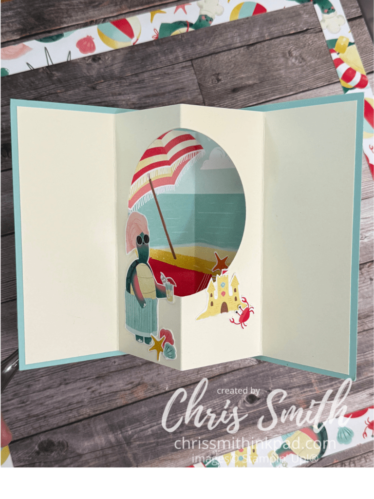
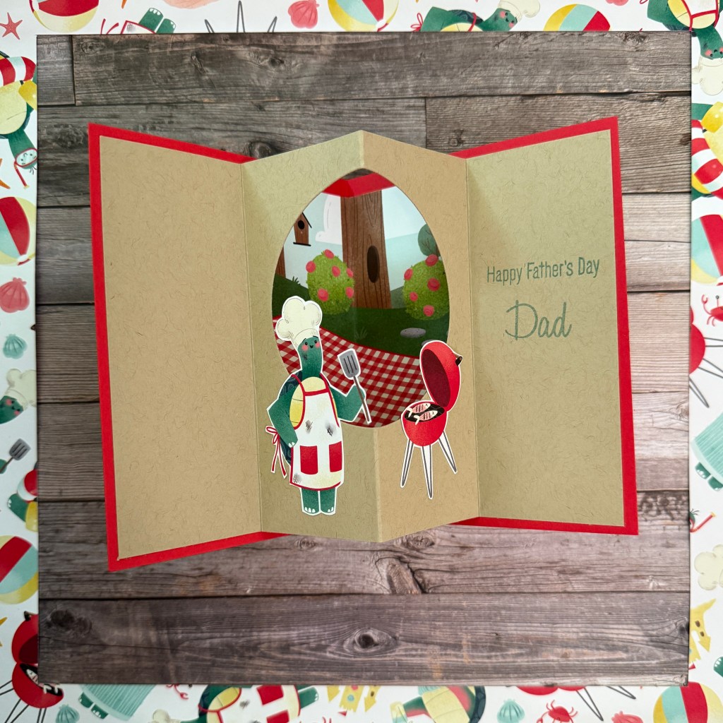
These next two do the same with the Turtley-Cute papers.