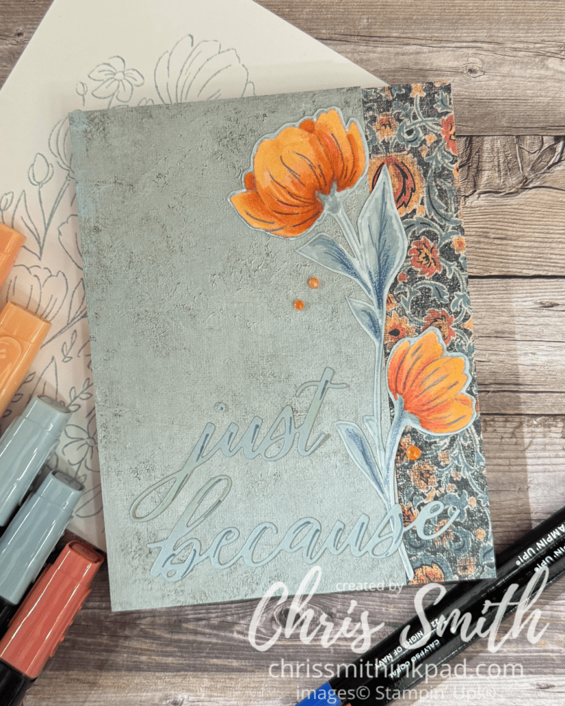
.I did the card above for an Inspiration Challenge over on Splitcoaststampers. I was inspired by this dress on the Anthropologie site. It reminded me so much of the Beautiful Gallery designer series paper. You know. One of those pieces you can’t cut into until you really know what you are going to do with it. I used the other side for the main part of the card with just a bit of the print on the side. The white space – or in this case blue – makes the border and the single flower, fussy cut from the rest, stand out. The die cut words are subtle.
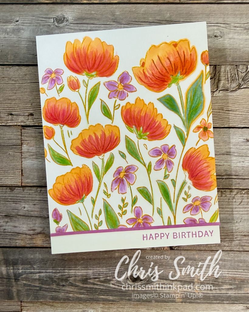
The bright one: Blends with a bit of pencil.
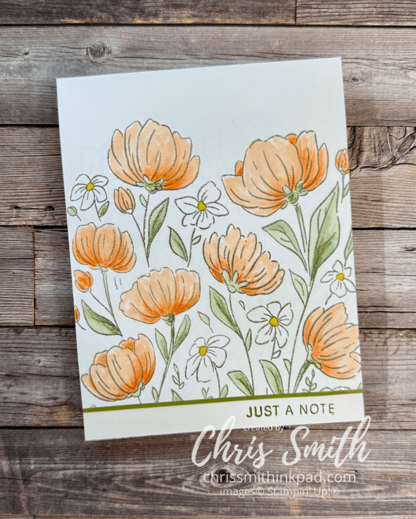
The subtle one…Blends.
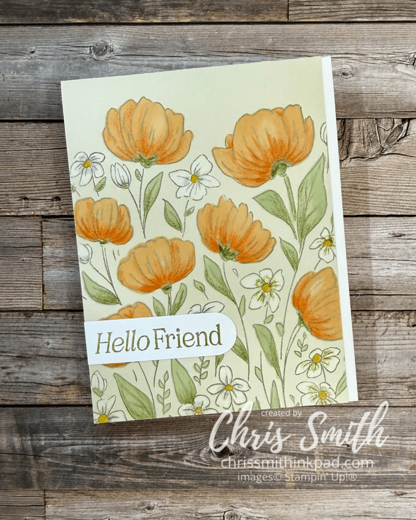
The slightly less subtle one. Blends with a bit of white pencil.
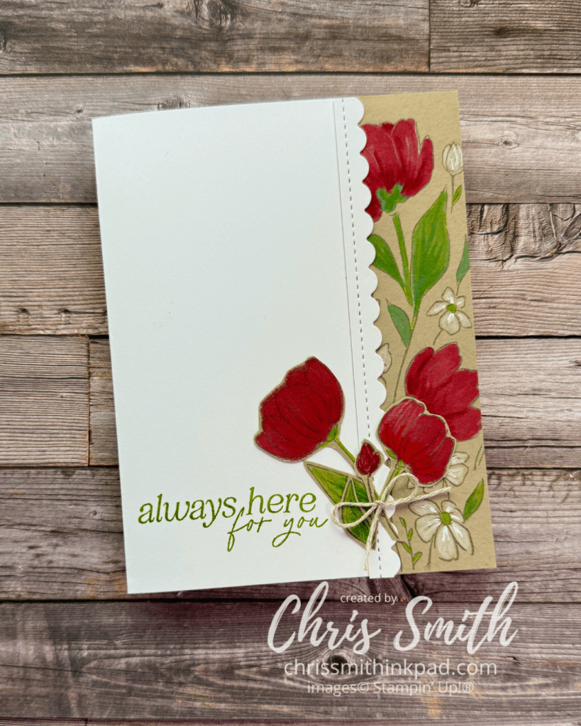
A favorite color combination that goes back decades for me: Red, white and bright greens on Crumb Cake. The greetings for these last four cards are from Lovely Arrangements. The scallop is from the retired Hand Penned Petals Bundle.
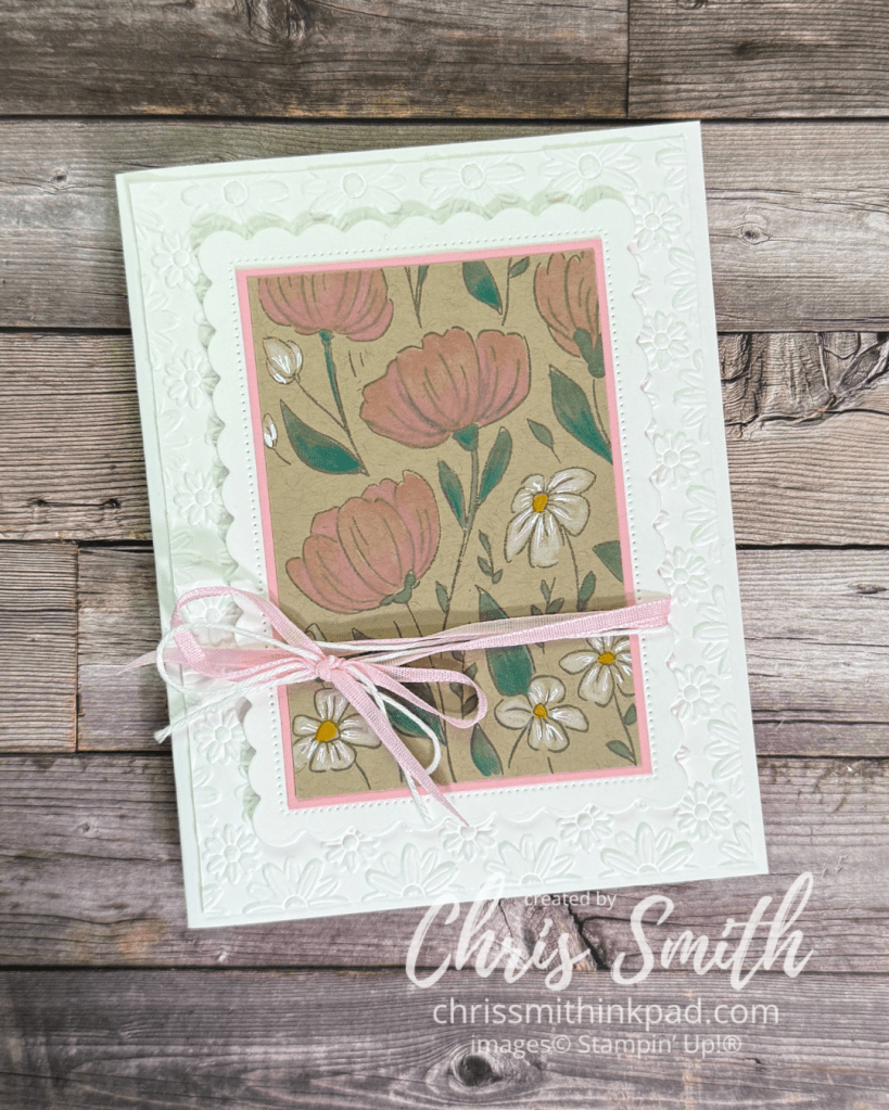
After trimming off the edge for the red on Crumb cake card above I still had more to work with so I changed it up with another color scheme. Blends + Watercolor Pencil but no water. I pulled out some scallops from my stash along with a test piece of embossing. I usually try out embossing folders in white before I actually design with them. Many end up in a stash that sits above my work area.


Leave a Reply