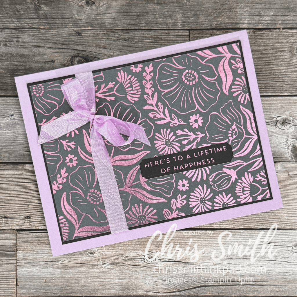
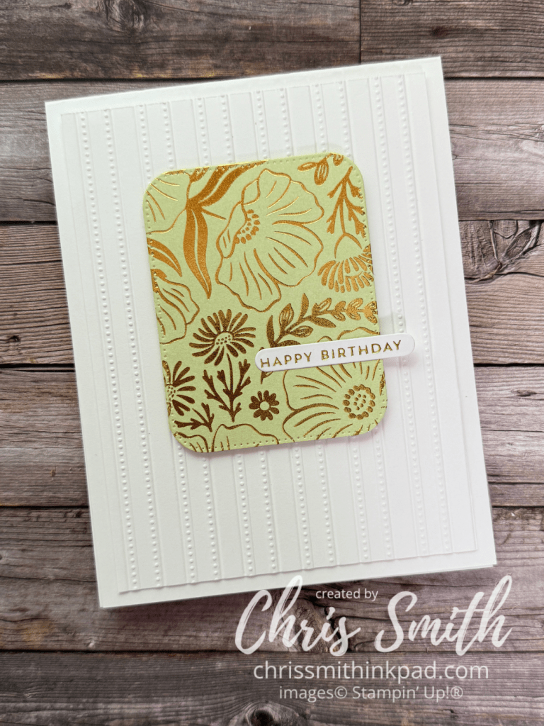
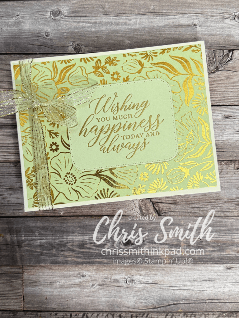
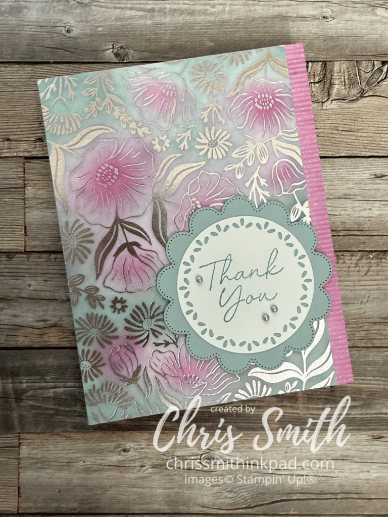
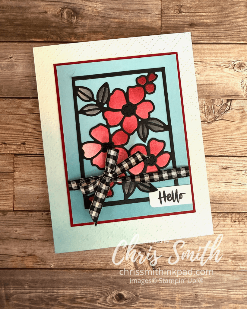
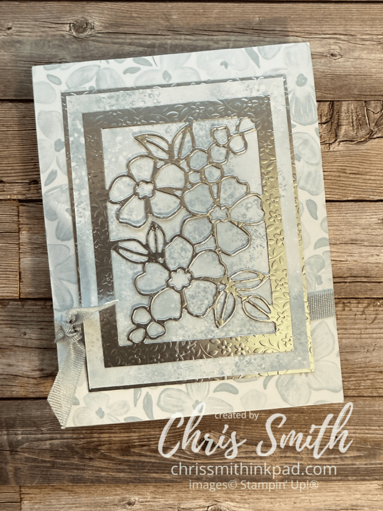
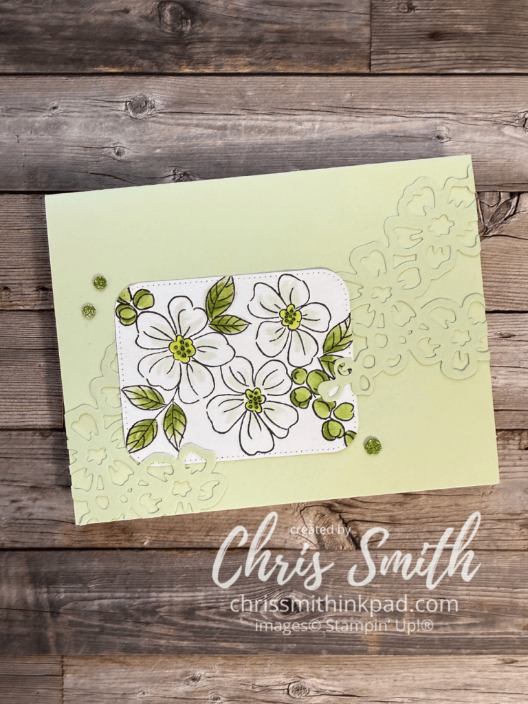
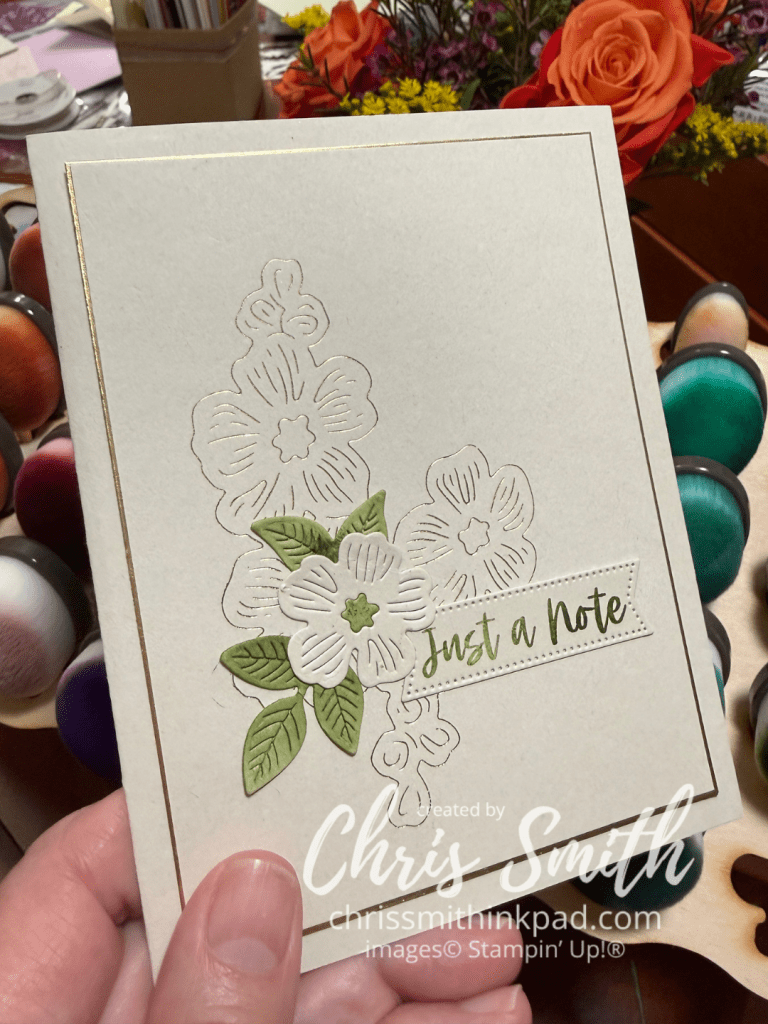
Garden Silhouette is one of the hot foil dies released in Stampin Up!’s first Hot Foil release earlier this summer.
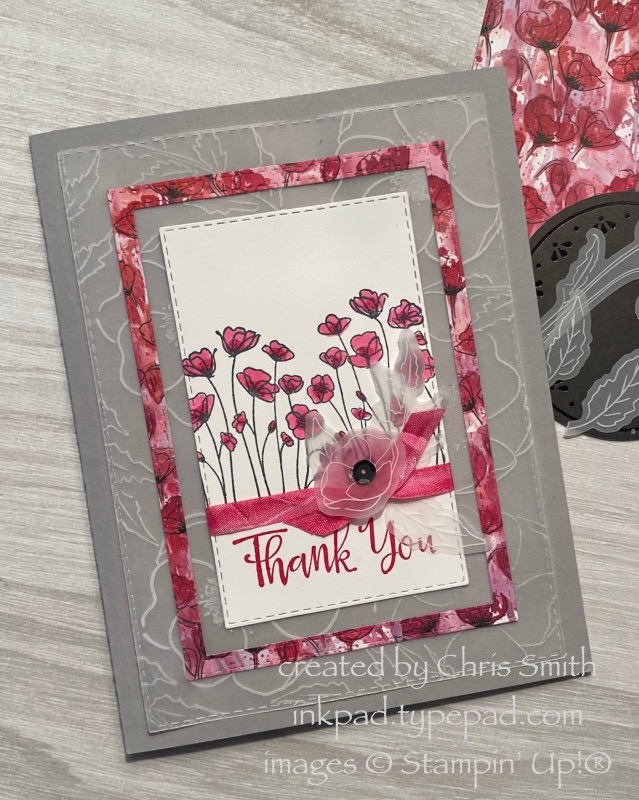
In real life, I think the light pink foil looks best with Fresh Freesia though I also like it with Bubble Bath. I used a Fresh Freesia Card base and retired FF seam binding. The Two Tone cardstock works particularly well with hot foiling because it is smoother than traditional cardstock. Since it was initially developed for scrapbooking with its light weight it also makes for a lighter weight card, though a less sturdy card base. one side is lighter and it has a white core. In this card I hot foiled the lighter side of Basic Gray and used the darker side as a mat and for the greeting. The greeting is from the Sweet Sentiment hot foil bundle and is foiled onto the darker side.
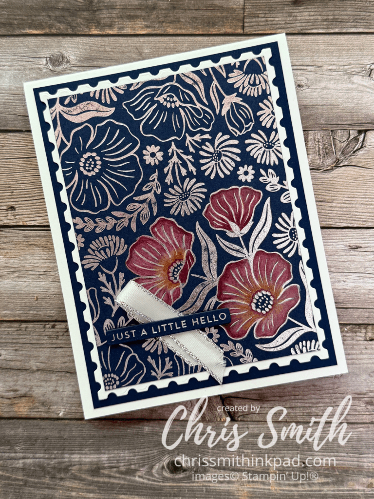
I got a little playful with this one. Silver Foil on Secret Sea cardstock. After using colored pencils on three of the blooms I layered onto a Perennial Postage die cut. When using colored pencils on a such a dark color it really helps to put down white as a base color.
I was starting to feel a little overwhelmed with the shiny pattern in large amounts so I cut out a little window using a Nested Essential die. This is layered on an embossed piece of white in my stash and takes it’s greeting, once again, from Sweet Sentiments.
…and here’s what I did with the frame the previous card left behind. I wasn’t sure it would look right to use embossing with foiling but, as you see, it works! This is a retired greeting from So Sentimental.
I think this one is my favorite so far! You would think that adding more colors would make it busier but I think the overall contrast is reduced so it pleases my eye a bit more.
Silver foil on white. I used blending brushes to add Berry Burst, Cloud Cover and Lost Lagoon. I think it was the first time I used this trio and it won’t be the last. The greeting uses the Scalloped Blooms bundle along with a die cut circle from the Spotlight on Nature dies. I do like those circle dies on the scallops!
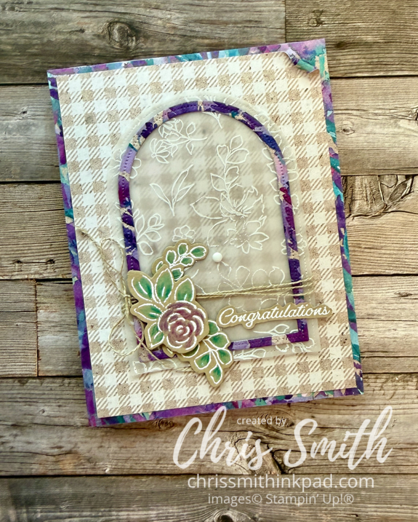
I recently had a question about a card I used with a similar sketch and after looking back at my Splitcoaststampers Gallery found that I’ve used this numerous times. It is, in fact, one of my favorite ways to feature some rich and lovely designer series papers (DSP) that I’m afraid would overwhelm a card.
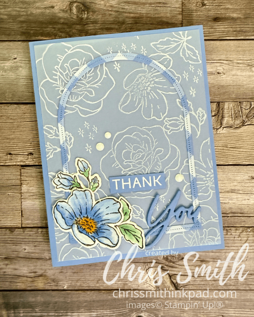
I often also use vellum with it since it gives a nice, ethereal look under a richly colored frame.
This card features the recently retired Perennial Lavender DSP along with the Extraordinary Flora Bundle. If you are familiar with my work, this is a lot of DSP for me though most of it is the neutral Crumb Cake gingham. As I said earlier, I prefer to use the richer colors is smaller amounts.
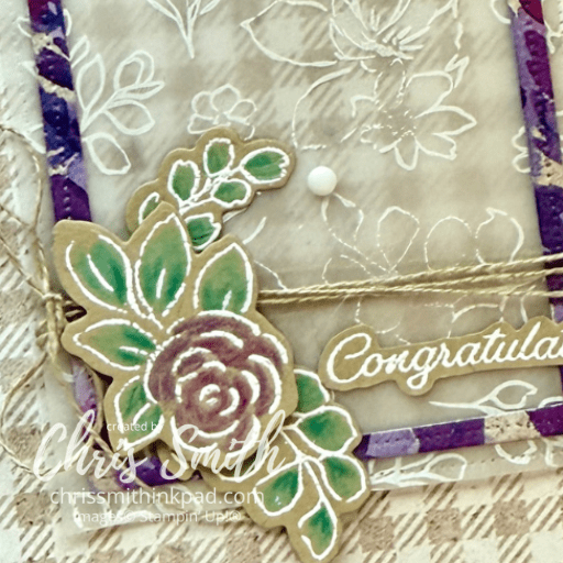
I used the floral stamp with white craft ink on the vellum. I don’t remember that it took too much time to dry. The greeting and floral stamp were also stamped with white and embossed with white on Crumb Cake. Coloring was done with a bit of Blender Pen and finished up with Watercolor Pencils.
It was fun to roll back one corner of the check to give another peek at the back.
The nested arch dies are perfect for making a nice skinny frame though I’ve used rectangles to make other versions of this sketch. I’ll have to collect the other cards I’ve done with this into another gallery.
I bet you have some papers in your stash that would work with this sketch! Go ahead and give it a try!
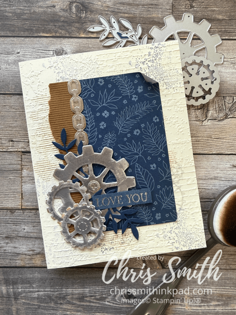
For Splitcoaststampers Color Challenge; Blending Brush, Exposed Brick Embossing Folder, Sanding Block, Gears & Textures Dies, Lifetime of Love Bundle, Silver Embossing Powder; Pecan Pie Night of Navy, Very Vanilla, Silver Metallic papers, True Blue Florals DSP
Today the artists from the Around the World on Wednesday crew are enjoying a little sand!
We are left to our own devices to decide how and I didn’t have too much trouble deciding that I would get out my sanding block.
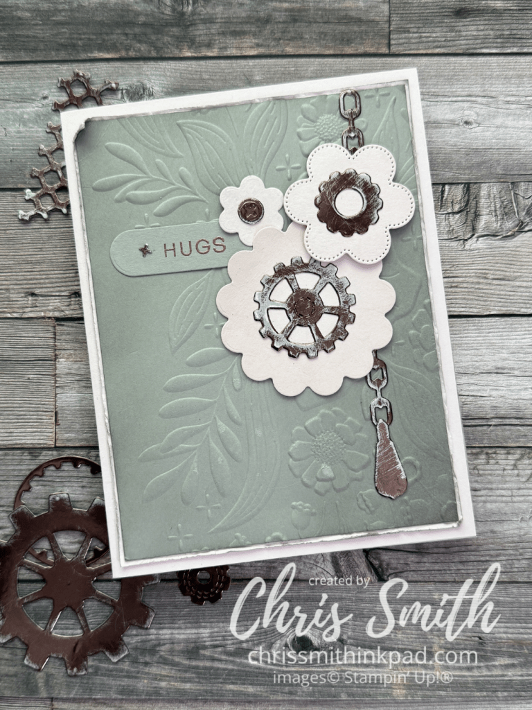
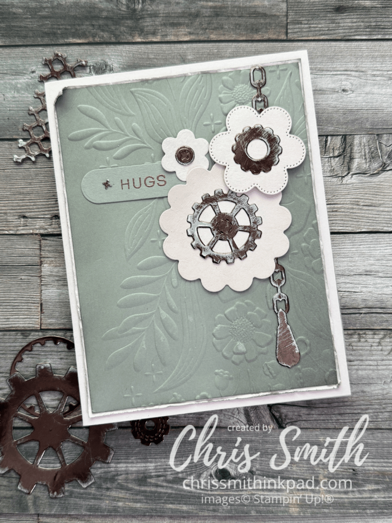
Awhile back I experimented with using sanding blocks to roughen up some metallic paper when I was using the Gears & Textures bundle and wanting the gears to look worn instead of shiny and new. This week I went back down that road to try some other ideas I’ve had rumbling around in my head. One idea was mixing the feminine scallops from the Scalloped Blooms Bundle with the more masculine Gears & Textures.
I had trouble getting the Barely Blush and Gray Granite in the card to come through right in this photo but I love the way they worked together with the Earthen Toned Metallic – in real life!
I lightly brushed Gray Granite ink onto the Gray Granite layer (3 7/8″ x 5 1/8″)before embossing it with the Floral Spray Embossing Folder. That piece is layered onto a 4″ x 5 1/4″ piece of Barely Blush before I roughened up the blush with my fingernail. I gave the edges another quick brushing of Gray Granite ink before rolling one corner and attaching it to a A2 (4 1/4″ x 5 1/2″) Barely Blush card.
The scallops/flowers are die cut from Barely Blush with the Scalloped Blooms dies and brushed ever so slightly with the same color of ink.
Most of the gear pieces were sanded as loose pieces but the chain was done in the negative piece that was left after making the die cuts. If you look closely you can see that the edges of the chain are more defined with the original Earthen Toned color. The others are more worn appearing at the edges.
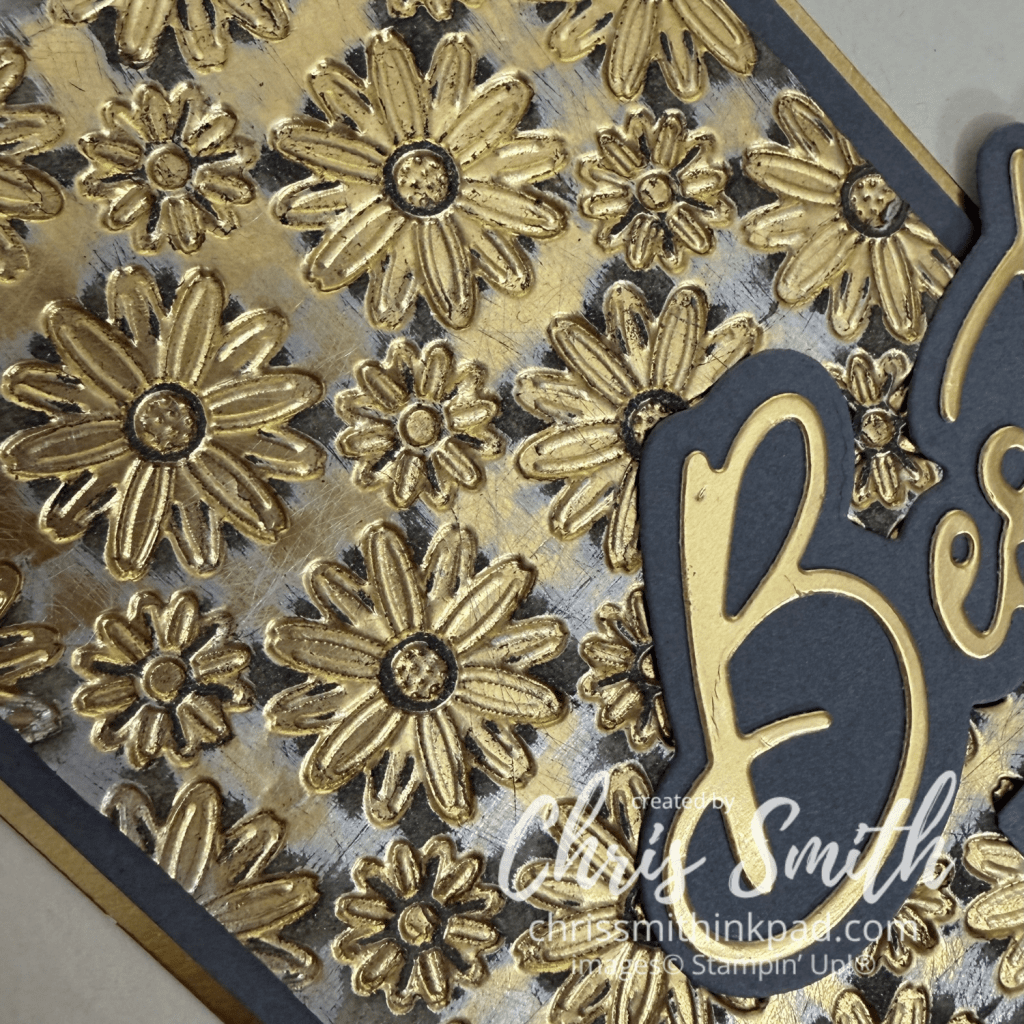
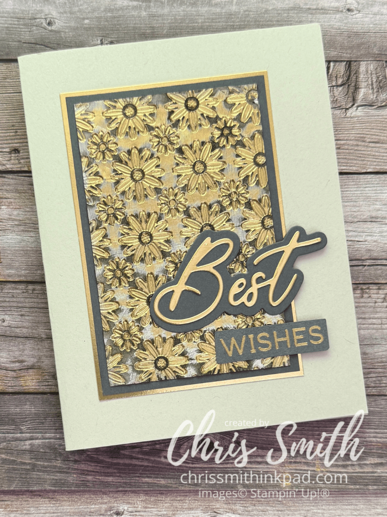
Here is one that started with a piece of shiny gold metallic paper.
I didn’t know what this would look like until I created the background piece but once I saw the way the pattern and colors work together I thought I would turn it into a card that was a little sophisticated and celebratory, like for a older couples wedding or maybe a retirement. You can see in the close-up at the top of the post that the piece shows gold that is roughened but not sanded off, a silver-ish color beneath it and then Basic Gray which is where I sanded down to white, uncoated paper that didn’t resist the ink like the gold and silver did.
I think it is good to vary the width of your layers if you use more than 2. The Basic Gray border is 1/8″ while the unhanded gold metallic border is 1/16″. Actual Measurements: 2 1/2″ x 3 7/8 of embossed pattern, 2 3/4″ x 4 1/8″ of Basic Gray; 2 7/8″ x 4 1/4″ of unsanded Gold Metallic Paper
When I have a design that won’t have an even border around the card I usually try to line it up so that the distance from the top and the sides of the card is the same with more space on the bottom. This time, since I knew that the words would extend towards the right edge, I made sure the left, top and bottom were equal distance and there was a little more room on the right.
I like mixing the die cut words with stamped words from the Words & Wishes Bundle.
I often just barely snip off the corners when I have a hand trimmed greeting such as “wishes”, just to slightly soften the edges. This time I also used my sanding block to smooth all the edges of this piece down. I’ll be using that trick again!
I hope you try sanding some of your metallic paper scraps at your craft desk! Here are some ideas to keep in mind as you experiment:
There are lots of tools you can use to sand, even emory boards, I found a nice sized, very slightly cushioned, block at the hardware store for just a few dollars.
Try different types of metallic or coated paper. You may find multiple layers and can experiment with how many layers you actually want to go through.
Think about what colors of ink you might like to apply. Something darker to emphasize the metal color or maybe something complimentary? Always brush loose paper/dust off your sanded piece so that you don’t transfer the paper dust to your ink pad. You may not realize it at first but your sanding block may accumulate dust too so it a good idea to brush that off a bit if you can.
Vary the way you swipe the sanding block across the paper or die cut. You will get different looks with straight swipes compared to using a circular motion.
You can apply ink with blending brushes, daubers, or even directly from the ink pad.
Save the negative from making die cuts and place the cut pieces back into the negative before sanding to get a different look. This preserves the metallic look at the edges, sanding more on the top surface. Without the negative you usually get the most of the metallic coating off of the edge.
For variety, use both sanded and unsanded metallics in your final card design.
Now it’s time to check out what kind of sand the rest of our time got into. Next up is Bree Renwick:
Thanks so much for stopping by today. Please note that there is a gallery page index linked at the top of my blog. You can find samples from various Stampin’ Up sets and sometimes even techniques by checking the index. Chris
Peaceful Days Hybrid Embossing Folder, Starstruck Embossing Folder, Night of Navy Gingham Ribbon, Sweet Bugs Dies (tiny butterfly), Label Framelit dies, Fragrant Layers Bundle
I cut the framed flowers die three times for this card: once in Basic Black, once in blended Basic Gray and once in blended Cherry Cobbler. The take a pick tool was really appreciated as I put the pieces together.
The designer paper and embossed Cloud Cover metallic paper are since retired though they really show off this 2025-27 In Color.
I just had to try this bundle with a favorite Soft Seafoam/ Granny Apple Green color combination.
…Playing around with Blends…
I did the background with gold hot foil and one of the regular cutting dies from this bundle. The other die cuts were done with Basic Beige. The blending was done with brushes and Mossy Meadow ink.
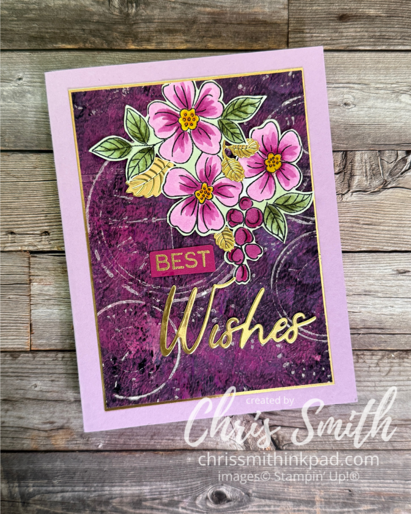
I fussy cut this image after coloring it with Blends. The background is a gel print I’ve had in my stash for years. I ran it through an Altenew embossing folder, Traces of Yesterday, that I bought intending to try with Gears and Textures but it found its way to this card first. Words & Wishes greeting … and little gold leaves. I had to sand the background to get the white core to show the design.
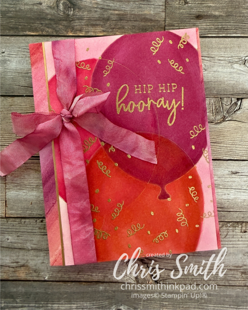
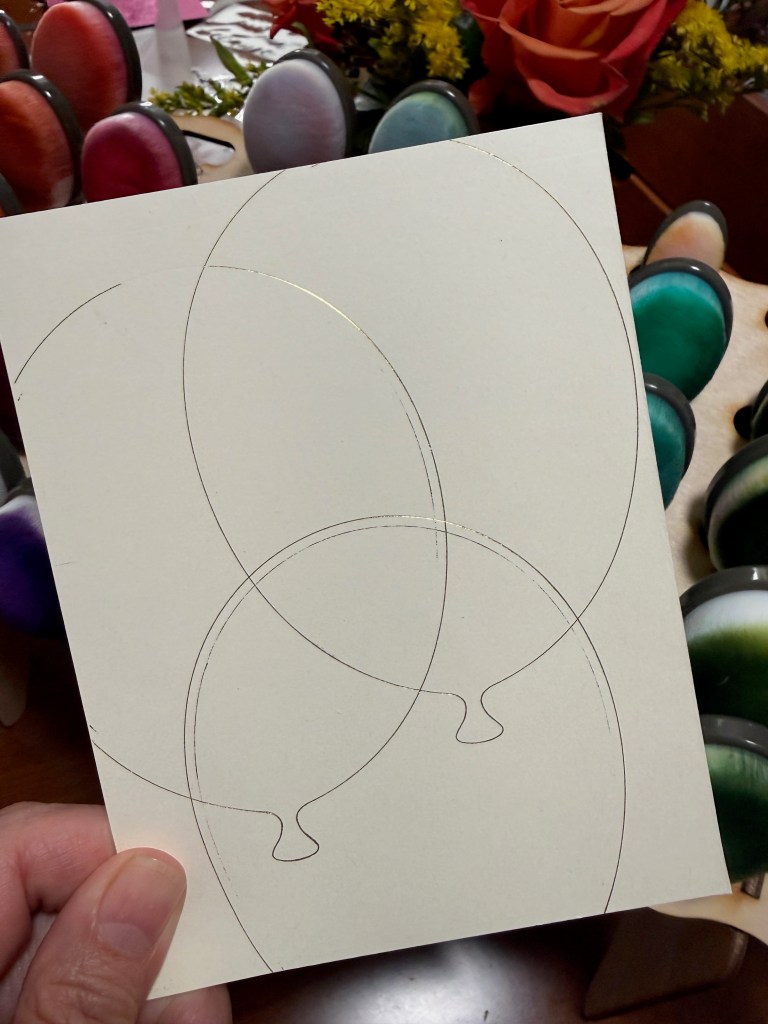
No, Balloon Festoon doesn’t have stamps this big. I just tried to do hot foil with the large balloon die. As you can see I got a bit of over-foiling, which is fairly common with large, open dies.
Luckily this is easy to remedy by using an eraser. I used a sand eraser.
Then, I colored them in with Berry Burst, Melon Mambo and Red (Poppy Parade?) Blends.
I brushed the uncolored parts with a blending brush with lighter pink on it.
When all of the inks were dry I embossed some confetti and a greeting, also from the Balloon Festoon stamp set.
Some Full of Life designer series paper (retired) really pulled these colors together so I added a bit on either side of the balloon panel, along with just a sliver of gold foil.
The ribbon is from a batch I did when I was paying with dying my own colors with reinkers (and a bit of vinegar, I think. It was at least a decade ago.)
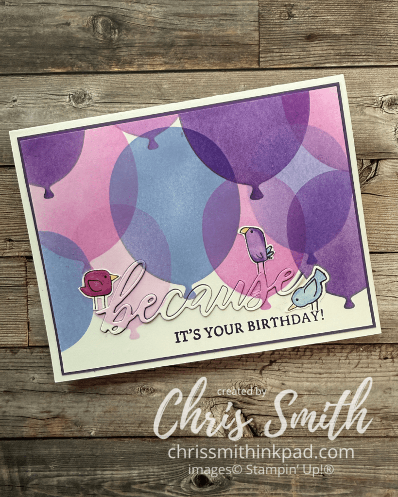
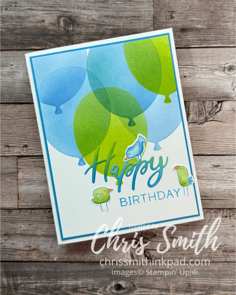
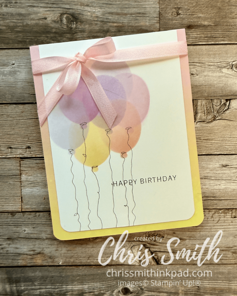
My first play with stencils made from balloon die cuts. It was so fun to play with different colors of inks!
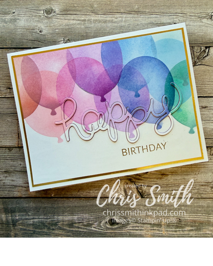
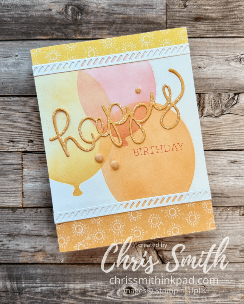
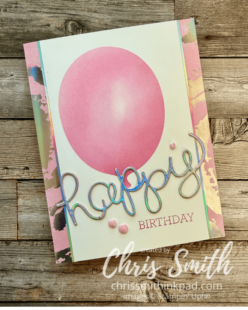
These first three cards feature the Hello You thinlet dies which were bundled with the Crazy About You stamps in Stampin’ Up!’s 2015 Occasions Catalog. It was one of the earlier word die sets and I don’t think I was ever too crazy about the font BUT I love it with these balloons! I only found out after I made the cards that I still had the word stamps so these used different “BIRTHDAY” stamps that are a little more recent.
I love the effect in the first card of cutting the word out of the stamped design. Just know that it’s a bit more time consuming and make sure you save all the necessary pieces so you can replace them after you put the word back in place.
The die cut “happy” has three layers to make it more sturdy which also makes it easier to apply to the card in the intended shape – otherwise a single layer might stretch out the letters.
The background paper and die cut “happy” use Beach Boardwalk DSP. The white trim is from the Cutest Crew Dies.
Splash of Sparkles DSP. I think the balloon was from leftover Melon Mambo ink on my blending brush.
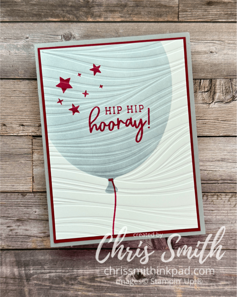
This used one of the biggest stencils I could die cut and it would make a great, easy graduation card. This one uses my high school colors: Red & Gray (Actually I think I just cleaned off my black blending brush.)for the Duluth East Greyhounds. It’s only been 50 years!!! The waves are for the waterfront, near where our graduation ceremony was held. Of course any embossing folder or even none at all would work.
Cutest Crew birds with Words of Beauty Bundle.
Cutest Crew birds with Words & Wishes greeting
The Beach Boardwalk DSP worked perfectly with these balloons which wrestled done by cleaning off a bunch of blending brushes. I think the greeting is from Lovely Arrangements.
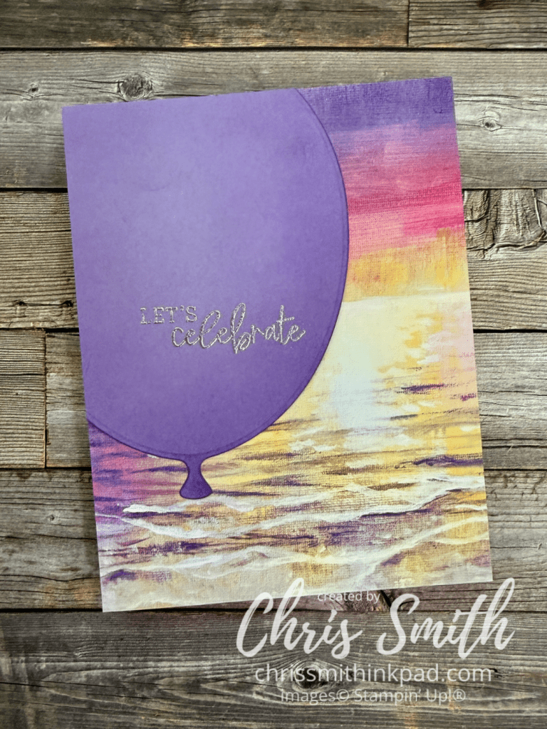
I wasn’t sure I would make use of the really big balloon dies but they are turning out to be some of my favorites. This simple Highland Heather balloon was lightly shaded with ink and embossed with a celebration message – I was thinking graduation or something. I chose silver to accentuate the iridescence in the background paper but I also think gold embossing would have worked well with the Crushed Curry in the design.
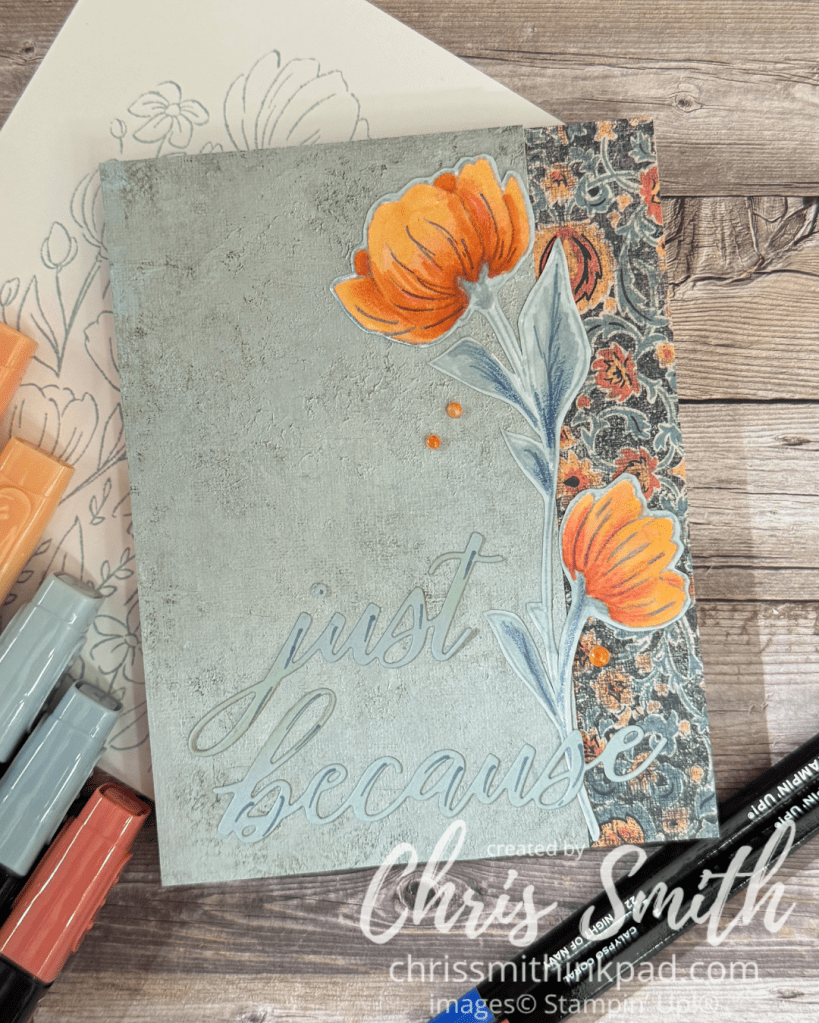
.I did the card above for an Inspiration Challenge over on Splitcoaststampers. I was inspired by this dress on the Anthropologie site. It reminded me so much of the Beautiful Gallery designer series paper. You know. One of those pieces you can’t cut into until you really know what you are going to do with it. I used the other side for the main part of the card with just a bit of the print on the side. The white space – or in this case blue – makes the border and the single flower, fussy cut from the rest, stand out. The die cut words are subtle.
The bright one: Blends with a bit of pencil.
The subtle one…Blends.
The slightly less subtle one. Blends with a bit of white pencil.
A favorite color combination that goes back decades for me: Red, white and bright greens on Crumb Cake. The greetings for these last four cards are from Lovely Arrangements. The scallop is from the retired Hand Penned Petals Bundle.
After trimming off the edge for the red on Crumb cake card above I still had more to work with so I changed it up with another color scheme. Blends + Watercolor Pencil but no water. I pulled out some scallops from my stash along with a test piece of embossing. I usually try out embossing folders in white before I actually design with them. Many end up in a stash that sits above my work area.
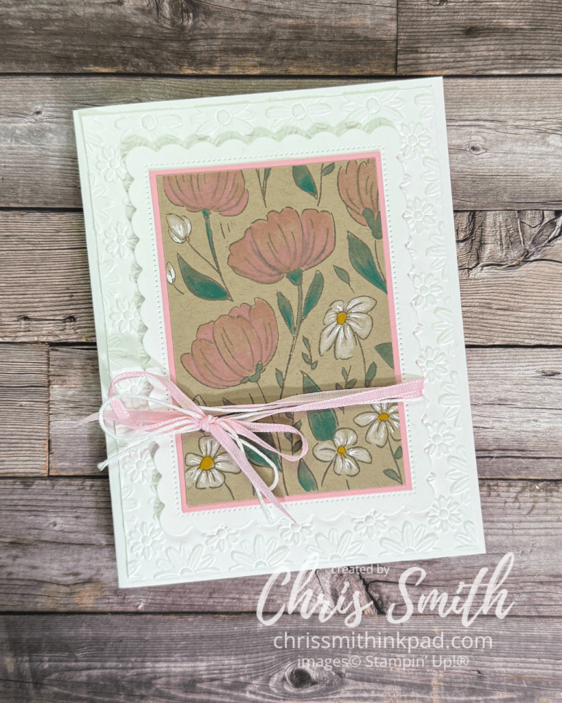
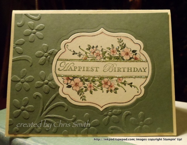
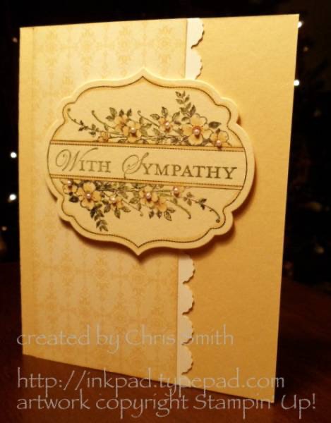
These are reposted from my old Typepad blog. Can you tell I had a lot of fun playing with my first set of nested framelits and Big Shot? These label dies are much like Stampin’ Up!’s current Beautifully Celebrated Dies so you may find the ideas to be interchangeable. The Typepad blog noted on my watermark no longer exists.
I splurged on Stampin’ Up!’s Occasions Mini pre-order, even express shipped it so I could play with it during my recent 3-day weekend. Needless to say I was impressed with what I saw in the catalog, but I’ve had even more fun than I expected playing with the new Big Shot “toys” and coordinating stamps.
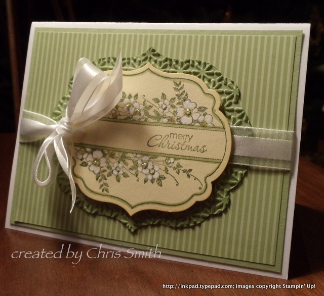
Paper Player’s challenge this week is to make a Christmas card out of non-Christmas stamps and colors. That challenge combined with my new box of goodies led to this:
Apothecary Art is a new set of 6 stamps that I thought might be a little more coloring than even I enjoy, but it really does color up quickly. I had a whole page stamped on So Saffron, colored and ready to cut up with the new Framelit Labels Collection in no time. I used the same framelit to cut the label as I did to cut the opening into the front of the card. This gave me a sort of dry embossed frame on the card in which to set my colored label.The roses were colored with Regal Rose and Blushing Bride; the leaves with Pear Pizazz and Lucky Limeade. The picture may not have caught it but Dazzling Details adds shimmer to the roses and border on the ribbon.
The Pear Pizazz label cut out of the first card ended up as a background layer for my next label image, after running it through the Snow Burst embossing folder. Once again the label is stamped on So Saffron. Coloring is with the white gel pen and Pear Pizazz with Dazzling Details. Several of the Petite Pairs greetings will work on these labels if you offset them.
White Christmas Flowers with Pear Pizzazz and So Saffron.
With tiny, tiny pearls…
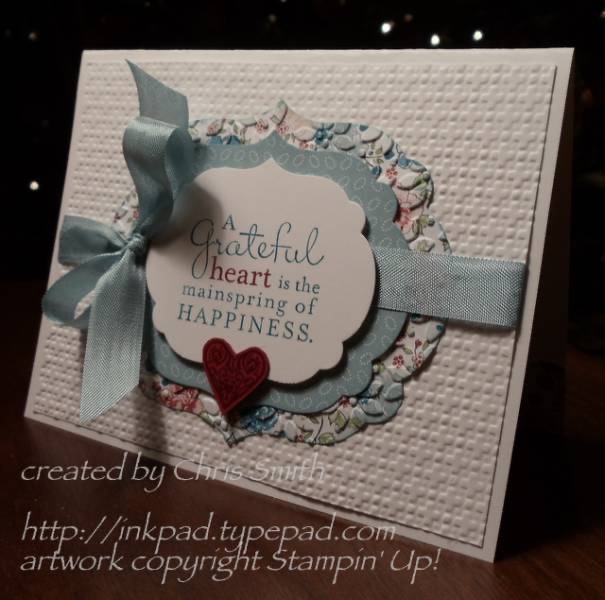
Take it to Heart stamp set(SU)
Pursuit of Happiness stamp set (SU)
Also uses Tiny Tags w/punch(SU) and Finial Press embossing folder(SU).
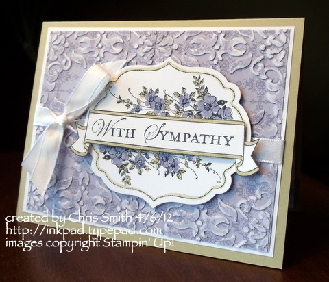
Wisteria Sympathy. Also uses Loving Thoughts (SU).
This also uses a 2012 designer paper, Twitterpated.
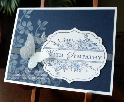
This features white craft ink stamped on Night of Navy cardstock. Accent is a die cut (and embossed) butterfly.
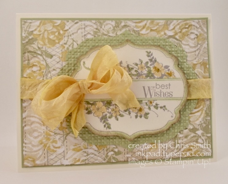
So Saffron with a little Pear Pizzazz. Lightly sanded the DSP after embossing. I loved this paper as it reminded me a bit of the wallpaper in my room while I was in high school.
A little bit more current look using a recent embossing folder plus flowers and a greeting from Fragrant Layers. I was using the sketch from the Wisteria Sympathy card above. There is sanding on both embossed layers. Sanding the Night of Navy DSP shows the white core of the paper and works best on monochromatic patterns. Lightly sanding the Silver Metallic papers gives a softer, aged patina.