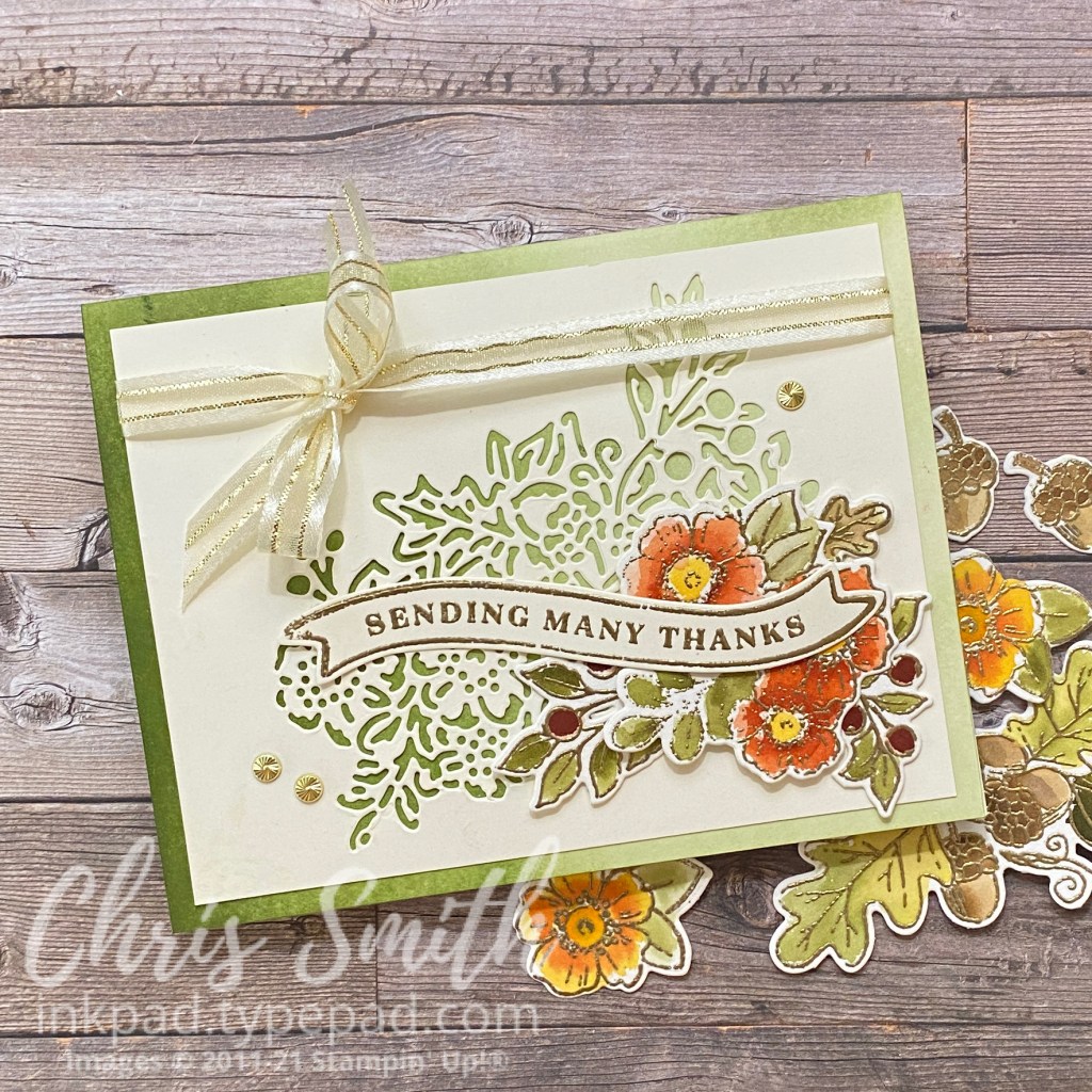
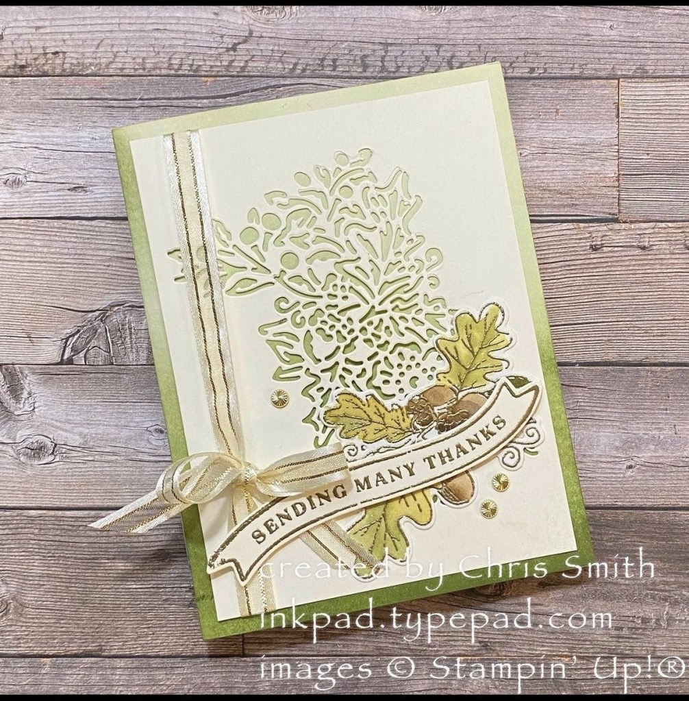
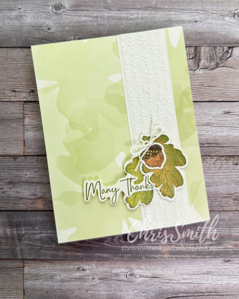
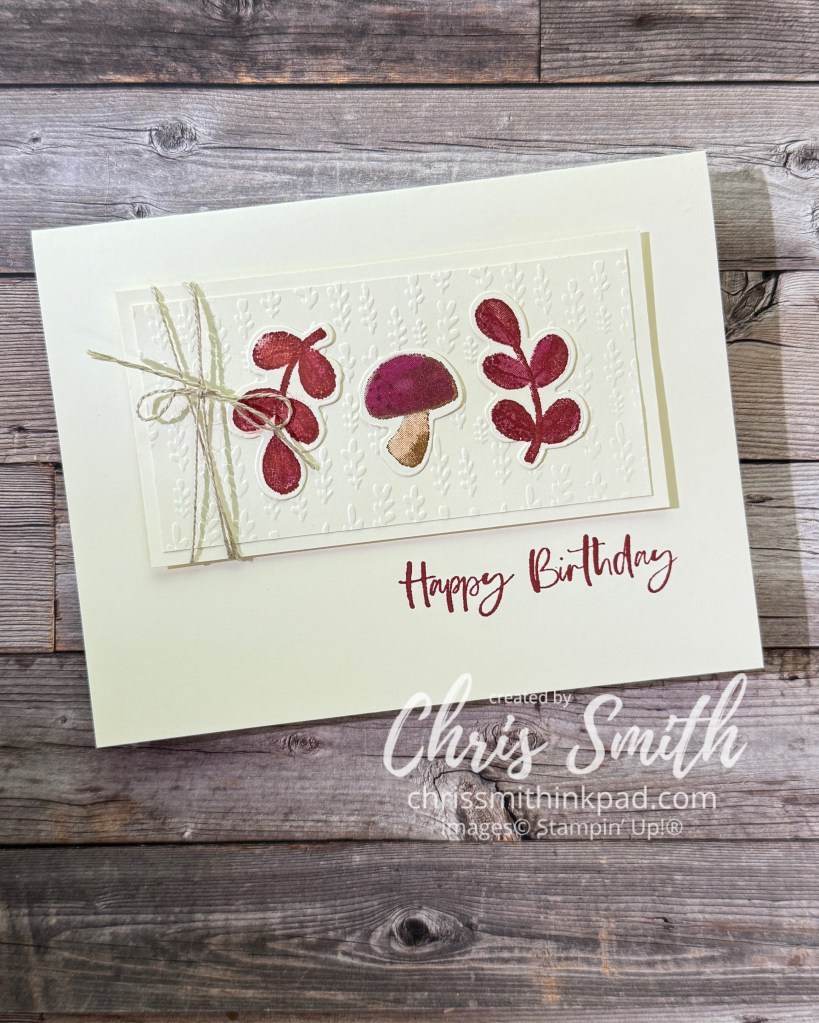
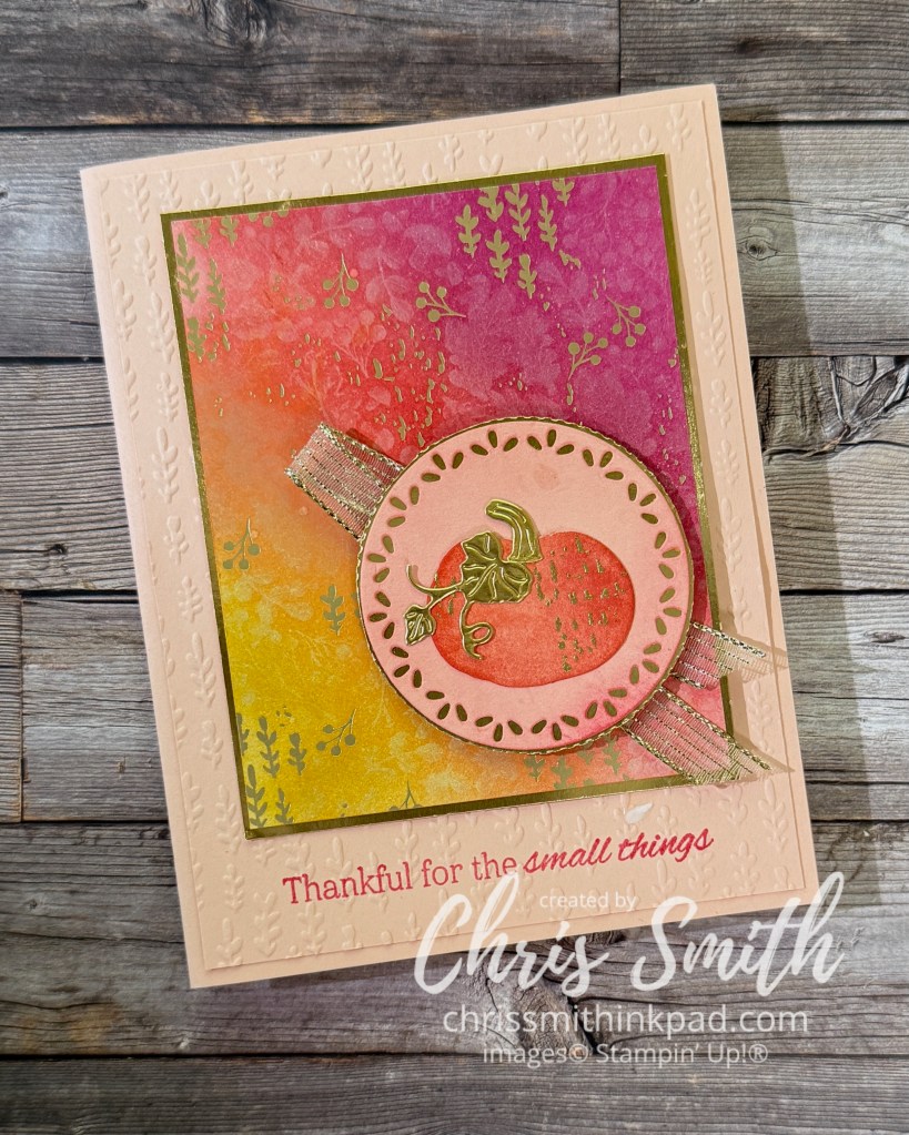
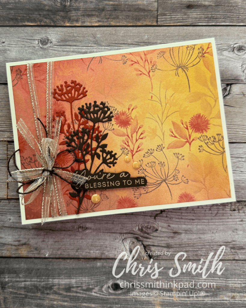
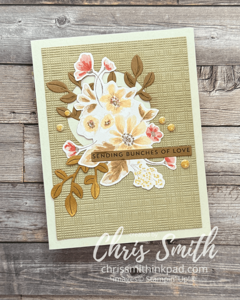
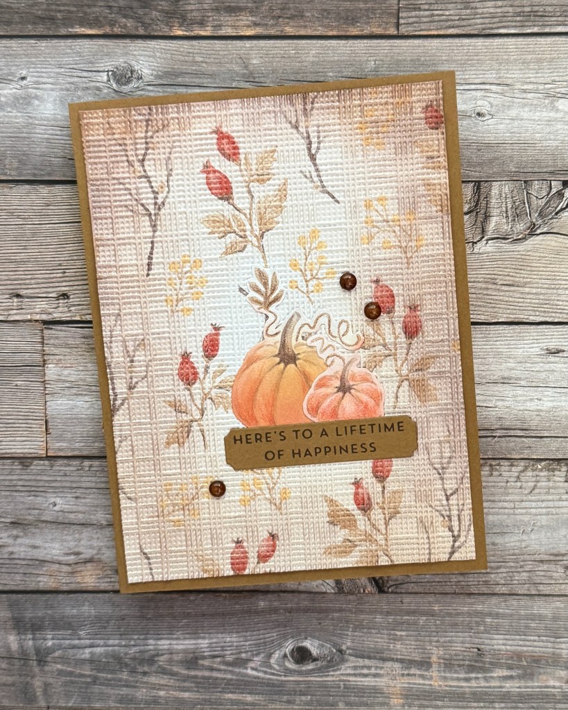
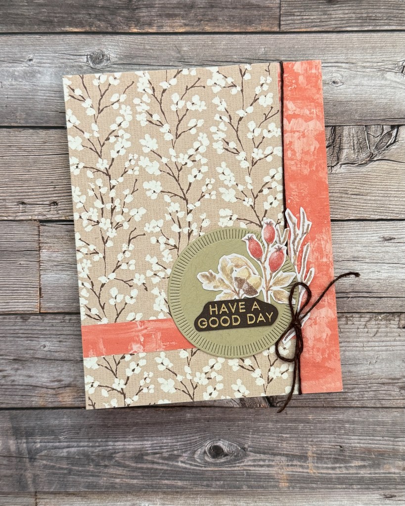
When I pull out my retired fall stamps and bundles, this one, Fond of Autumn, always gets attention from people who join me in my stamp studio. Watch this space for more samples… since we are working it again in 2026!
These are two cards that I made when the bundle was originally released. Pretty much the same with two different orientations.
I gold embossed and watercolored the largest image and then cut it into several with the corresponding die. You also want to gold emboss two banner greetings.
I added Old Olive to the fronts of two Very Vanilla card bases.
Cut the lacy detail die out of two pieces of vanilla and layer each onto a card base.
My first two cards are, to me anyway, the default sketch for these pretty dies: the die is cut from the top center of the card. Both of these also use designer series paper(DSP). When friends have made this at my place they can then choose their own color schemes, which I think is the beauty of this sketch. The sketch is rather simple and the creativity comes in playing with colors.
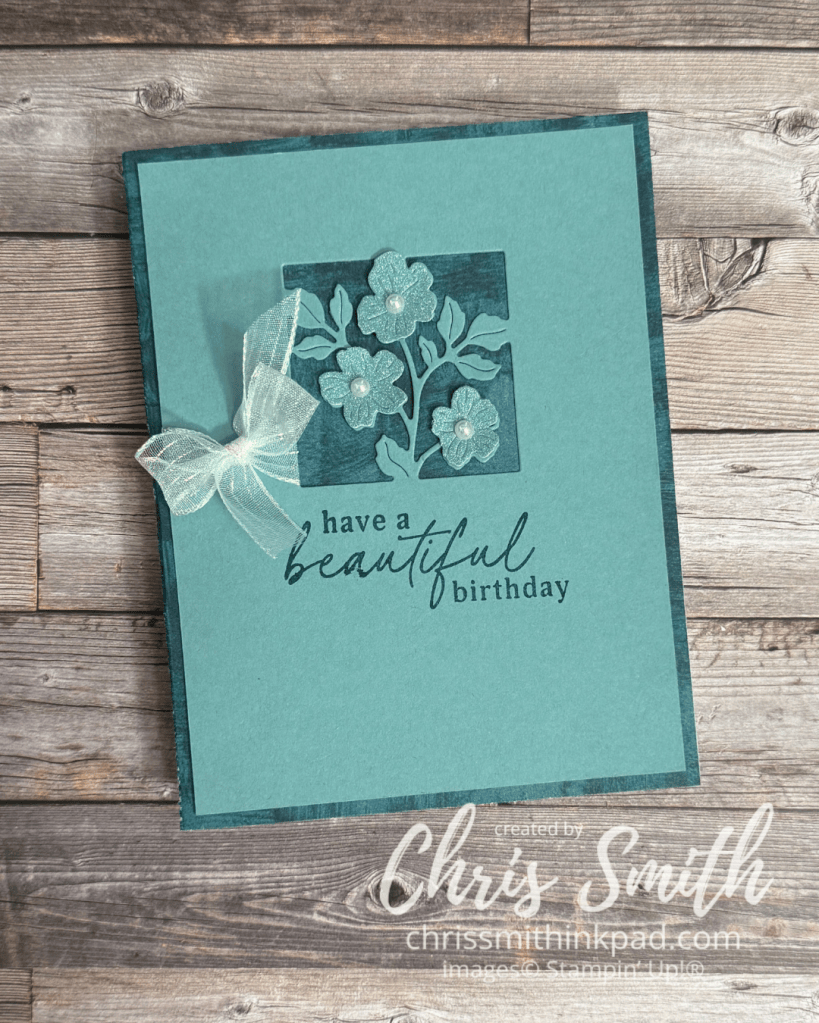
I start with a full quarter sheet of CS – 5 1/2″ x 4 1/4″ for an A2 sized card. I used Lost Lagoon for this card. The square flower die is placed so that it looks evenly spaced from the top and two side edges of the cardstock. I just eyeball this but if you feel like measuring, you do you. After die cutting I trim off 1/8″ from each side. If for some reason you aren’t happy with the positioning you can make adjustments in how you trim it. You could also trim off more than 1/8″ if you want more of your background to show.
Just about any greetings would work with these die cut images, those that come with the bundle have the potential to cover many occasions and styles. I used a positioner to add the birthday greeting in Pretty Peacock ink.
At first I intended to die cut extra flowers from more Lost Lagoon cardstock but alas my scrap drawer only had it in a shimmer scrap. That didn’t curl as well to lend the 3d look I had in mind. Maybe I’ll try that idea again on another card – with regular cardstock. I added Iridescent Pearls to the centers.
You don’t need to add a ribbon but I wanted to test out the idea. Tied around an inch or so piece of cardstock, it needs to have a delicate look as this mesh ribbon does. We’ve also found that baker’s twine works.
I used a quarter sheet of Pretty Peacock Nature Walk DSP for my background on this card. Although it’s not visible I used a Pool Party card base
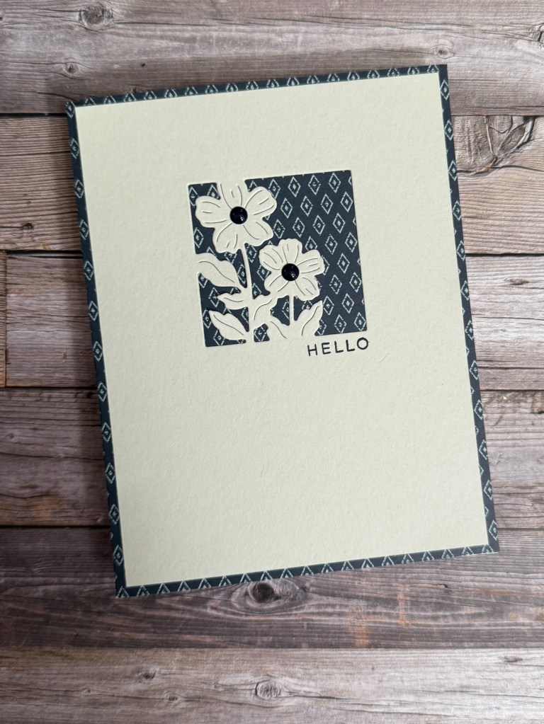
Here is my first version. I love how the tiny print looks in the background.
The technique is much the same as the previous card except I used Basic Beige cardstock for my top layer and card base.
The background is from Lovely Blossoms DSP and the Secret Sea dots are from the same collection.
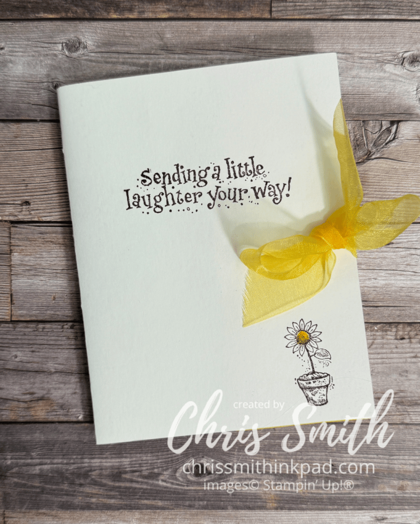
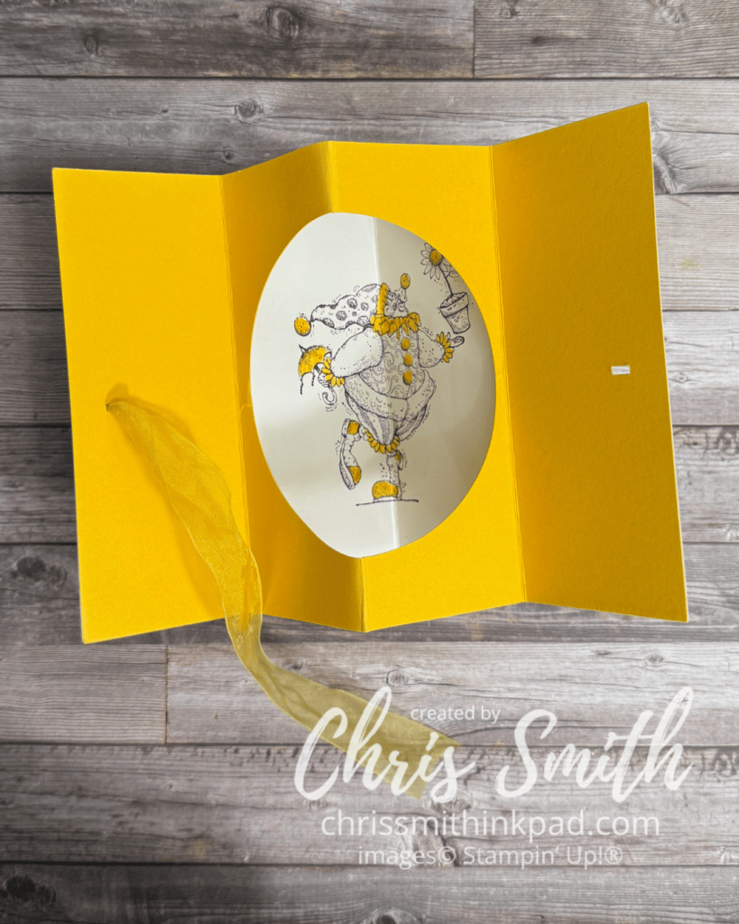
I’ve been making “tunnel” or theater cards off and on for well over 20 years. I think I received one in a swap in the early 2000’s and later used the idea with this clown set for another swap. Fortunately, Beate Johns, who was very active in stamping site Splitcoaststampers in it’s early days, was also in the swap and she posted my card on the site and then created a tutorial for the fun fold.
I did this with a set called Jest Between Friends and I believe that the swap was for that set. Circa 2004.
At the time I made this Stampin’ Up carried glossy cardstock that was glossy on one side and mat on the other. I used the matte side for the outside of the card on the glossy on the inside.
This is the only tunnel card that I used a bow on but I think I should try that again sometime.
The yellow in this card was Summer Sun, the first yellow Stampin’ Up had in their original color families. I still think it is the best!
Note the finely detailed image. Beautiful artwork! But I was doing 10-15 of these for a swap and there was no way I would color all of it in. So, I kept it monochromatic and only colored in those things that I decided would be Summer Sun yellow. I think you see more of the actual artwork this way too.
Scoring was simply 2 1/8″, 4 1/4″ and 6 3/8″ on a regular 5 1/2″ x 4 1/4″ size card. You could make the inside card a little smaller and have a border. Then you would adjust the measurements making sure the middle one was half the width and the others were a quarter of the width from the outside edges. thus making all four of the resulting sections the same size.
Making this is so much easier using circle dies, but this first one was made before I had any die cutting supplies. I think it was a circle cutting on glass set-up.
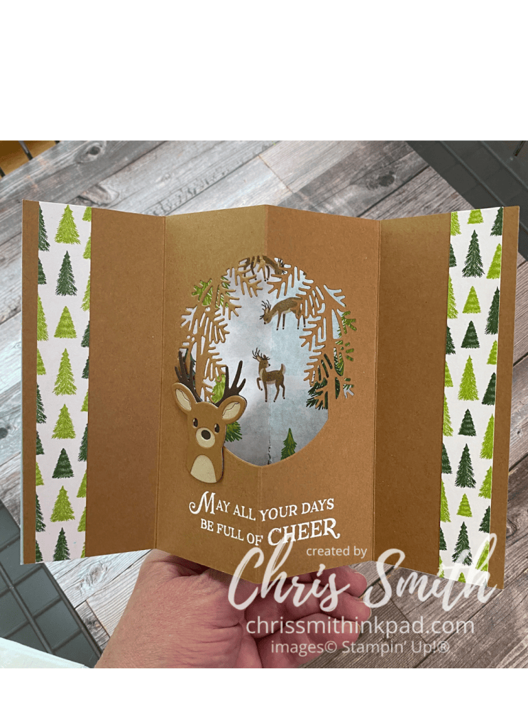
This fun fold works with more than just circle dies as this card shows. It’s best that the die is less than 4 1/4″ wide.
I had so much fun making this one with a teammate’s Reindeer Fun Bundle I had to get my own set of the dies.
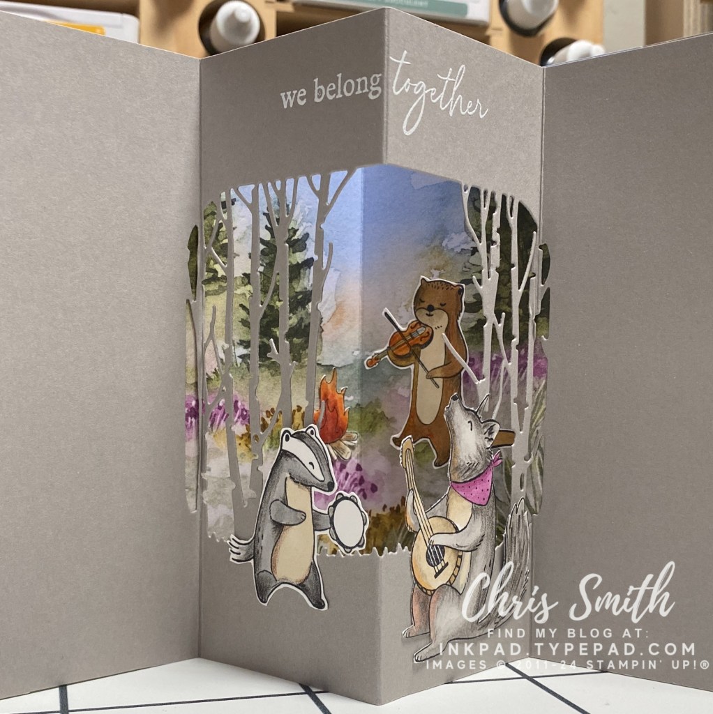
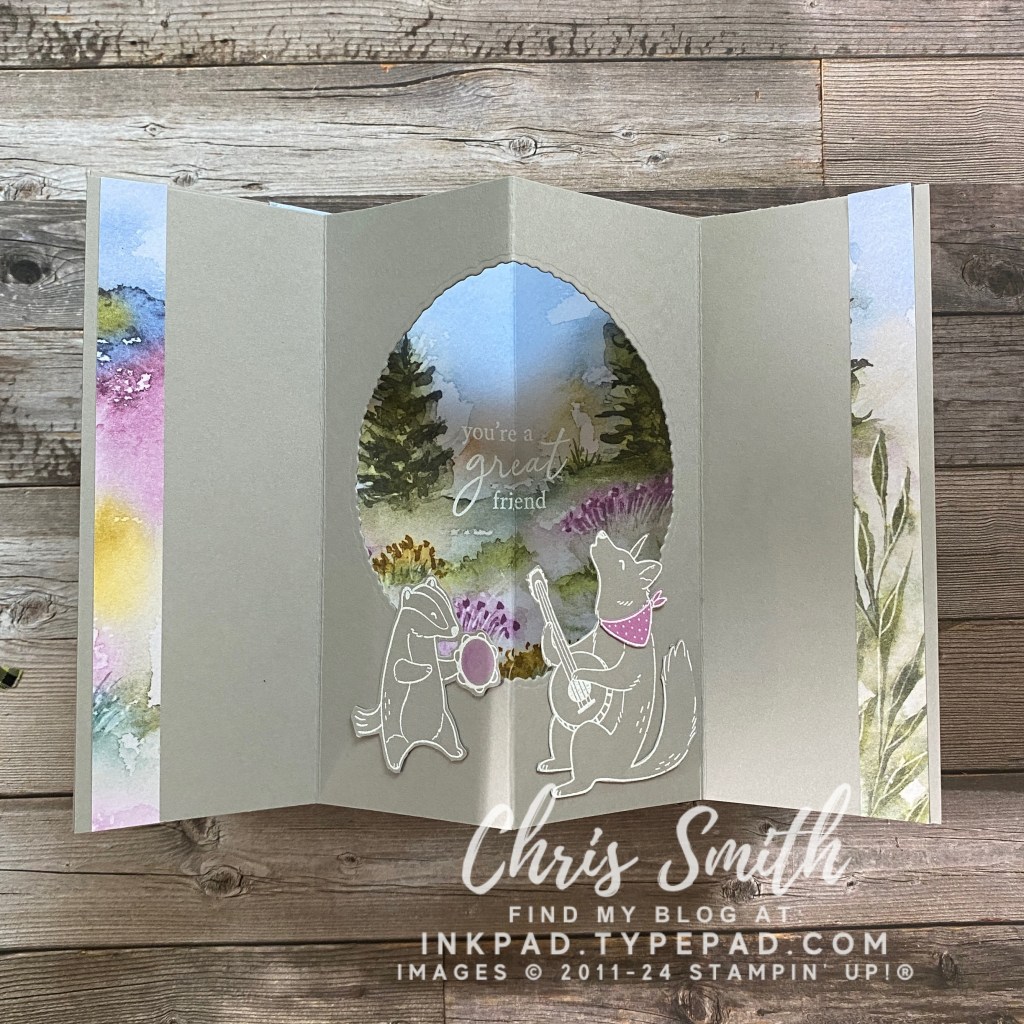
I did several of these when I presented this Musical Jamboree set for a new catalog class put together by Kevin Theesen. I loved coloring in these animals but that’s not always what works best for a class.
Can you see how much I enjoyed coloring these critters? I used a base of blends and then added detail with watercolor pencil – but never added any water.
This is also the first time I tried something other than a circle for my frame. I think this die was from Grassy Grove. It isn’t ideal for this kind of card but the look was worth the experimenting I had to do to get there. This card taught me that you need to score your fold lines before doing any detailed die cuts. It’s much easier to use die cuts that don’t go over a fold. BUT, it’s doable!
I know some cardmakers just don’t do coloring and that’s fine. To eliminate the coloring on this card I white embossed that animals on Gray Granite cardstock and added some Petunial pop in the tambourine (Blends) and the coyote’s bandana (cardstock). There weren’t any dies to go with Musical Jamboree so these were fussy cut.
Deckle circle die gave it a little more rustic feel and was much easier than the trees.
This was the first time I used left over designer paper to dress up the sides.
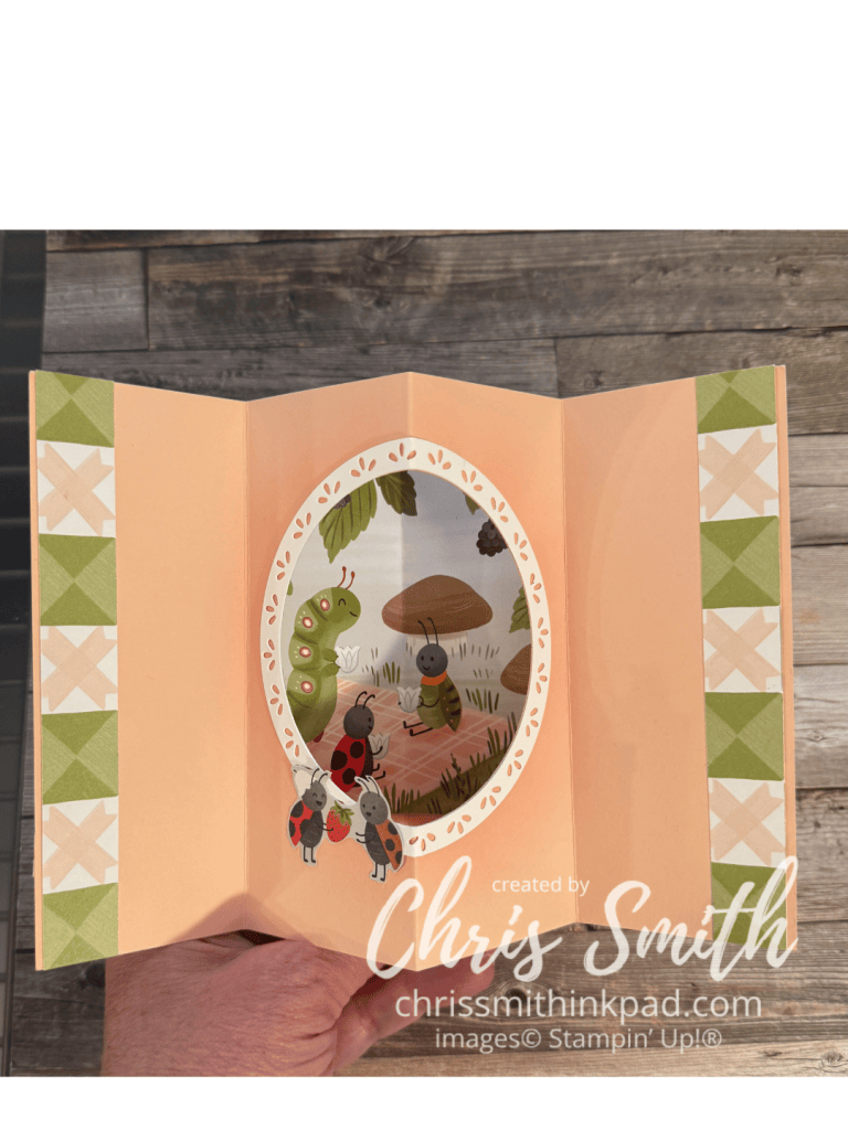
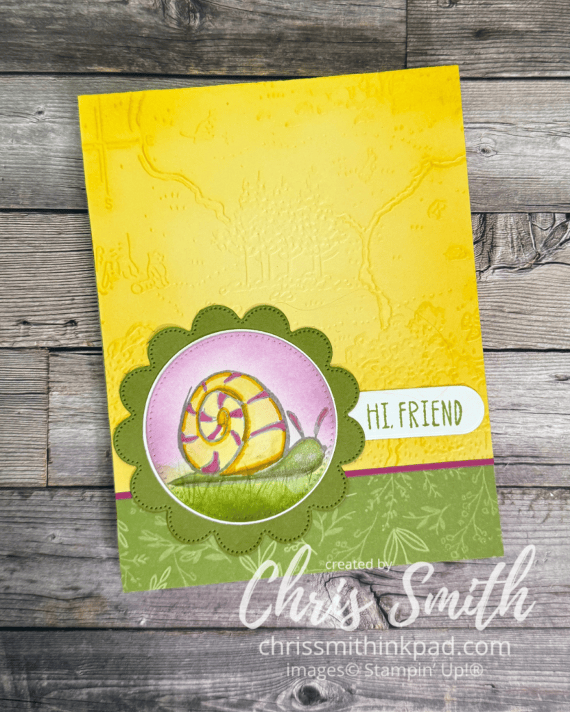
The Cute as a Bug Suite with the Sweet Bugs Bundle was kind of a no-brainer to try a tunnel card:
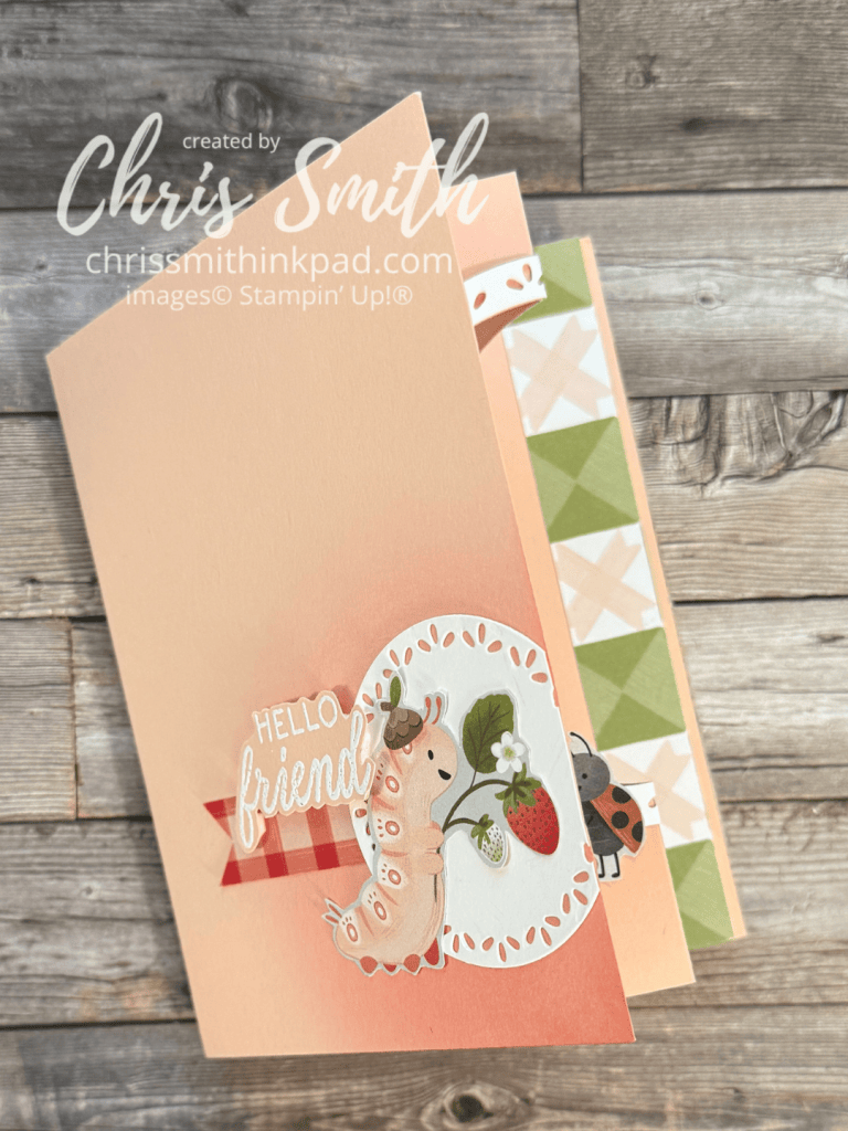
Normally I put something very simple on the front of a tunnel card so that it is a little more of a surprise when you open it. While this Sweet Bugs card still has a lot of white, ahem – Petal Pink, space on this front, I did make it just a little bit fussier to take advantage of the cute papers. It also gave me a chance to repeat the fancy circle design I used to frame the inside frame. It was the first time I added this and I don’t think that it will be the last.
Also note that I used a blending brush to add shading on the from and inside of the card. When you are adding it to the middle you need to make sure you do the shading before scoring or the shading will emphasize the score line.
I’ve also learned that the smaller designs in designer series paper packs, often about 4″x6″ often work really well as the background in the frame.
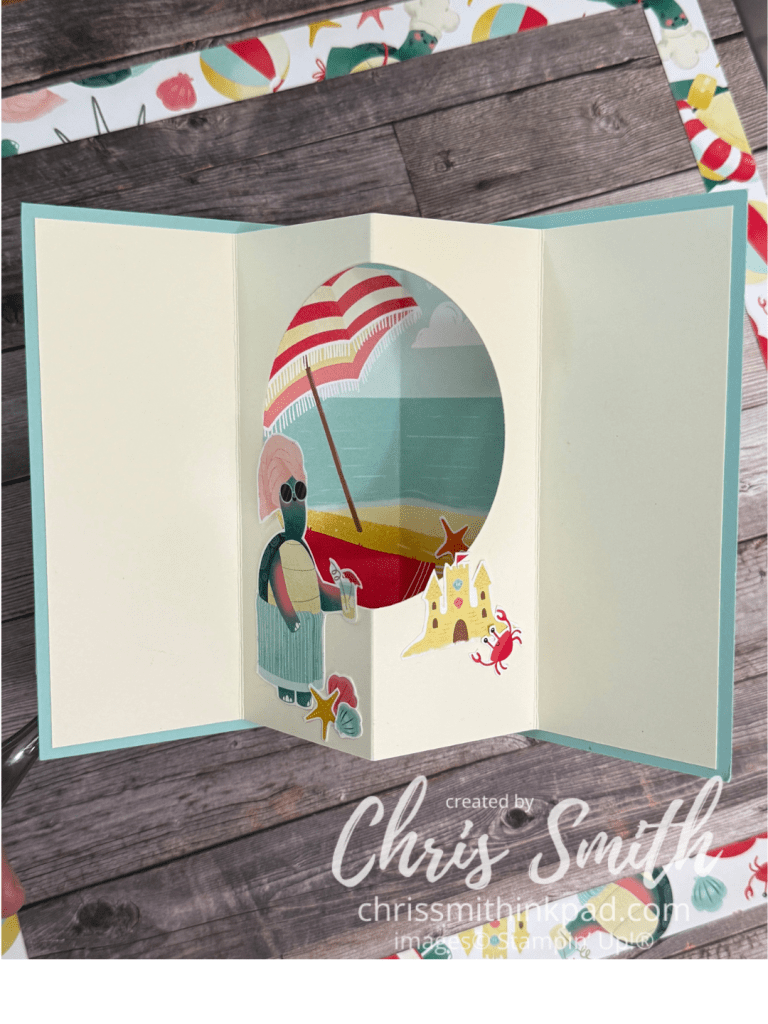
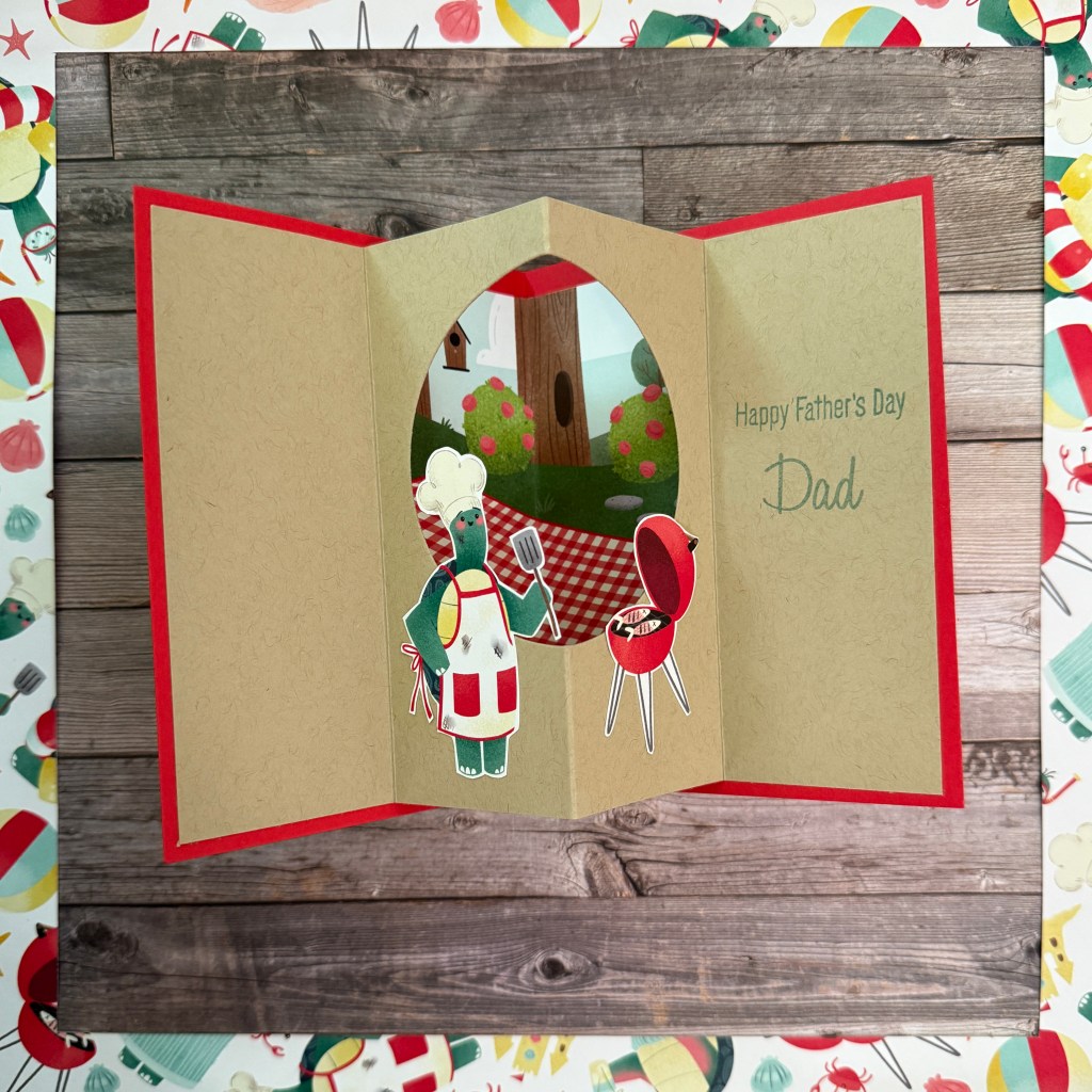
These next two do the same with the Turtley-Cute papers.
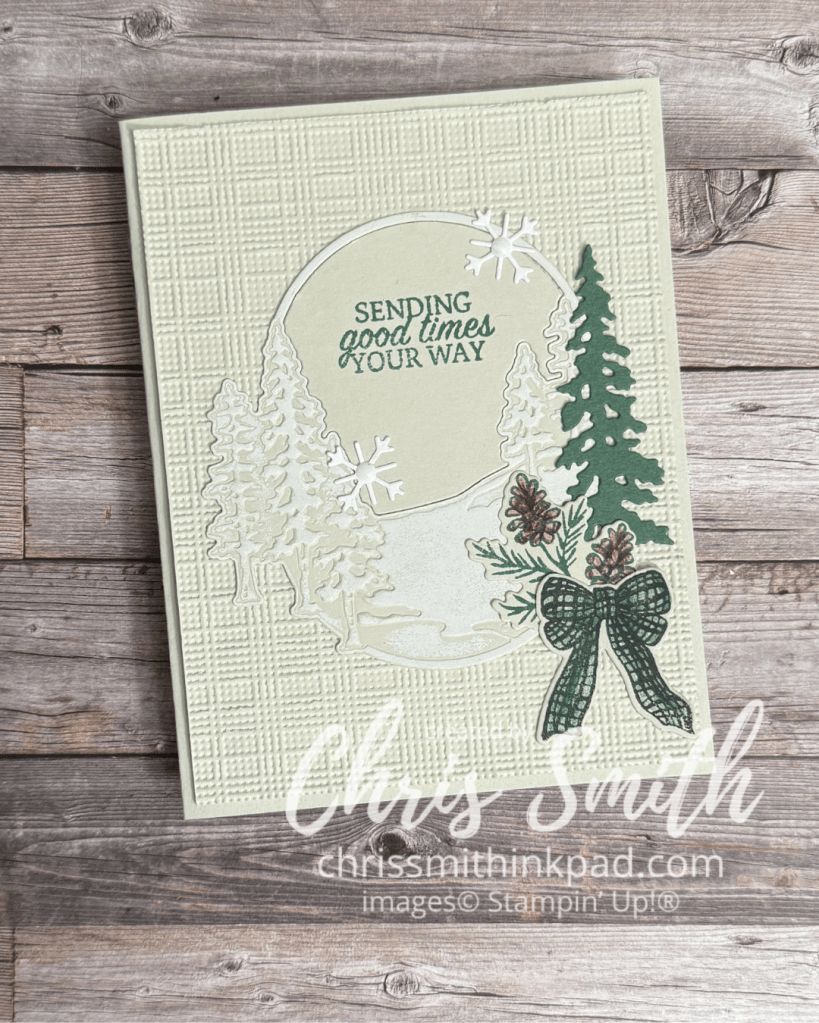
One of my favorite cards in Stampin’ Up!’s September catalog has a white, beige, green and brown color scheme. I didn’t order the particular suite used to create it but I thought I would try my own version with Winter Adventures…
You want to use the Impressions plate after die cutting the oval scene to increase the differentiation of the trees and “snow”. I used a brayer with white craft ink to subtly emphasize the snow.
I added the color to the pinecones gradually with pencils to avoid covering up the detail. Blends would work too but you would want to use maybe light Crumb Cake first and then add tiny dots with a darker brown. Don’t add them too fast because they can spread a bit.
The bow is stamped with Peaceful Pine. I added more color with a blender pen and the ink.
I love that the bundle has its own embellishments with the snowflakes! Though I used white dots in mine they also look great without them.
I loaned out my Winter Adventures bundle for a few weeks so most of these cards were made with a stash of images I stamped and/or die cut without necessarily knowing what I was going to do with them. I think it was actually a good way to explore what the images can do. Maybe if I had the set while I was composing with them I might have tweaked one or two elements but I hope that you see the possibilities.
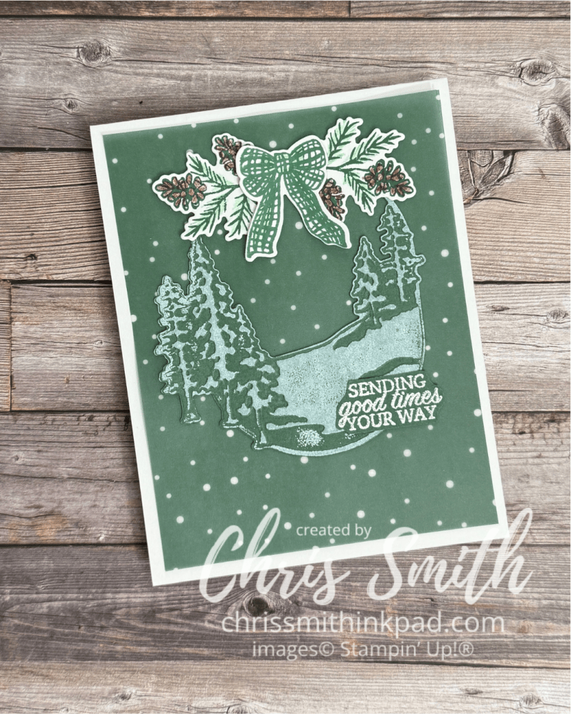
I pulled out a piece of Berry Botanicals vellum for the background on this one. Snowflakes against Pine, right?
Same treatment of the oval scenery piece as the preceding card to get the snow effect.
I was kind of thinking of the overall image being decor you hung on a door when I added the bow and greens to the top. If I was to do it again, maybe I would try adding some lighter green over the white of these pieces so that the “white” on the snow would pop more. Or maybe try stamping those images on another piece of Peaceful Pine vellum?
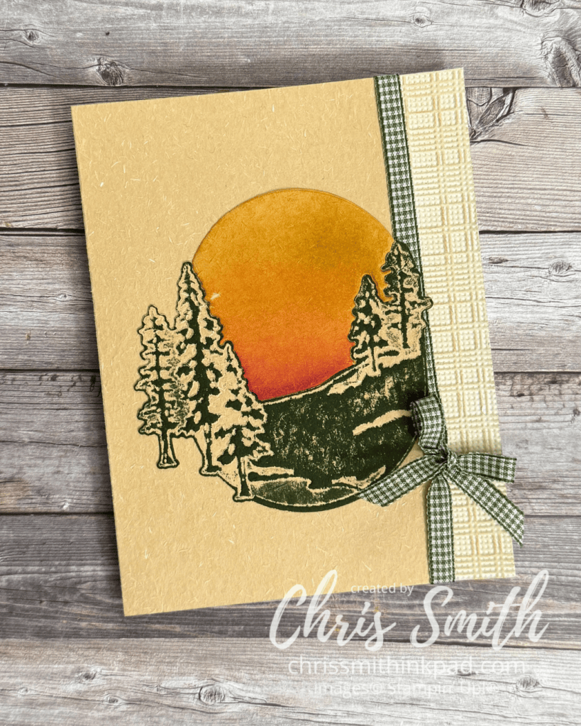
These pieces came together from some of my first experiments with my preorder. I was using some now retired specialty paper with a sort of handmade texture. you can see it if you look carefully at the photo. I hadn’t used it previously and really wished I had done more with it earlier as it was gone from the online store shortly after I made this. It also shows that the die doesn’t just have to be used for winter scenes.
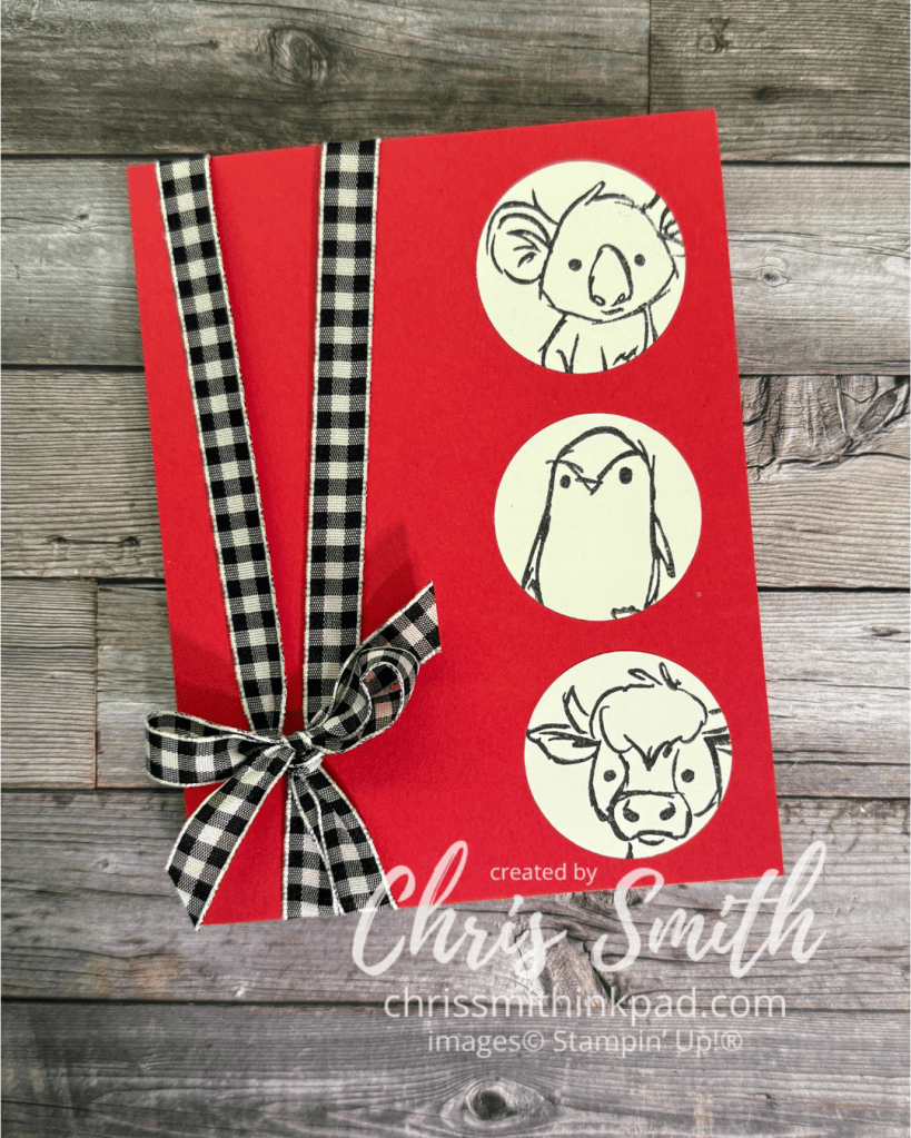
Just for the record, I collect gingham ribbon…
The Mossy Meadow ink was brayered onto the embossed die cut.
The top of the oval was trimmed off here due to a mistake I made in doing the die cut. So. I made up for it by blending ink onto the so called negative of the die to create a sunset. It’s a little smudged from ink on my finger, but you can get the idea.
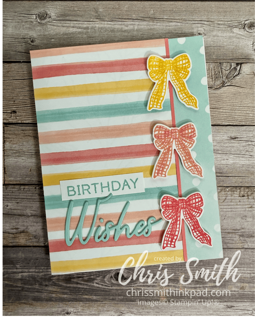
I had 2 strips of the stripe pattern cut, planning to use one on each side, but then decided a corner look would be less “squished”.
I’ve been designing corner border cards for years, practically hoarding the diagonal patterns that work so well with this and thinking stripes just wouldn’t work. but this was SO easy. Somehow I thought I would need to miter both strips exactly or it wouldn’t work. No! Just glue on a vertical strip (1/4″ in this case)to the right edge. Then make whatever you think is close to a diagonal cut on another strip and glue it over the first strip. I think as long as you are using the thinner weight designer series paper it will look perfect. Heavier cardstock might give you a bulkier corner but it would still be worth a try.
One of the things that attracted me to Winter Adventures is that the images lends themselves to a change in mood or season just by changing the colors.
I chose a couple of patterns from the Beautiful Ordinary Life DSP. I initially tried white embossing on colored cardstock but didn’t see enough of the color so I switched to stamping the bows in Daffodil Delight, Calypso Coral and Strawberry Slush (for the “red” in the paper).
I used watercolor pencils to add a little shading to each bow.
Greeting is in Pool Party with the Words & Wishes Bundle.
If you do decide to emboss the bows I found that a long skinny tweezers could hold onto that skinny space below the knot to help me get the heat part of the job done.
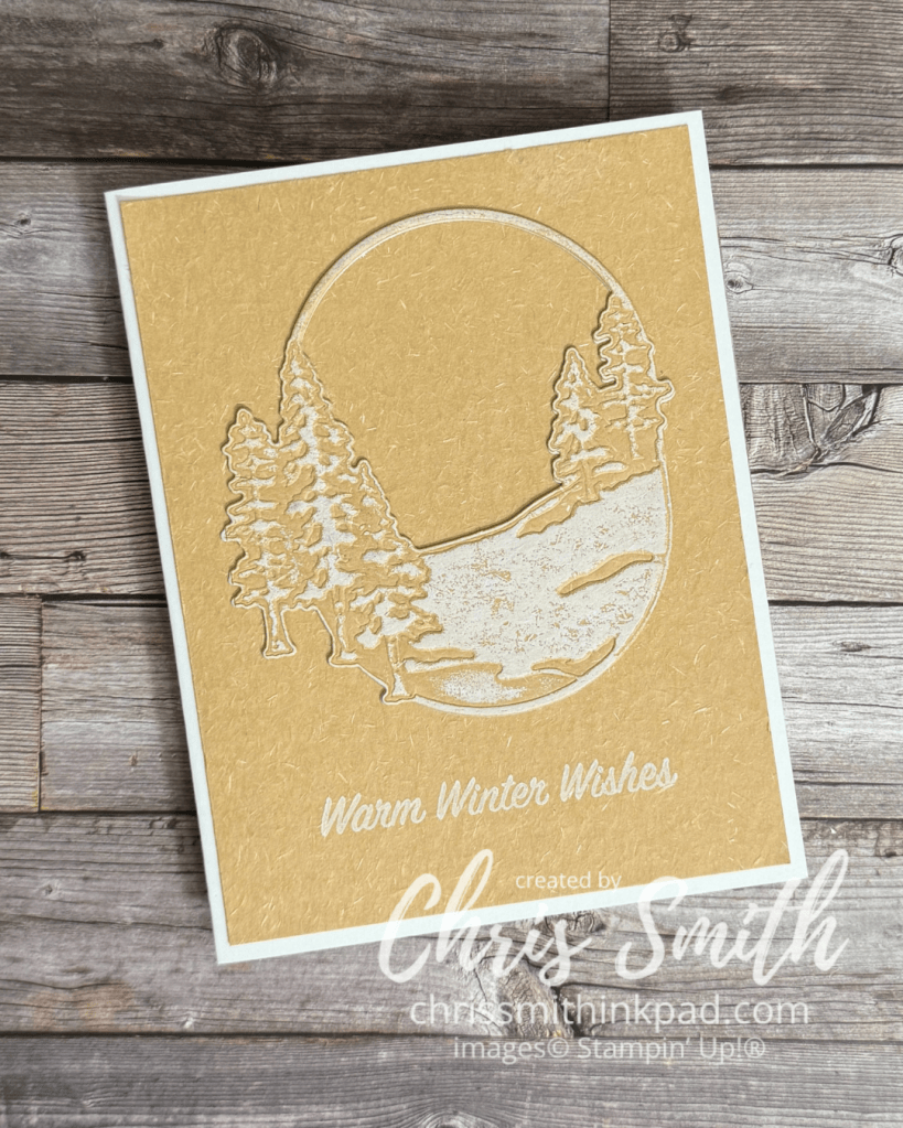
This one uses a Natural Hues paper, which almost has a handmade kind of texture. It works beautifully with this scenery die.
I used white craft ink without embossing to add “snow” to the scene (with a brayer) and for the greeting. Easy Peasy
One of the things that really attracted me to this bundle was that I thought it could work with a range of looks from rustic to feminine, along with a variety of color combinations. That always makes points with me!
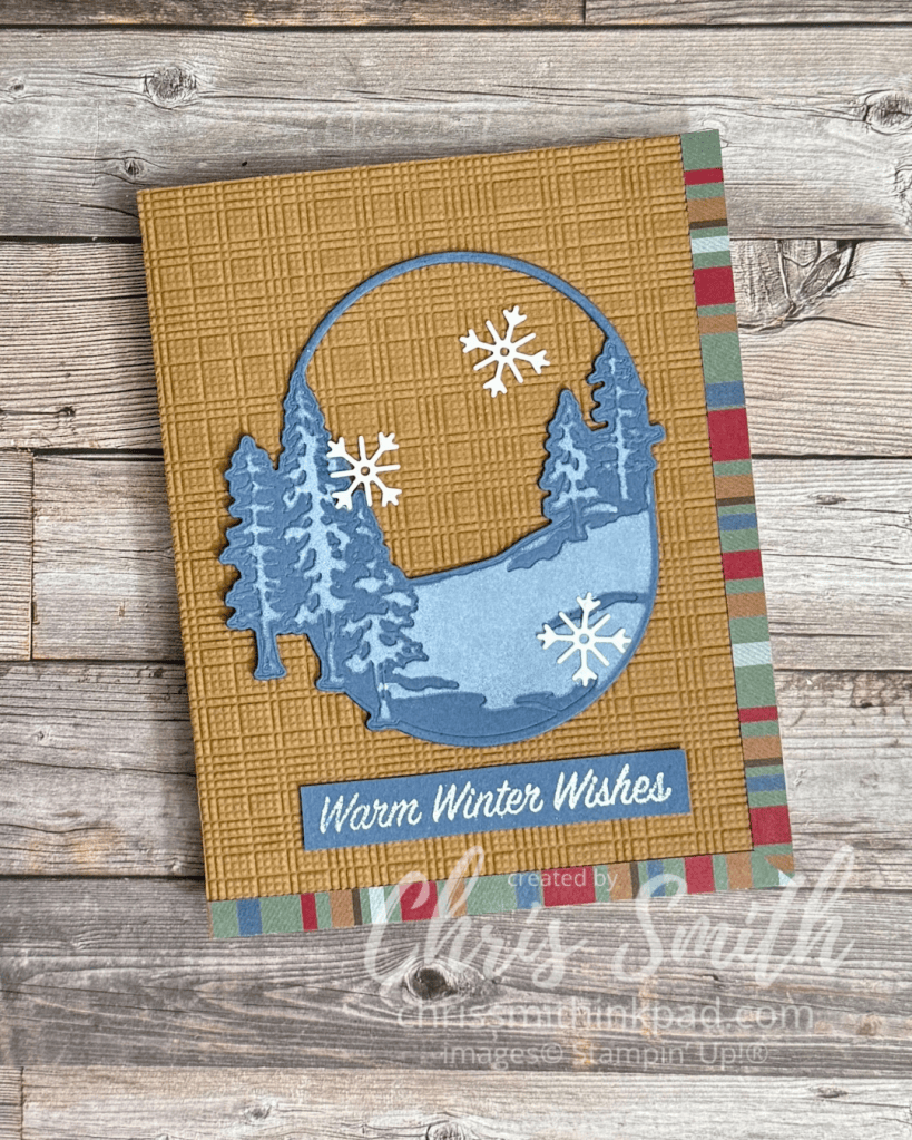
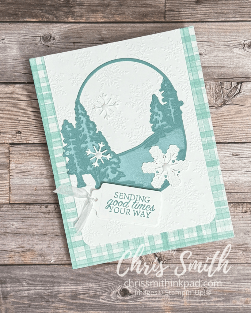
This one started with one of several oval impressions die cuts that I played around with and only later explored how to make them into cards.
You need the impressions pad to get a good impression of the texture after you make the initial die cut. Both the larger snowflake die and the oval tree scene give impressions.
I’ve used two ways to add “snow”: Lay the die over and add white craft ink with a sponge dauber or brayer white craft directly over the embossed piece.
Background paper is from Valley in Bloom DSP. There is a current hybrid embossing folder with snow but I used a retired regular folder in this card. The tag die is from the Scalloped Blooms dies and the skinny white seam binding is also retired.
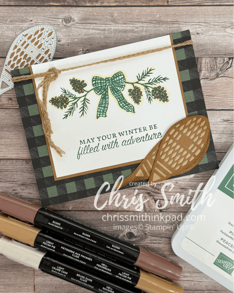
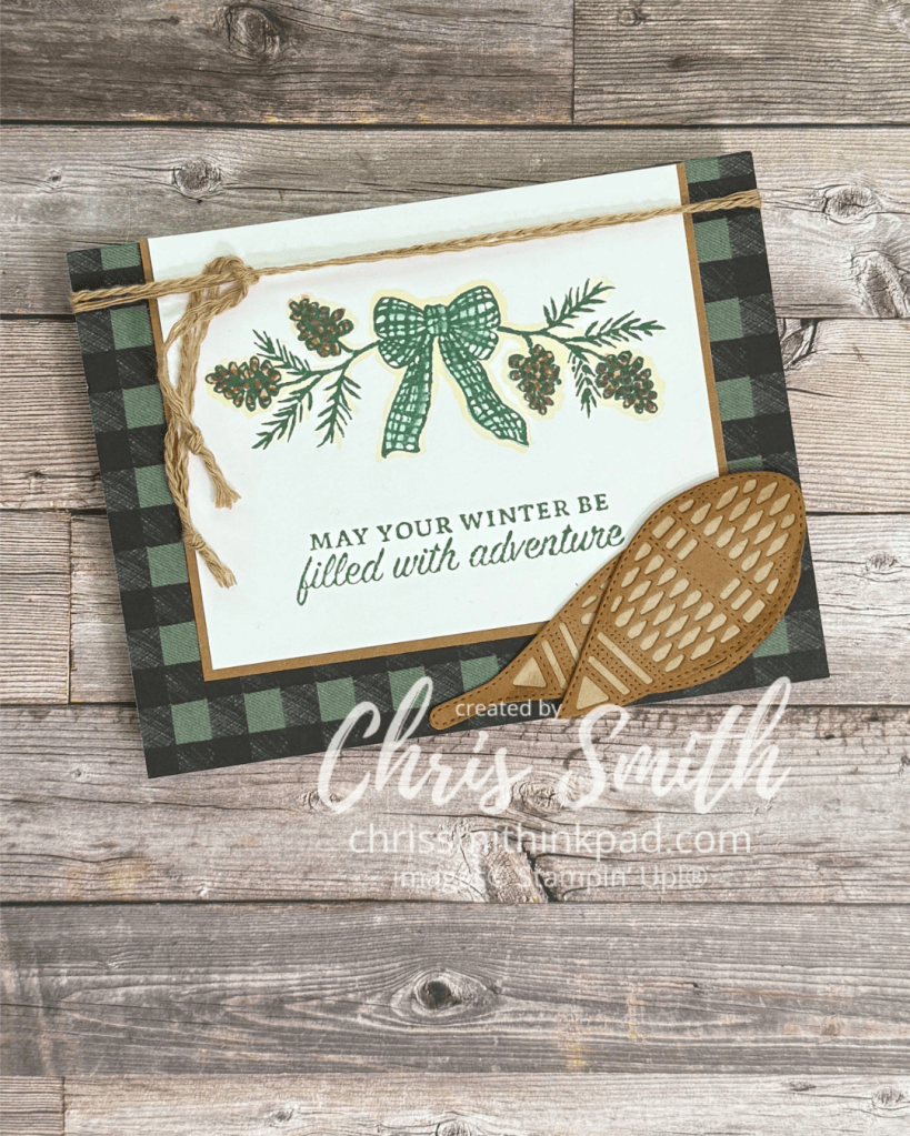
Here’s my first go round with the Winter Adventures Bundle. I thought the mix of snowshoes, a bow and greens along with the oval scene, trees and snowflake dies could be so much fun. After this one I have so many more ideas!
The stamping is done on Basic White with Peaceful Pine. When stamping the pine boughs I took off some of the ink from the “stick” part of the bough so that I could stamp it closer to the tied bow. I probably could have left off even more.
I colored the Bow by picking up a little ink from the Peaceful Pine ink pad with a blender pen and adding it to the stamped image.
The browns shown in the photo were used on the pine cones. I softened the stamped image with a little bit of Crumb Cake outline.
The snowshoes are die cut with Crumb Cake and Pecan Pie. The Peaceful Pine Buffalo Plaid print is from the Alpine Winter designer series paper
I used to be a bit of a hoarder with all things Baked Brown Sugar, an In Color from several years ago. I separated some of the cording in this color and used it to add a little texture to this card.
Barely Blush with Glow of Harvest DSSP and Gathering Moments Bundle
This was fun to do with a small class though I warned everyone not to wear their favorite clothes!
…and another color scheme…
Blending extra color onto the Gather Together DSP really made this paper magical too. Now I almost always look at white background designer papers as asking for a little more color. This time I used Crushed Curry, Cajun Craze with a little Early Espresso around the edges; Delightful Wishes Bundle for Greeting.
Neutral Color Scheme: Very Vanilla + Basic Beige + Early Espresso. I loved the look of the acorns.
I made a stencil with the big dies and made them look a little like faded fallen leaves.
Aside from all of the big dies there are some cute little images too. There are so many ways to use them!
This used the Beautiful Pumpkins Bundle instead of Gathering Moments but it did use the Gather Together DSP. This was a very popular card at one of my make and takes. Can you see how a shadow design pops out of the paper a bit when you add color?
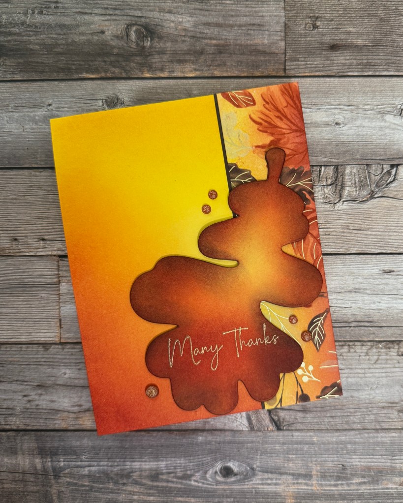
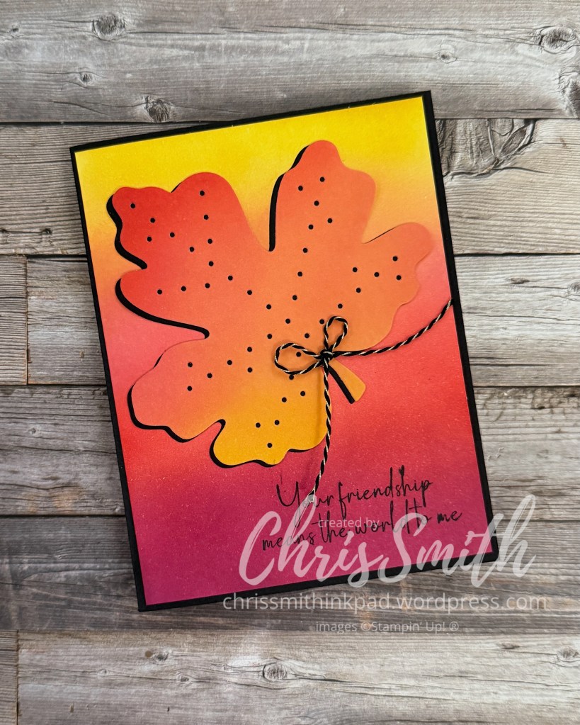
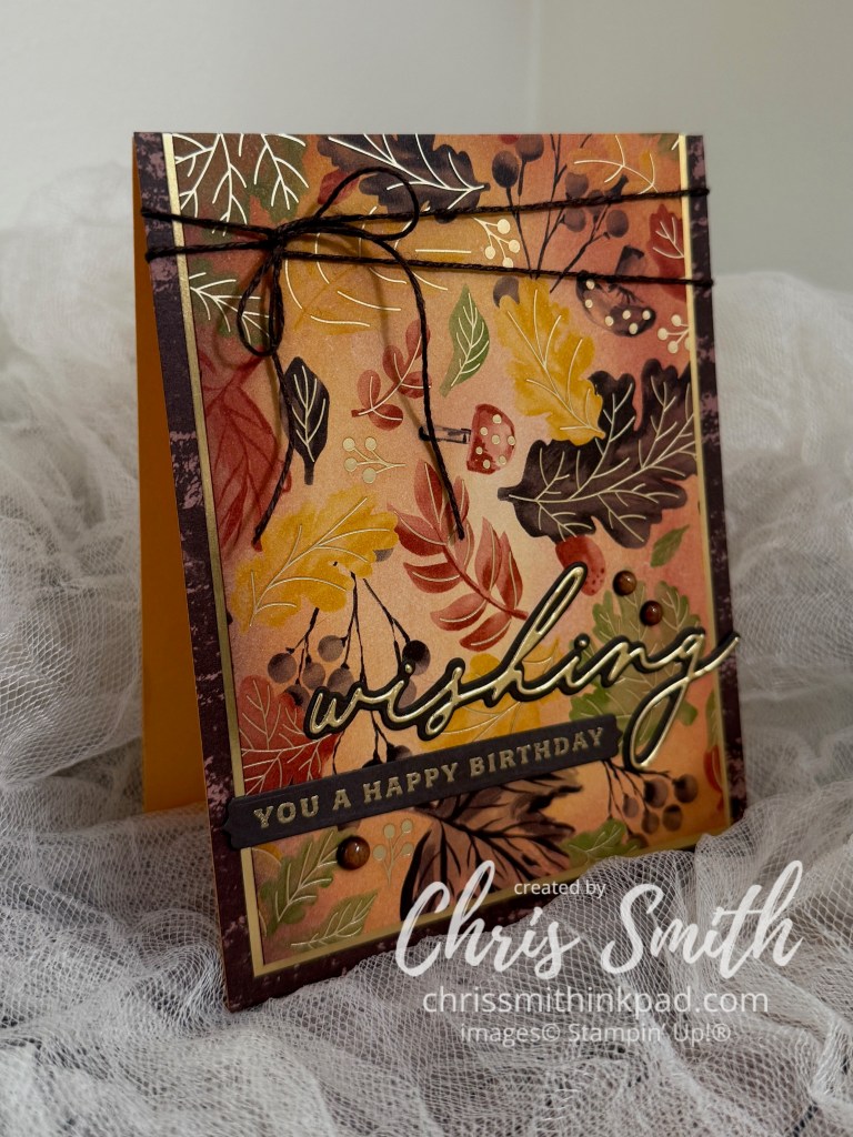
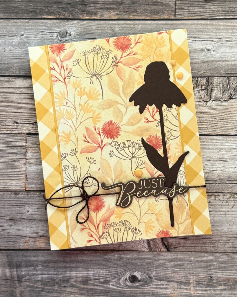
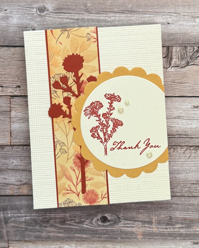
After playing around with adding deeper colors to the shimmery Glow of Harvest Specialty paper, I looked through past bundles for some silhouette dies that would work well with the botanicals featured in the paper’s design. I hit the jackpot with the Nature’s Harvest dies which I used on these first 3 cards.
The gingham (Gingham Gallery DSP) is always a fresh addition.
Some subtle texture with the Softly Woven embossing folder and then a little perkiness with the scalloped circle (Scalloped Blooms) accent the die, image and greeting from Nature’s Harvest.
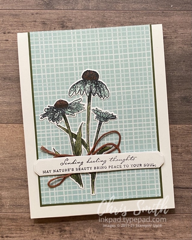
a card from the 2021 archives: can you make blue coneflowers because you like the simple, pretty background papers? Yes, yes you can!
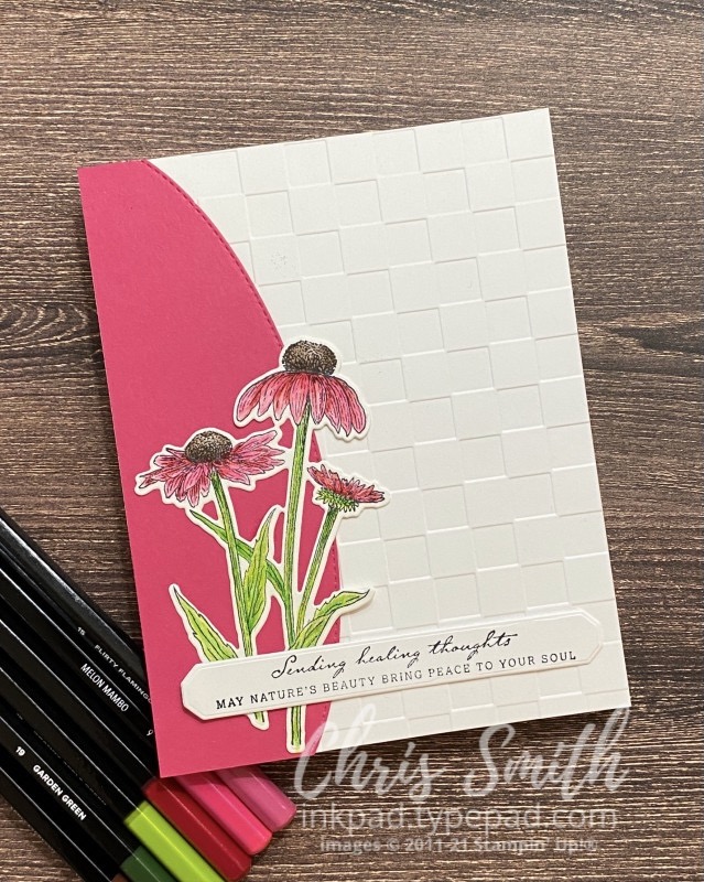
…and another, this time with more realistic, summery coneflowers.
Designer Series Specialty Paper (DSSP)- August Product of the Month
After the first 6 cards with this paper I set all of it aside to change directions. Then I saw a card on Instagram by Peggy Noe using pink with this paper and just had to try it out for myself. You can find Peggy’s card on her blog here.
I added a little extra pink to the Glow of Harvest piece, one of the fussy cut images and the background piece.
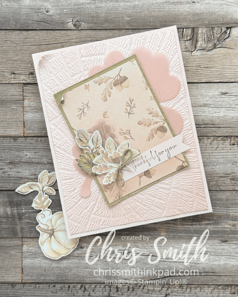
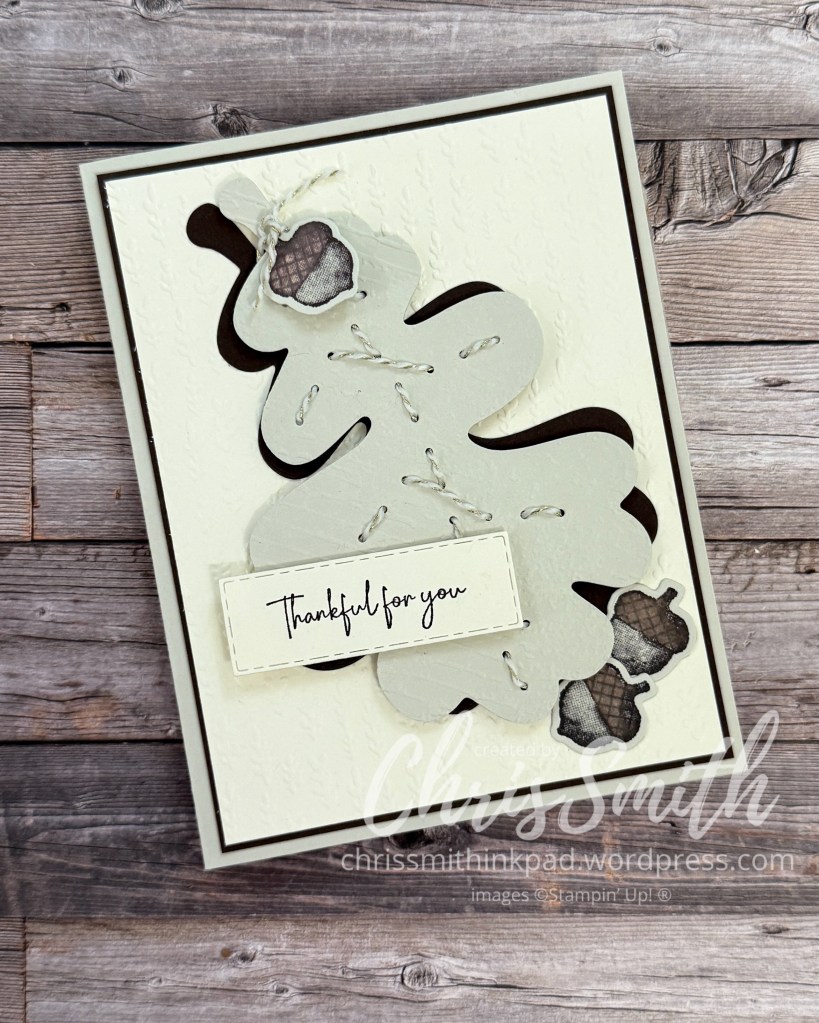
Once I was in the pink (mostly barely Blush) I thought about tying in some shimmery vellum and decided to try an Oak leaf die cut from the Gathering Moments Bundle from 2025.
While I had it out I pulled out the delicate “Thankful for You” greeting which was perfect for this.
The Textured Tree Ring folder adds to the fun I was having contrasting the strong oak idea with a delicate color.
See more Gathering Moments cards here.
Photos don’t easily show the lovely shimmer of this paper. I learned last year with the Gathering Together specialty paper that magic happens when you add color to the white coated background.
These first three cards make use of the Nature’s Harvest Bundle from the Stampin’ Up!’s 2021 August – December Mini Catalog.
I added just enough Golden Glow ink to make sure the DSSP blended nicely with the Gingham Gallery DSP.
The third of this Nature’s Harvest trio also uses a few of the stamped images along with another of the silhouette type dies. I thought it mimicked the paper well. I also used the Softly Woven embossing folder and a Scalloped Blooms die.
Another use of the Softly Woven embossing folder, plus the Boutique Blossom leaflets. I used the sweetly Sentimental Hot foil dies with Early Espresso ink rather than foil for the greeting. I also used a few Blends and pencils to bring out the color of the bouquet that was fussy cut from the DSSP.
Yet another use of the Softly Woven folder, this time with the DSSP itself. I brushed a little Early Espresso and Pecan Pie ink around the edges. I also added color to the white pumpkins with Blends and watercolor pencils that were used dry.
Several of the papers from Brushed with Beauty also blend beautifully with fussy cut images from Glow of Harvest.
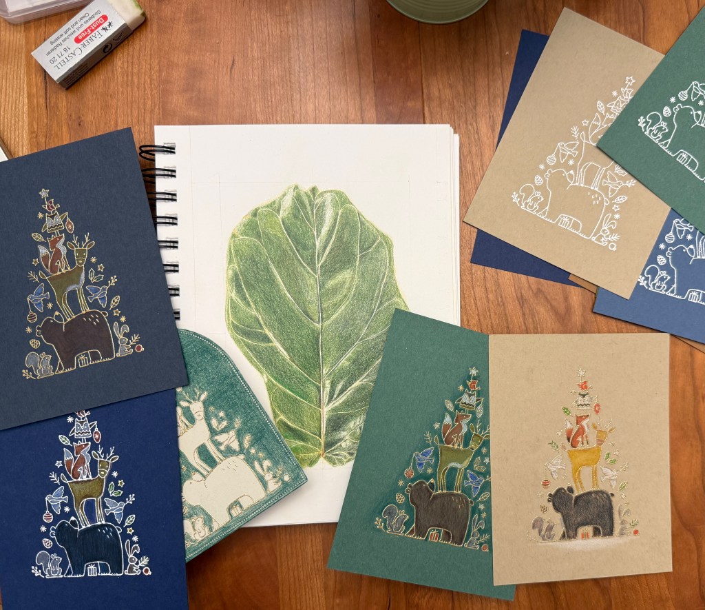
One of the other things that attracted me to this set is that I thought the images would look good with simply embossing and that coloring could be optional. A class I recently took on Botanical Art and Colored Pencils meant that I was tempted to color in everything though. (The fiddle leaf fig drawing was inspired by some of the leaves I recently removed from an out of control tree in our living room.)
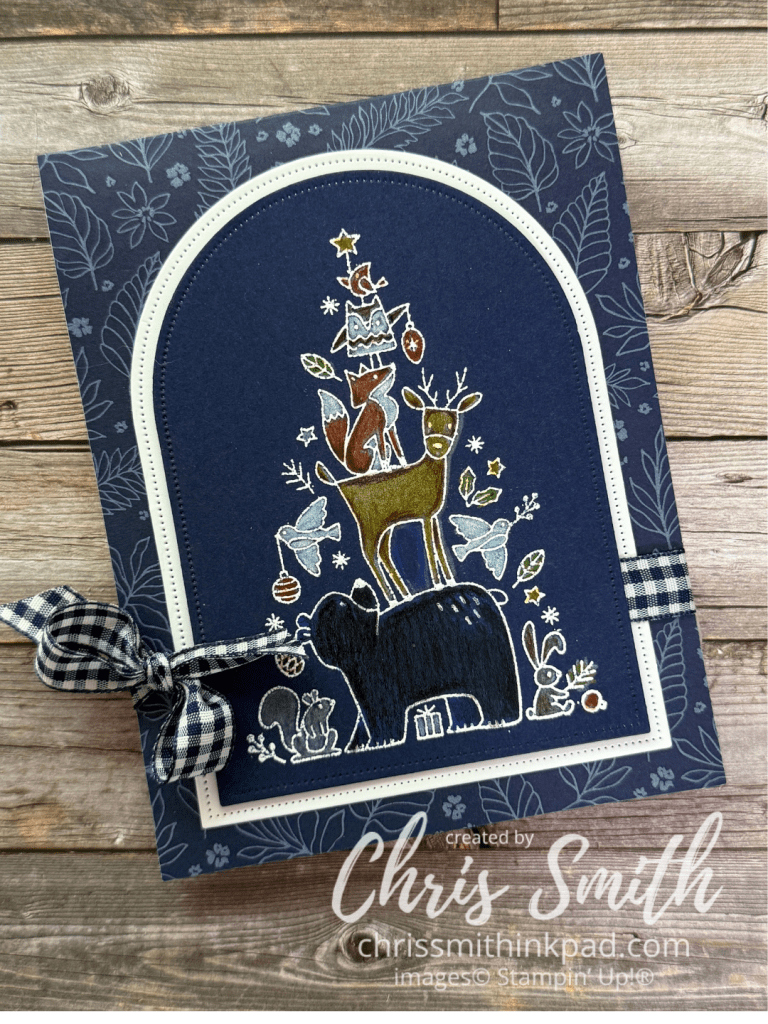
This is the only one to become a complete card so far. I started by coloring everything but the bear in white – to make the other colors come across as brighter. I used a Balmy Blue pencil on the bear because I was attempting to create a blue sheen to his coat.
This post features cards made with the Cute as a Bug Suite. As I have more I will add them to this post. I don’t always add that many details but feel free to ask a question and I can elaborate in a separate post.
Featuring the Cute as a Bug Suite
This one has a little more detail than I usually use on the front of tunnel cards. If you look closely you will see that I was experimenting with blending ink behind the circles both on the front and inside. the 4″x6″ scenery pieces in designer series paper packs like this one work well inside the circle.