Tag: stamping

  • Tunnel Cards

    I’ve been making “tunnel” or theater cards off and on for well over 20 years. I think I received one in a swap in the early 2000’s and later used the idea with this clown set for another swap. Fortunately, Beate Johns, who was very active in stamping site Splitcoaststampers in it’s early days, was also in the swap and she posted my card on the site and then created a tutorial for the fun fold.
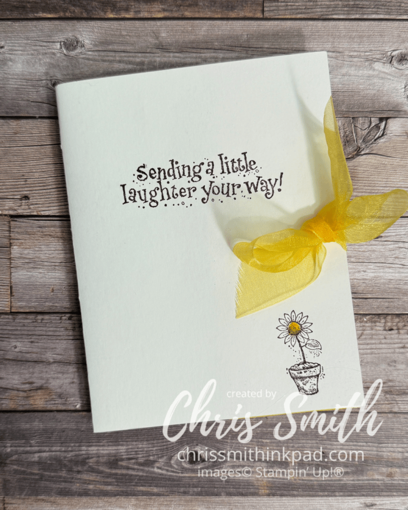
    • I did this with a set called Jest Between Friends and I believe that the swap was for that set. Circa 2004.
    • At the time I made this Stampin’ Up carried glossy cardstock that was glossy on one side and mat on the other. I used the matte side for the outside of the card on the glossy on the inside.
    • This is the only tunnel card that I used a bow on but I think I should try that again sometime.
    • The yellow in this card was Summer Sun, the first yellow Stampin’ Up had in their original color families. I still think it is the best!
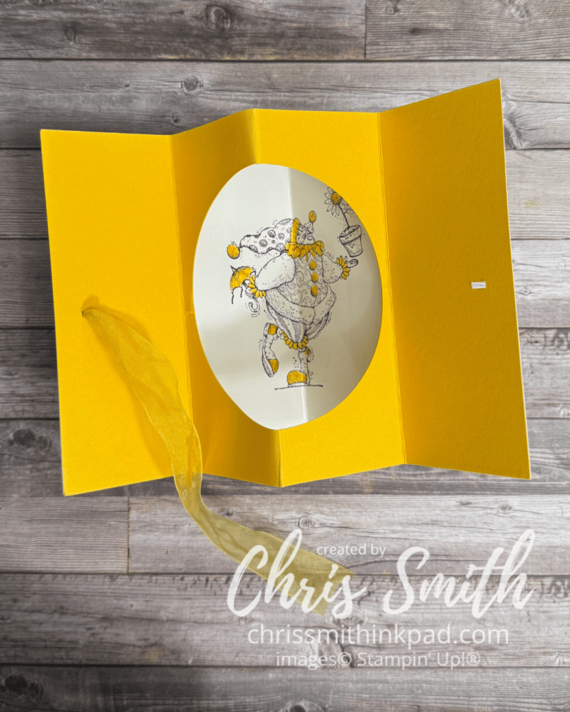
    • Note the finely detailed image. Beautiful artwork! But I was doing 10-15 of these for a swap and there was no way I would color all of it in. So, I kept it monochromatic and only colored in those things that I decided would be Summer Sun yellow. I think you see more of the actual artwork this way too.
    • Scoring was simply 2 1/8″, 4 1/4″ and 6 3/8″ on a regular 5 1/2″ x 4 1/4″ size card. You could make the inside card a little smaller and have a border. Then you would adjust the measurements making sure the middle one was half the width and the others were a quarter of the width from the outside edges. thus making all four of the resulting sections the same size.
    • Making this is so much easier using circle dies, but this first one was made before I had any die cutting supplies. I think it was a circle cutting on glass set-up.
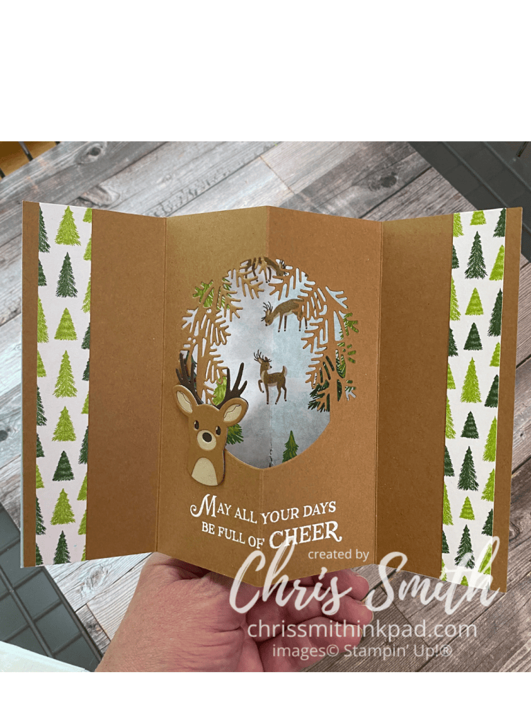
    • This fun fold works with more than just circle dies as this card shows. It’s best that the die is less than 4 1/4″ wide.
    • I had so much fun making this one with a teammate’s Reindeer Fun Bundle I had to get my own set of the dies.

    I did several of these when I presented this Musical Jamboree set for a new catalog class put together by Kevin Theesen. I loved coloring in these animals but that’s not always what works best for a class.
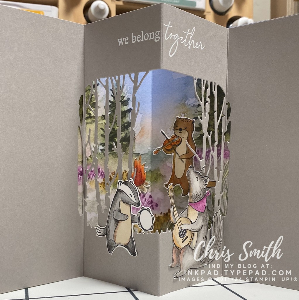
    • Can you see how much I enjoyed coloring these critters? I used a base of blends and then added detail with watercolor pencil – but never added any water.
    • This is also the first time I tried something other than a circle for my frame. I think this die was from Grassy Grove. It isn’t ideal for this kind of card but the look was worth the experimenting I had to do to get there. This card taught me that you need to score your fold lines before doing any detailed die cuts. It’s much easier to use die cuts that don’t go over a fold. BUT, it’s doable!
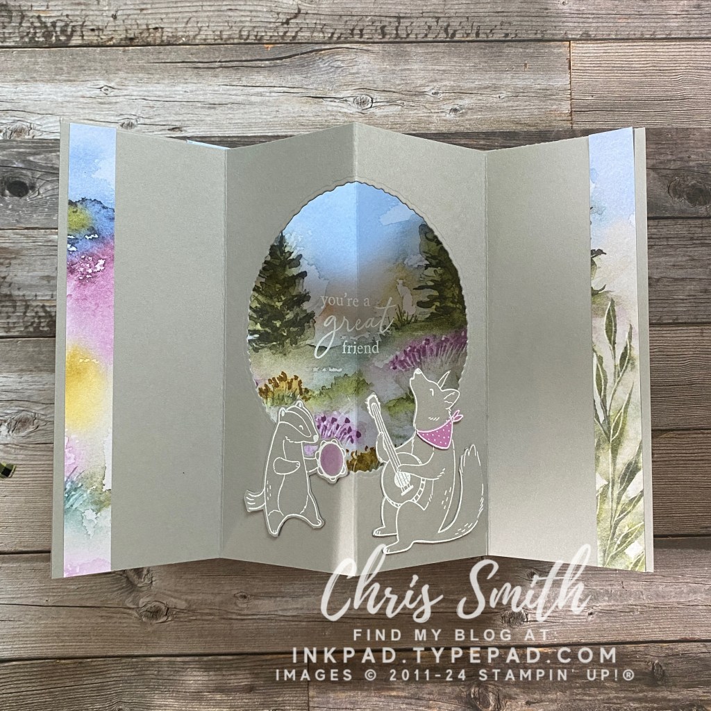
    • I know some cardmakers just don’t do coloring and that’s fine. To eliminate the coloring on this card I white embossed that animals on Gray Granite cardstock and added some Petunial pop in the tambourine (Blends) and the coyote’s bandana (cardstock). There weren’t any dies to go with Musical Jamboree so these were fussy cut.
    • Deckle circle die gave it a little more rustic feel and was much easier than the trees.
    • This was the first time I used left over designer paper to dress up the sides.

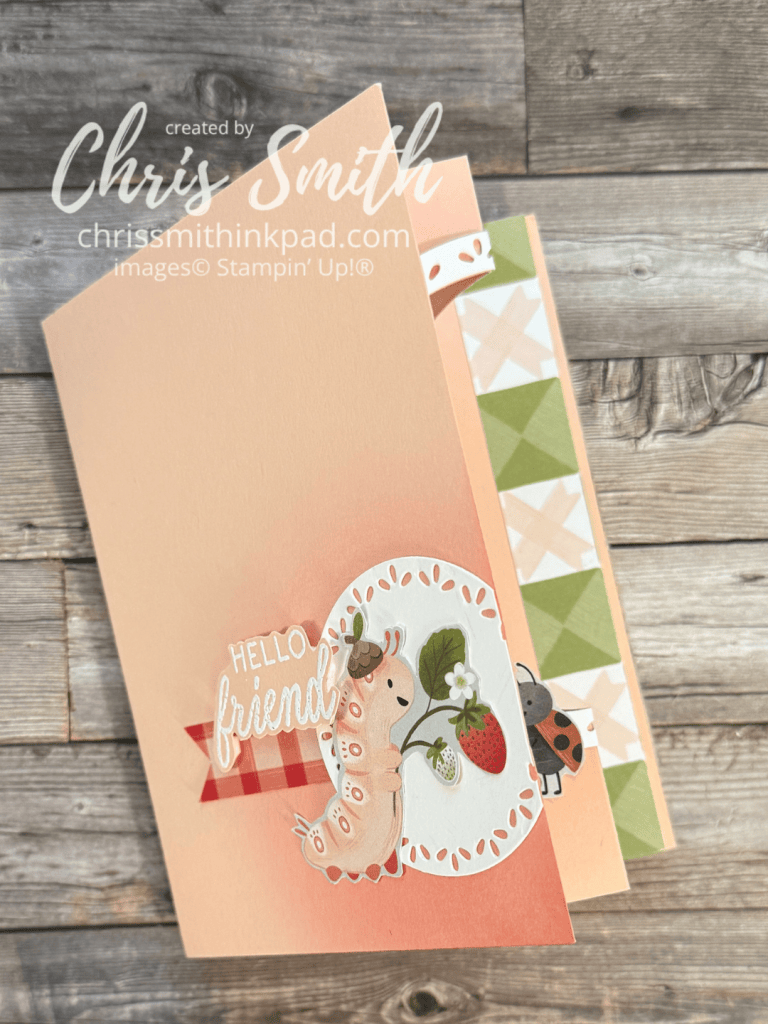
    The Cute as a Bug Suite with the Sweet Bugs Bundle was kind of a no-brainer to try a tunnel card:
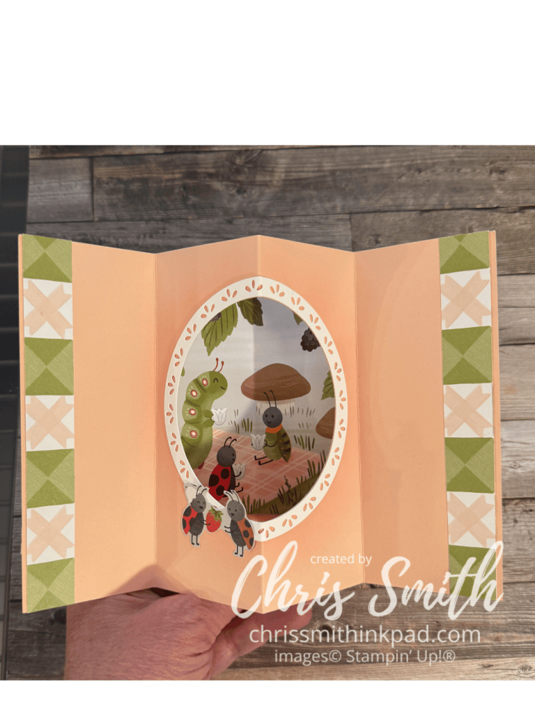
    • Normally I put something very simple on the front of a tunnel card so that it is a little more of a surprise when you open it. While this Sweet Bugs card still has a lot of white, ahem – Petal Pink, space on this front, I did make it just a little bit fussier to take advantage of the cute papers. It also gave me a chance to repeat the fancy circle design I used to frame the inside frame. It was the first time I added this and I don’t think that it will be the last.
    • Also note that I used a blending brush to add shading on the from and inside of the card. When you are adding it to the middle you need to make sure you do the shading before scoring or the shading will emphasize the score line.
    • I’ve also learned that the smaller designs in designer series paper packs, often about 4″x6″ often work really well as the background in the frame.

    These next two do the same with the Turtley-Cute papers.
  • Winter Adventures Gallery

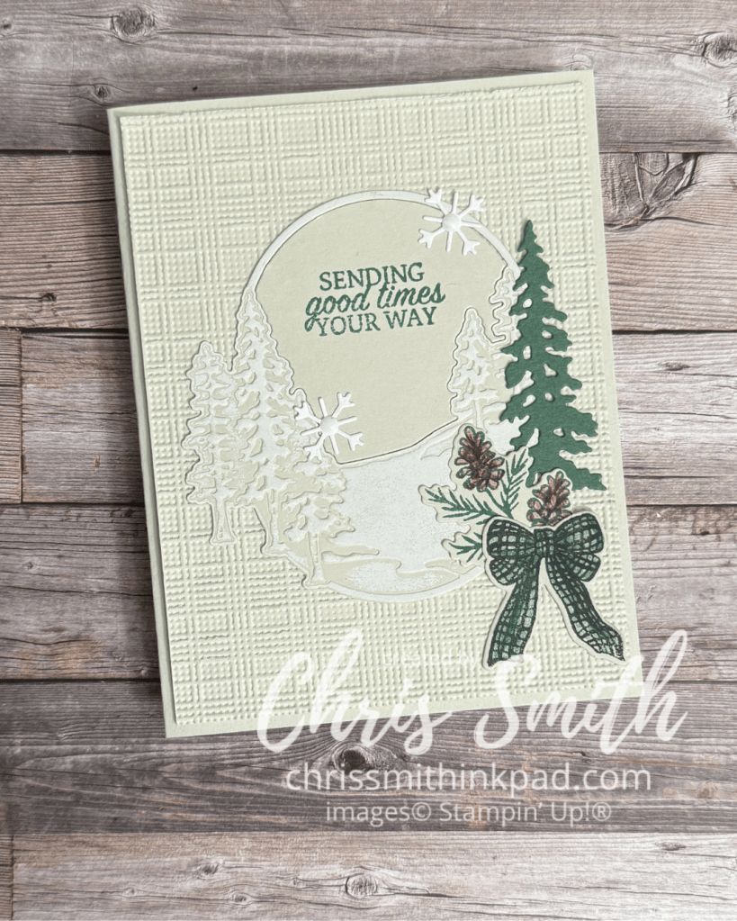
    One of my favorite cards in Stampin’ Up!’s September catalog has a white, beige, green and brown color scheme. I didn’t order the particular suite used to create it but I thought I would try my own version with Winter Adventures…

    • You want to use the Impressions plate after die cutting the oval scene to increase the differentiation of the trees and “snow”. I used a brayer with white craft ink to subtly emphasize the snow.
    • I added the color to the pinecones gradually with pencils to avoid covering up the detail. Blends would work too but you would want to use maybe light Crumb Cake first and then add tiny dots with a darker brown. Don’t add them too fast because they can spread a bit.
    • The bow is stamped with Peaceful Pine. I added more color with a blender pen and the ink.
    • I love that the bundle has its own embellishments with the snowflakes! Though I used white dots in mine they also look great without them.

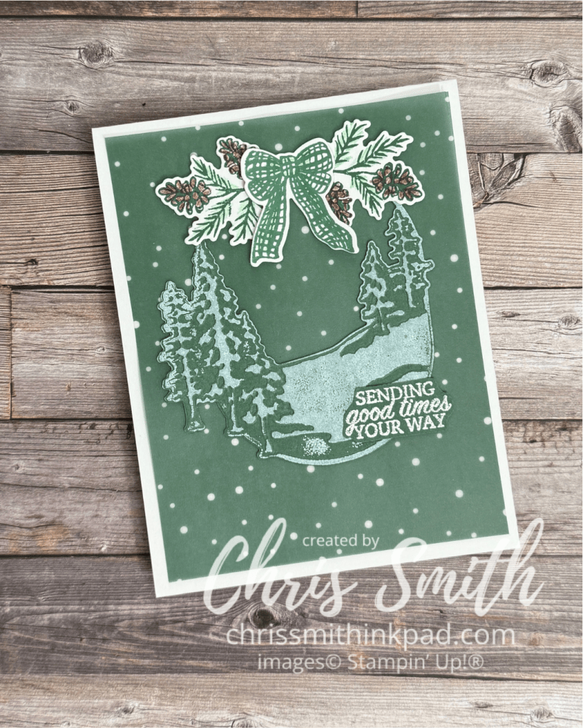
    I loaned out my Winter Adventures bundle for a few weeks so most of these cards were made with a stash of images I stamped and/or die cut without necessarily knowing what I was going to do with them. I think it was actually a good way to explore what the images can do. Maybe if I had the set while I was composing with them I might have tweaked one or two elements but I hope that you see the possibilities.

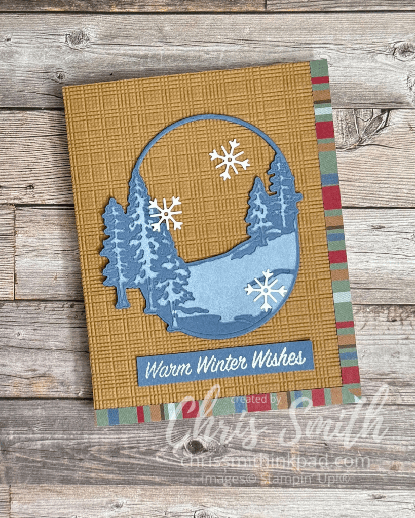
    • I pulled out a piece of Berry Botanicals vellum for the background on this one. Snowflakes against Pine, right?
    • Same treatment of the oval scenery piece as the preceding card to get the snow effect.
    • I was kind of thinking of the overall image being decor you hung on a door when I added the bow and greens to the top. If I was to do it again, maybe I would try adding some lighter green over the white of these pieces so that the “white” on the snow would pop more. Or maybe try stamping those images on another piece of Peaceful Pine vellum?

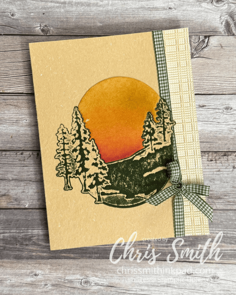
    These pieces came together from some of my first experiments with my preorder. I was using some now retired specialty paper with a sort of handmade texture. you can see it if you look carefully at the photo. I hadn’t used it previously and really wished I had done more with it earlier as it was gone from the online store shortly after I made this. It also shows that the die doesn’t just have to be used for winter scenes.

    • Just for the record, I collect gingham ribbon…
    • The Mossy Meadow ink was brayered onto the embossed die cut.
    • The top of the oval was trimmed off here due to a mistake I made in doing the die cut. So. I made up for it by blending ink onto the so called negative of the die to create a sunset. It’s a little smudged from ink on my finger, but you can get the idea.

    I had 2 strips of the stripe pattern cut, planning to use one on each side, but then decided a corner look would be less “squished”.

    • I’ve been designing corner border cards for years, practically hoarding the diagonal patterns that work so well with this and thinking stripes just wouldn’t work. but this was SO easy. Somehow I thought I would need to miter both strips exactly or it wouldn’t work. No! Just glue on a vertical strip (1/4″ in this case)to the right edge. Then make whatever you think is close to a diagonal cut on another strip and glue it over the first strip. I think as long as you are using the thinner weight designer series paper it will look perfect. Heavier cardstock might give you a bulkier corner but it would still be worth a try.

    One of the things that attracted me to Winter Adventures is that the images lends themselves to a change in mood or season just by changing the colors.

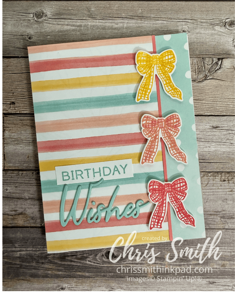
    • I chose a couple of patterns from the Beautiful Ordinary Life DSP. I initially tried white embossing on colored cardstock but didn’t see enough of the color so I switched to stamping the bows in Daffodil Delight, Calypso Coral and Strawberry Slush (for the “red” in the paper).
    • I used watercolor pencils to add a little shading to each bow.
    • Greeting is in Pool Party with the Words & Wishes Bundle.
    • If you do decide to emboss the bows I found that a long skinny tweezers could hold onto that skinny space below the knot to help me get the heat part of the job done.

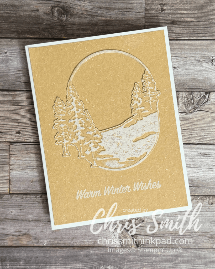
    This one uses a Natural Hues paper, which almost has a handmade kind of texture. It works beautifully with this scenery die.

    One of the things that really attracted me to this bundle was that I thought it could work with a range of looks from rustic to feminine, along with a variety of color combinations. That always makes points with me!

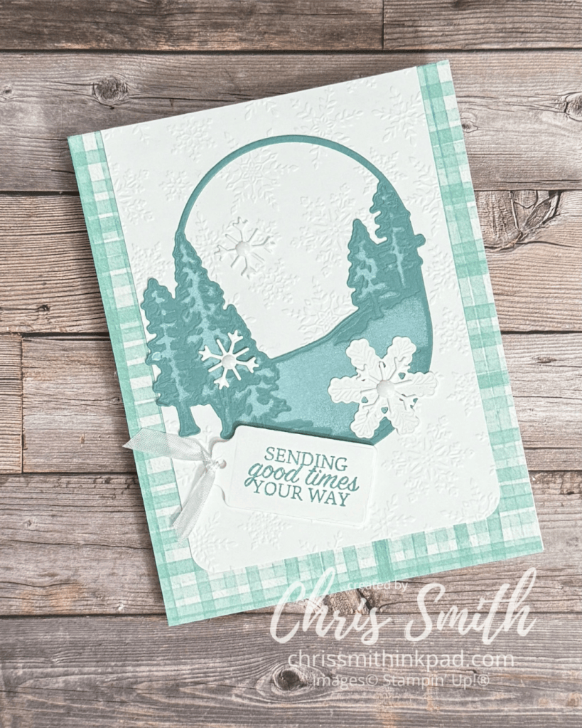
    This one started with one of several oval impressions die cuts that I played around with and only later explored how to make them into cards.

    • You need the impressions pad to get a good impression of the texture after you make the initial die cut. Both the larger snowflake die and the oval tree scene give impressions.
    • I’ve used two ways to add “snow”: Lay the die over and add white craft ink with a sponge dauber or brayer white craft directly over the embossed piece.
    • Background paper is from Valley in Bloom DSP. There is a current hybrid embossing folder with snow but I used a retired regular folder in this card. The tag die is from the Scalloped Blooms dies and the skinny white seam binding is also retired.

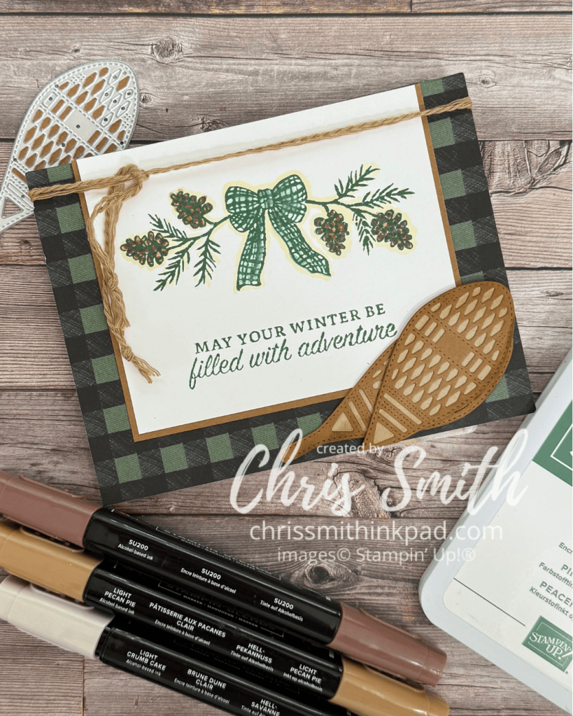
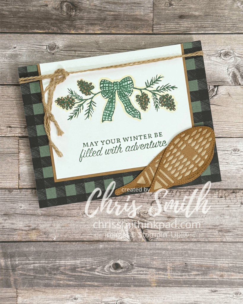
    Here’s my first go round with the Winter Adventures Bundle. I thought the mix of snowshoes, a bow and greens along with the oval scene, trees and snowflake dies could be so much fun. After this one I have so many more ideas!

    • The stamping is done on Basic White with Peaceful Pine. When stamping the pine boughs I took off some of the ink from the “stick” part of the bough so that I could stamp it closer to the tied bow. I probably could have left off even more.
    • I colored the Bow by picking up a little ink from the Peaceful Pine ink pad with a blender pen and adding it to the stamped image.
    • The browns shown in the photo were used on the pine cones. I softened the stamped image with a little bit of Crumb Cake outline.
    • The snowshoes are die cut with Crumb Cake and Pecan Pie. The Peaceful Pine Buffalo Plaid print is from the Alpine Winter designer series paper
    • I used to be a bit of a hoarder with all things Baked Brown Sugar, an In Color from several years ago. I separated some of the cording in this color and used it to add a little texture to this card.
  • Garden Silhouette Gallery

    Return to Gallery List/Links

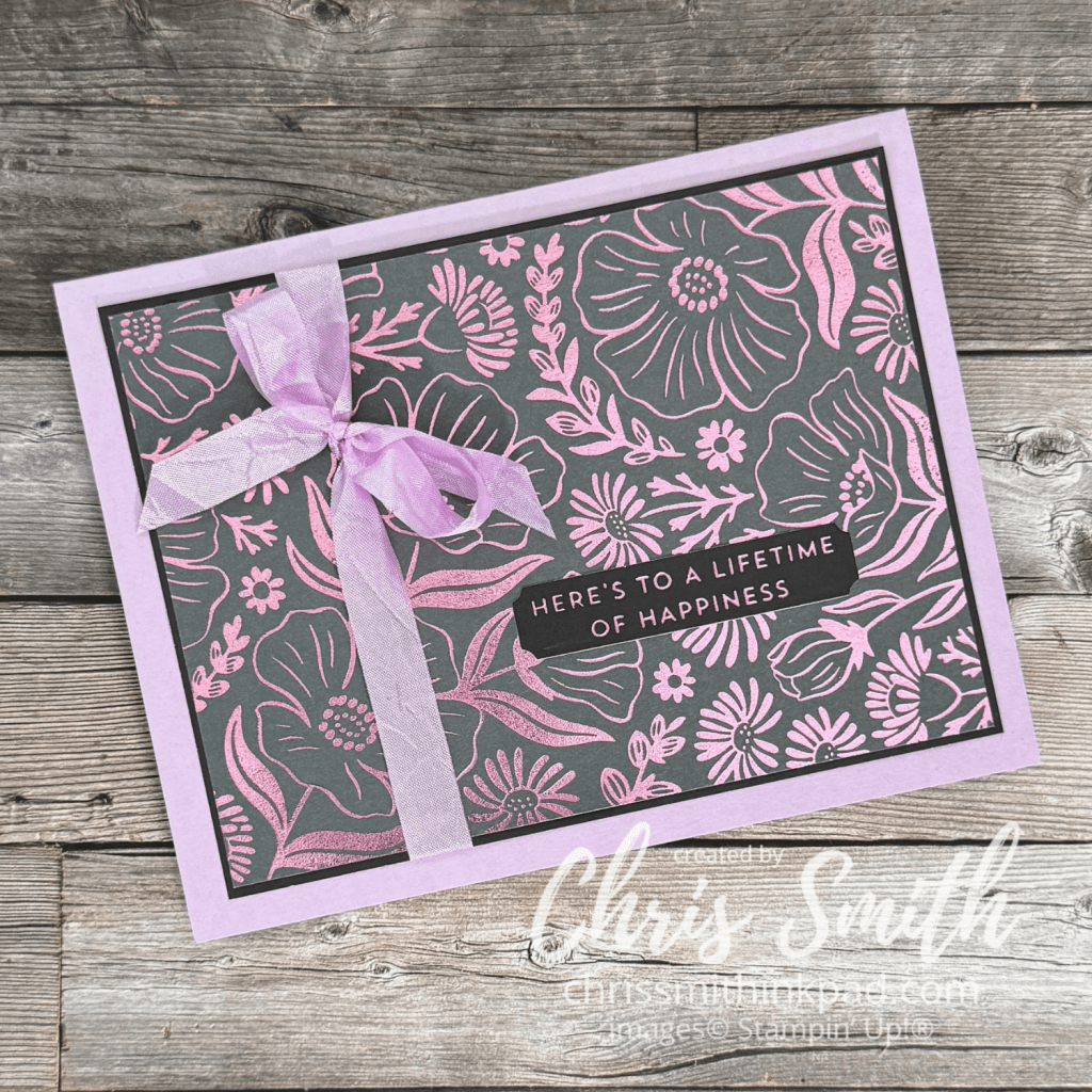
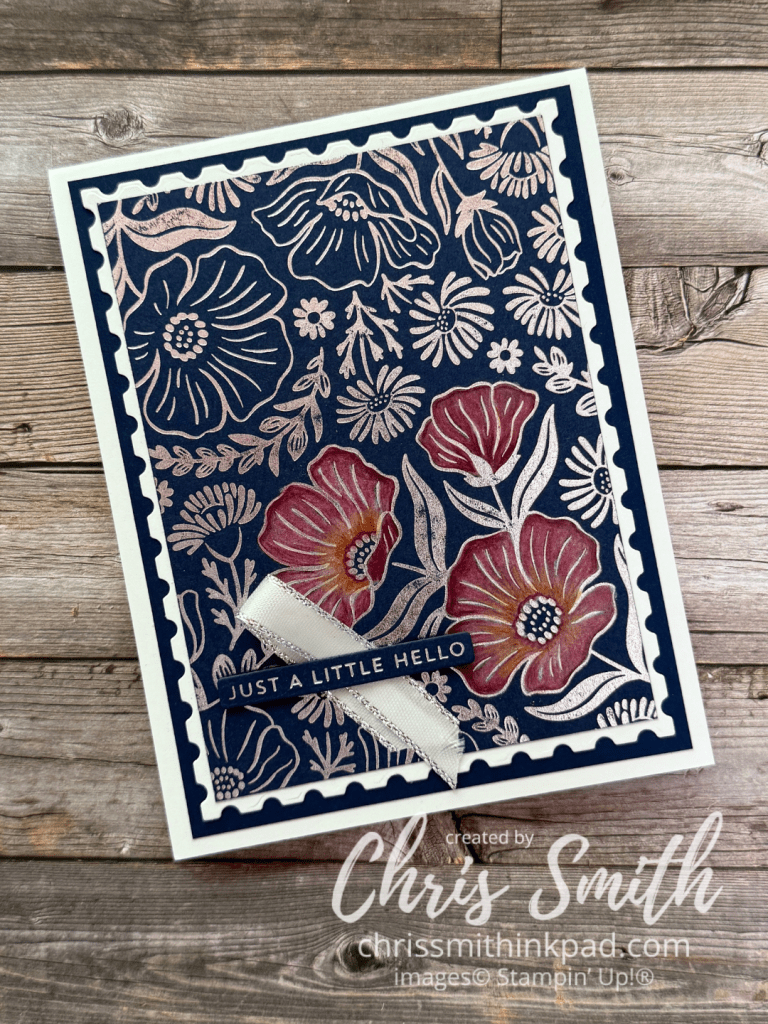
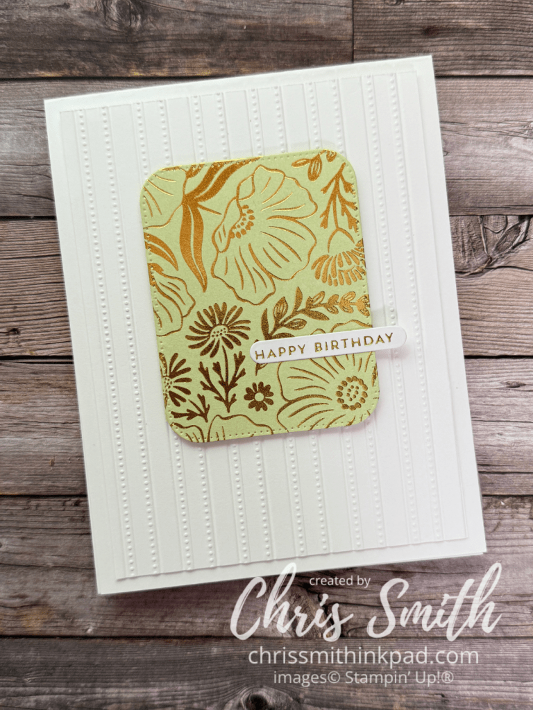
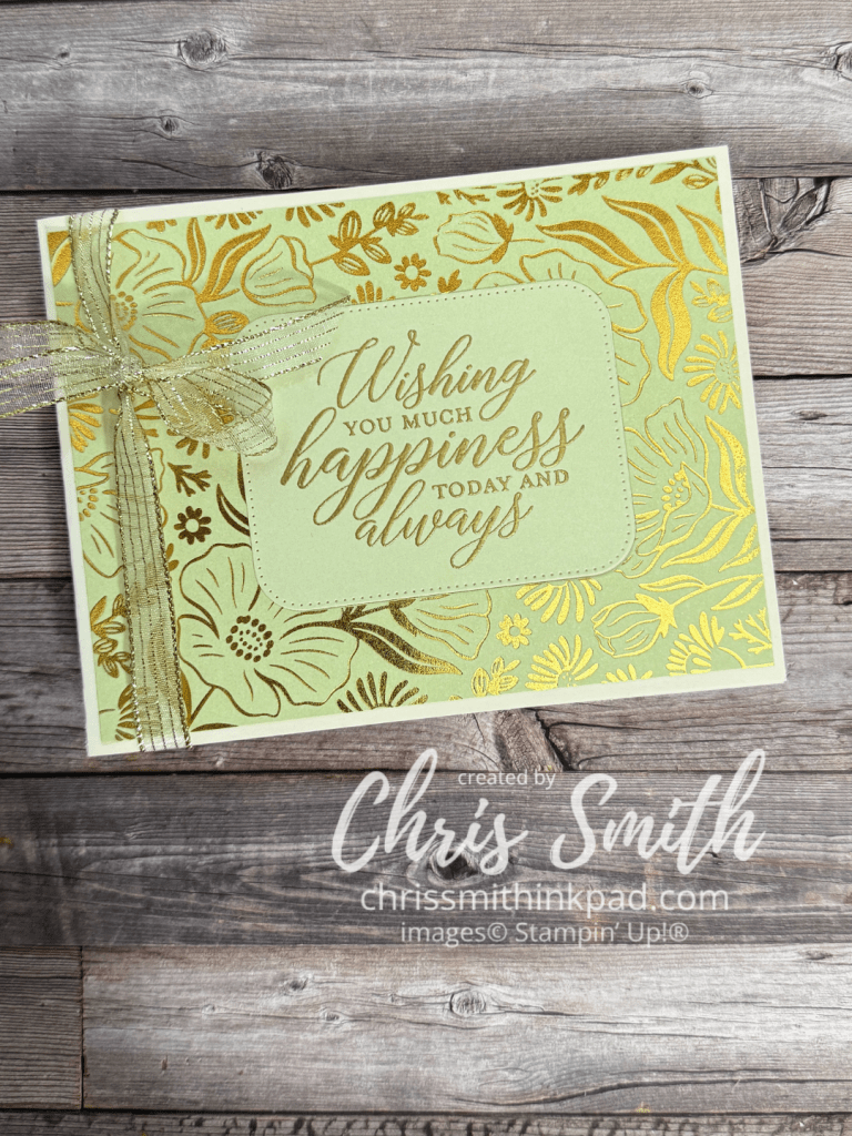
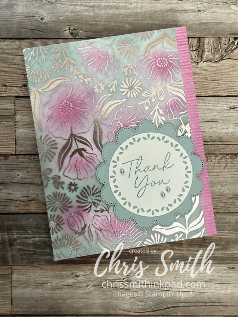
    Garden Silhouette is one of the hot foil dies released in Stampin Up!’s first Hot Foil release earlier this summer.

    In real life, I think the light pink foil looks best with Fresh Freesia though I also like it with Bubble Bath. I used a Fresh Freesia Card base and retired FF seam binding. The Two Tone cardstock works particularly well with hot foiling because it is smoother than traditional cardstock. Since it was initially developed for scrapbooking with its light weight it also makes for a lighter weight card, though a less sturdy card base. one side is lighter and it has a white core. In this card I hot foiled the lighter side of Basic Gray and used the darker side as a mat and for the greeting. The greeting is from the Sweet Sentiment hot foil bundle and is foiled onto the darker side.

    I got a little playful with this one. Silver Foil on Secret Sea cardstock. After using colored pencils on three of the blooms I layered onto a Perennial Postage die cut. When using colored pencils on a such a dark color it really helps to put down white as a base color.

    I was starting to feel a little overwhelmed with the shiny pattern in large amounts so I cut out a little window using a Nested Essential die. This is layered on an embossed piece of white in my stash and takes it’s greeting, once again, from Sweet Sentiments.

    …and here’s what I did with the frame the previous card left behind. I wasn’t sure it would look right to use embossing with foiling but, as you see, it works! This is a retired greeting from So Sentimental.

    I think this one is my favorite so far! You would think that adding more colors would make it busier but I think the overall contrast is reduced so it pleases my eye a bit more.

    Silver foil on white. I used blending brushes to add Berry Burst, Cloud Cover and Lost Lagoon. I think it was the first time I used this trio and it won’t be the last. The greeting uses the Scalloped Blooms bundle along with a die cut circle from the Spotlight on Nature dies. I do like those circle dies on the scallops!

  • Around the World on Wednesday: Playing with Sand

    Today the artists from the Around the World on Wednesday crew are enjoying a little sand!

    We are left to our own devices to decide how and I didn’t have too much trouble deciding that I would get out my sanding block.

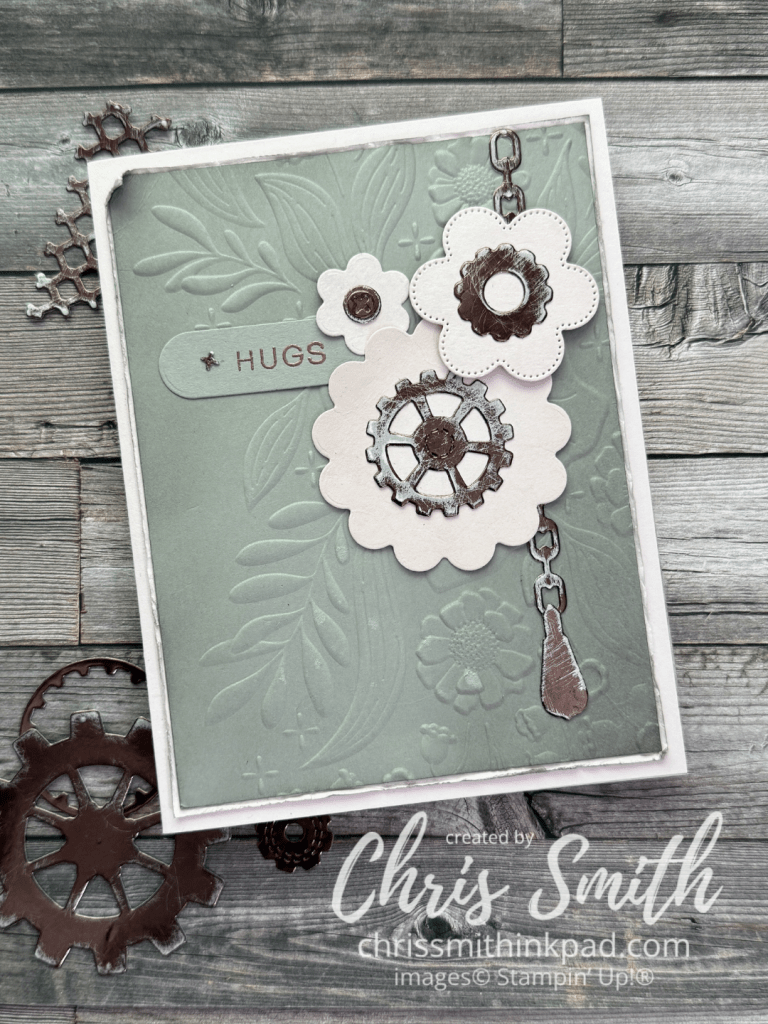
    Awhile back I experimented with using sanding blocks to roughen up some metallic paper when I was using the Gears & Textures bundle and wanting the gears to look worn instead of shiny and new. This week I went back down that road to try some other ideas I’ve had rumbling around in my head. One idea was mixing the feminine scallops from the Scalloped Blooms Bundle with the more masculine Gears & Textures.

    1. I had trouble getting the Barely Blush and Gray Granite in the card to come through right in this photo but I love the way they worked together with the Earthen Toned Metallic – in real life!
    2. I lightly brushed Gray Granite ink onto the Gray Granite layer (3 7/8″ x 5 1/8″)before embossing it with the Floral Spray Embossing Folder. That piece is layered onto a 4″ x 5 1/4″ piece of Barely Blush before I roughened up the blush with my fingernail. I gave the edges another quick brushing of Gray Granite ink before rolling one corner and attaching it to a A2 (4 1/4″ x 5 1/2″) Barely Blush card.
    3. The scallops/flowers are die cut from Barely Blush with the Scalloped Blooms dies and brushed ever so slightly with the same color of ink.
    4. Most of the gear pieces were sanded as loose pieces but the chain was done in the negative piece that was left after making the die cuts. If you look closely you can see that the edges of the chain are more defined with the original Earthen Toned color. The others are more worn appearing at the edges.

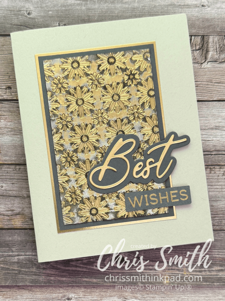
    Here is one that started with a piece of shiny gold metallic paper.

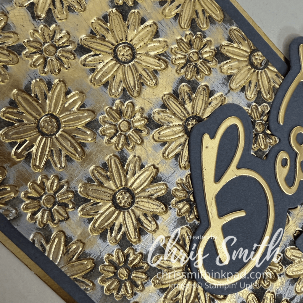
    1. I didn’t know what this would look like until I created the background piece but once I saw the way the pattern and colors work together I thought I would turn it into a card that was a little sophisticated and celebratory, like for a older couples wedding or maybe a retirement. You can see in the close-up at the top of the post that the piece shows gold that is roughened but not sanded off, a silver-ish color beneath it and then Basic Gray which is where I sanded down to white, uncoated paper that didn’t resist the ink like the gold and silver did.
    2. I think it is good to vary the width of your layers if you use more than 2. The Basic Gray border is 1/8″ while the unhanded gold metallic border is 1/16″. Actual Measurements: 2 1/2″ x 3 7/8 of embossed pattern, 2 3/4″ x 4 1/8″ of Basic Gray; 2 7/8″ x 4 1/4″ of unsanded Gold Metallic Paper
    3. When I have a design that won’t have an even border around the card I usually try to line it up so that the distance from the top and the sides of the card is the same with more space on the bottom. This time, since I knew that the words would extend towards the right edge, I made sure the left, top and bottom were equal distance and there was a little more room on the right.
    4. I like mixing the die cut words with stamped words from the Words & Wishes Bundle.
    5. I often just barely snip off the corners when I have a hand trimmed greeting such as “wishes”, just to slightly soften the edges. This time I also used my sanding block to smooth all the edges of this piece down. I’ll be using that trick again!

    I hope you try sanding some of your metallic paper scraps at your craft desk! Here are some ideas to keep in mind as you experiment:

    1. There are lots of tools you can use to sand, even emory boards, I found a nice sized, very slightly cushioned, block at the hardware store for just a few dollars.
    2. Try different types of metallic or coated paper. You may find multiple layers and can experiment with how many layers you actually want to go through.
    3. Think about what colors of ink you might like to apply. Something darker to emphasize the metal color or maybe something complimentary? Always brush loose paper/dust off your sanded piece so that you don’t transfer the paper dust to your ink pad. You may not realize it at first but your sanding block may accumulate dust too so it a good idea to brush that off a bit if you can.
    4. Vary the way you swipe the sanding block across the paper or die cut. You will get different looks with straight swipes compared to using a circular motion.
    5. You can apply ink with blending brushes, daubers, or even directly from the ink pad.
    6. Save the negative from making die cuts and place the cut pieces back into the negative before sanding to get a different look. This preserves the metallic look at the edges, sanding more on the top surface. Without the negative you usually get the most of the metallic coating off of the edge.
    7. For variety, use both sanded and unsanded metallics in your final card design.

    Now it’s time to check out what kind of sand the rest of our time got into. Next up is Bree Renwick:

    Leonie Stuart – AU

    Rochelle Laird-Smith – AU

    Kelly Taranto – US

    Chris Smith – US

    Bree Renwick – US

    Lori Willcox – CA

    Cheryl Hamilton – US

    Thanks so much for stopping by today. Please note that there is a gallery page index linked at the top of my blog. You can find samples from various Stampin’ Up sets and sometimes even techniques by checking the index. Chris

  • Turtle-y Cute

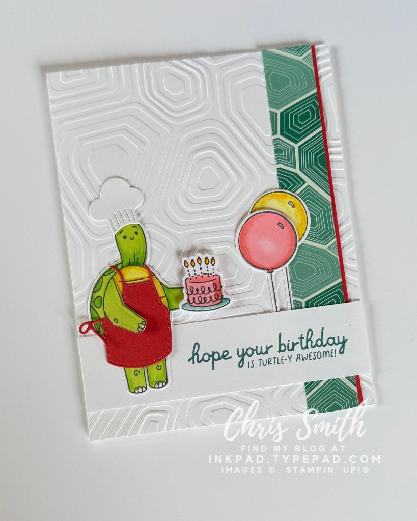
    Today I’m celebrating the Turtle-y Cute Collection and Designer Series Paper(DSP) with ideas and card making tips you can make work for many different kinds of characters.
    This cute and kind of silly collection of turtles came out a little over a year ago and went on Stampin’ Up!’s Last Chance list this past April. I was first introduced to them at Onstage last March, when I attended an evening stamp party.

    I did a post last year before the Typepad blogs ended and I am incorporated those cards plus a few more here to show a little of what you can do with this suite, particularly the DSP. As I write this the paper is discounted at $7.50 (US) for 12 sheets and the stamp and die bundle is also significantly discounted. The DSP pack alone will make many cards!

    I suspect the paper will be gone by the time many read this but I hope you will find ideas that you can use for other character based papers and craft supplies that you might have or come across.

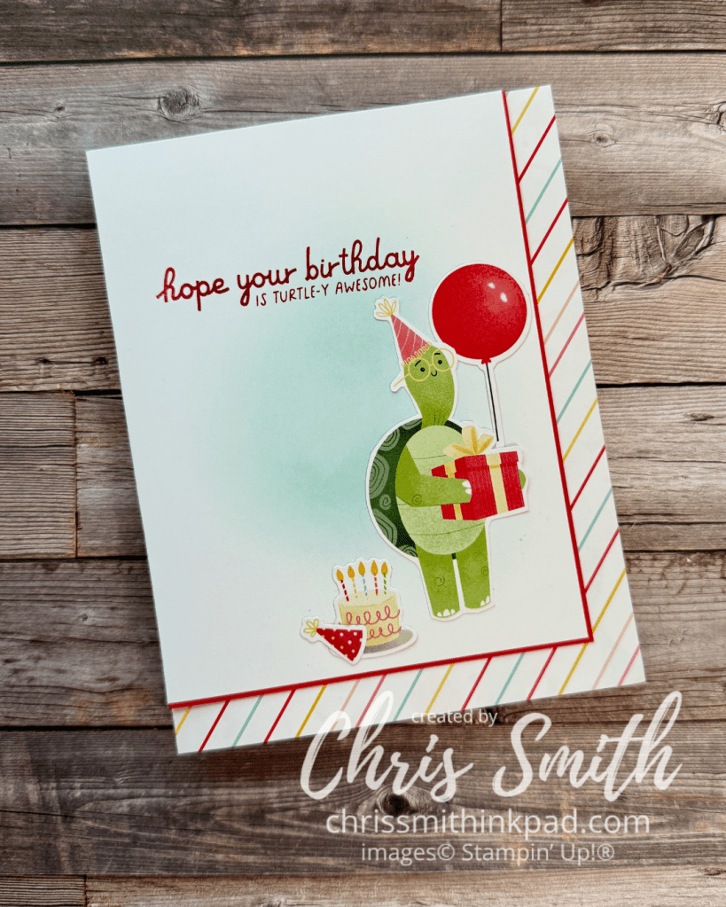
    First off, a classic birthday card using one of my favorite DSP card sketches and techniques.

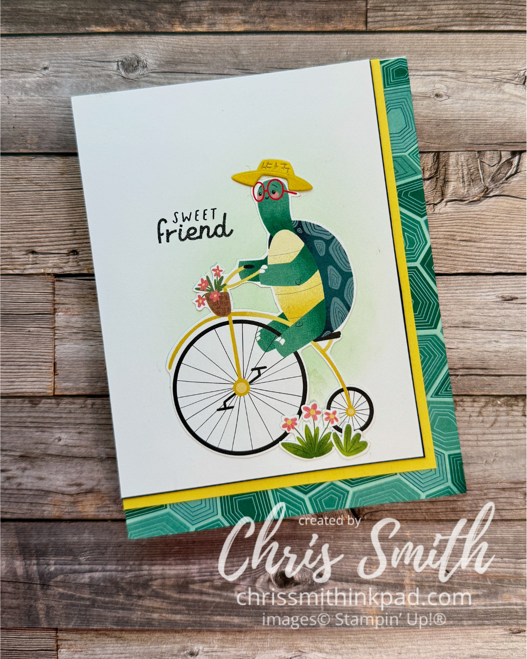
    I love to create these cards with corner borders, especially when I have diagonal stripe or plaid. I’e also started keeping a stash of quarter front or slightly smaller pieces of card stock brushed slightly with a bit of blue, purple or green ink, whatever is ready to be cleaned from my brush. This simple little bit of background color can really make a fussy cut image seem a little more at home on the background.

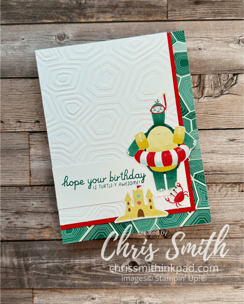
    This beachy turtle gets a background treated with a coordinating embossing folder.

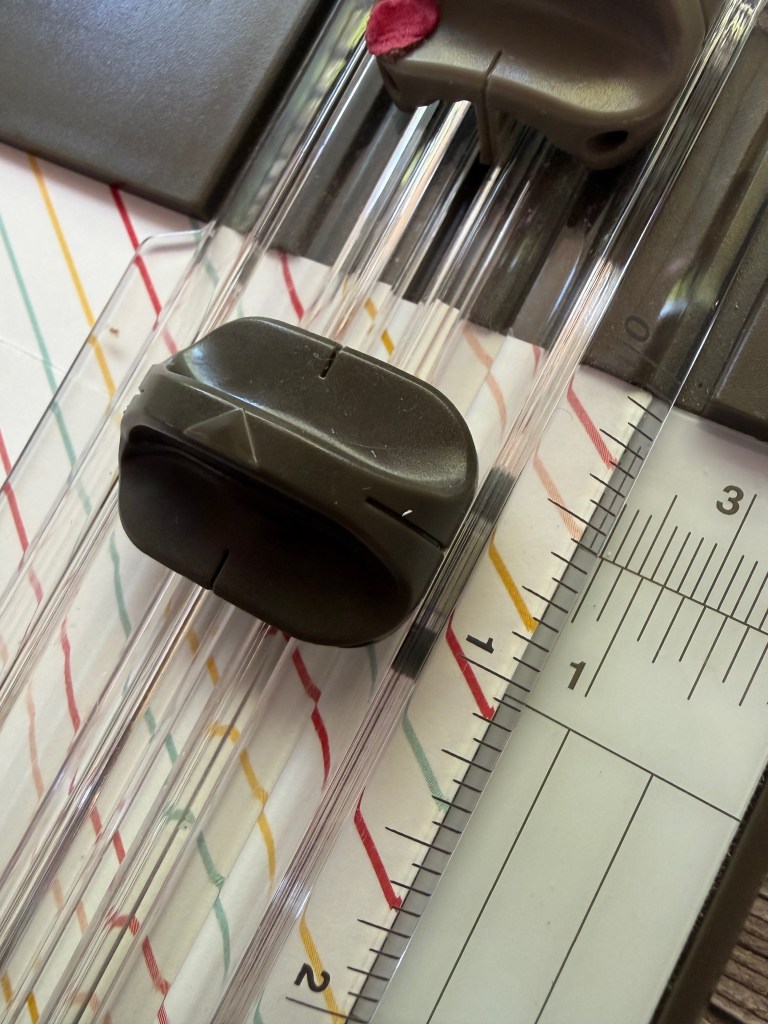
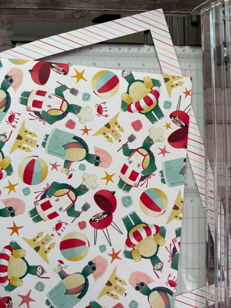
    Here’s how to get some extra mileage out of your DSP when making corners:

    I start with a 12″ square piece of DSP but feel free to try this with another size.

    Choose a width for your border. I’m using 3/4″ here but sometimes I use a half inch. Start your cut 3/4″ down from the top edge and 3/4″ in from the right edge. Cut until you reach 3/4″ in from the bottom edge of your DSP.

    Lift up your ruler/cutting blade and turn your paper 1 quarter turn to the right so that the placed you finished the cut is now at the top.

    Repeat until you have cut out a square with a frame. This works wonderfully with the Turtle-y cute DSP because you will have pieces to trim your card and lots of turtles and their accessories for your cards.

    I did a video on You Tube (several years ago that allowed me to get 13-14 corner borders from one 12×12 sheet.

    Some time ago I did a video for the frame cut out technique . For some reason I can’t link it here but it’s not hard to find on my little YouTube channel. It’s got a little snowman with another corner border.

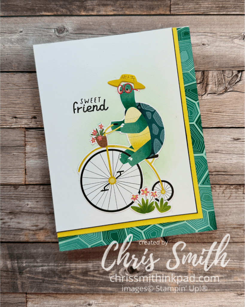
    And, those partial images on the edge of your DSP? There are lots of uses for them.

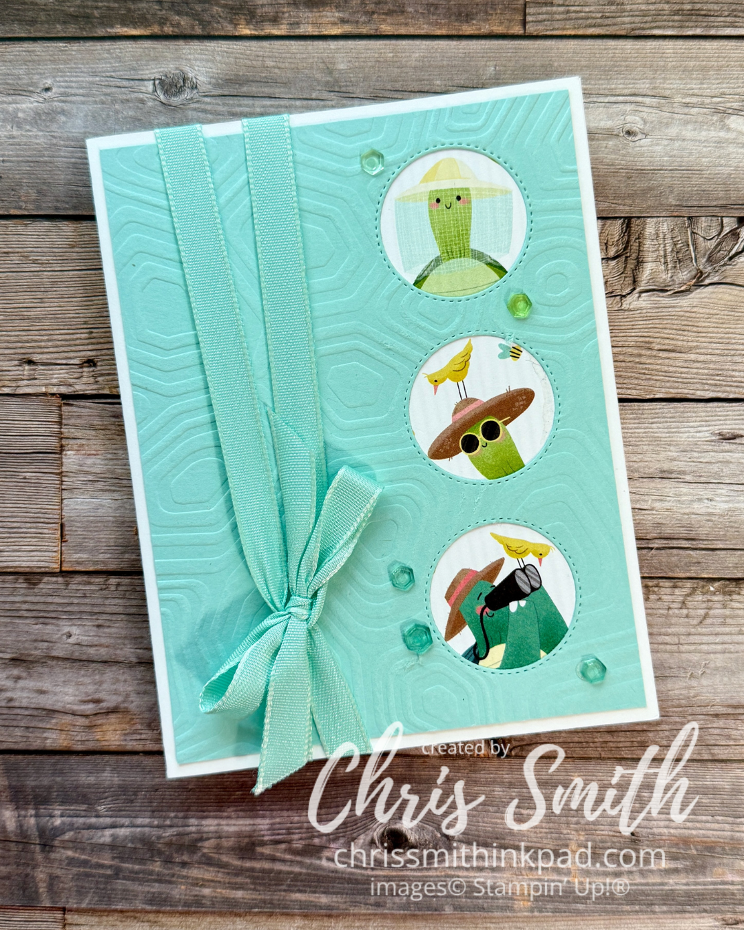
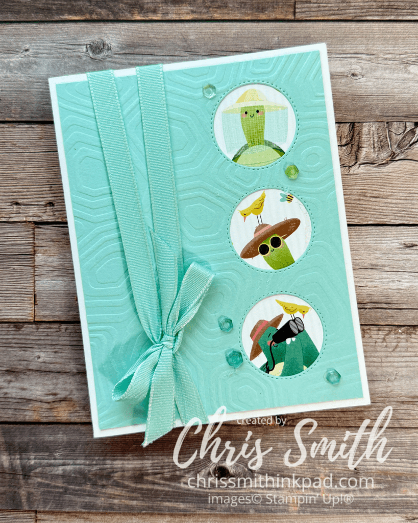
    I did a trio of the Nature themed turtles along the side of this card. You could punch or die cut them or create windows for them to peek through as I did here.

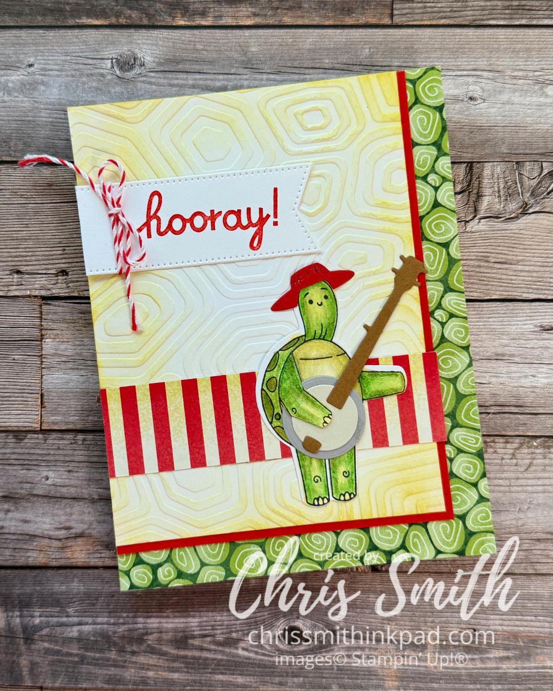
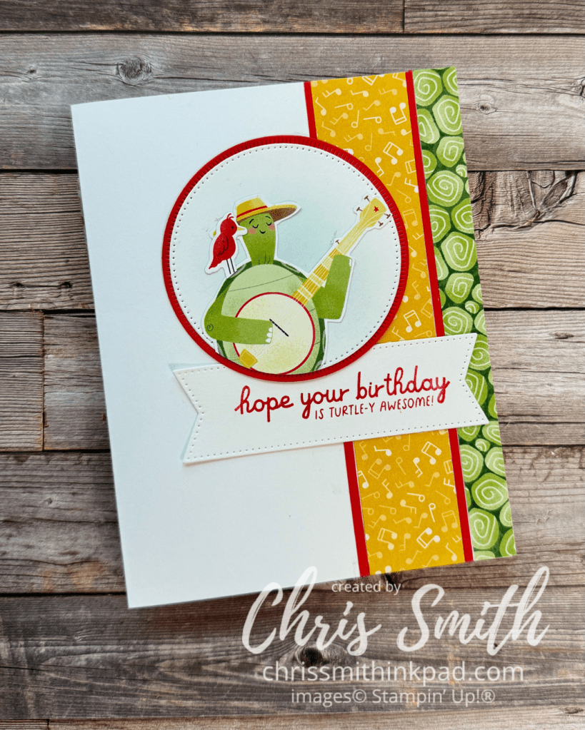
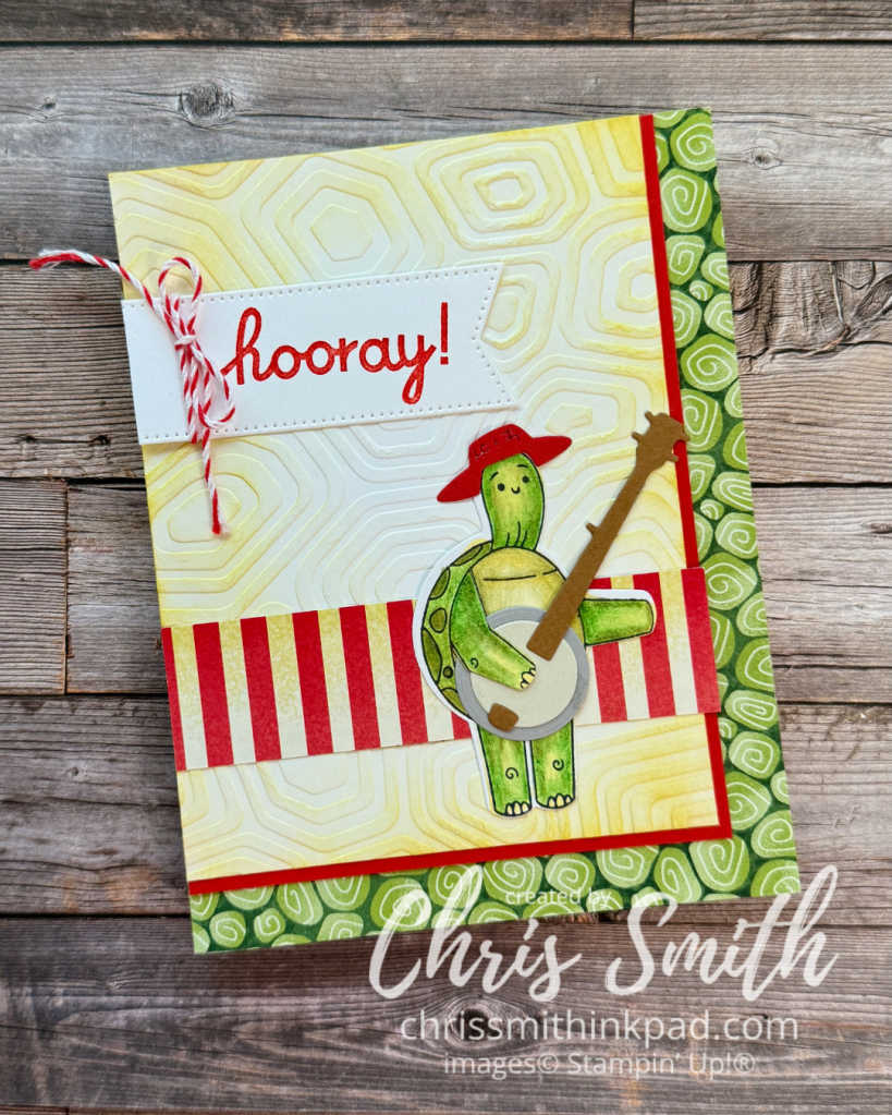
    There was a little more image available for this banjo picking turtle so I put him on a circle with the same blending brush background.

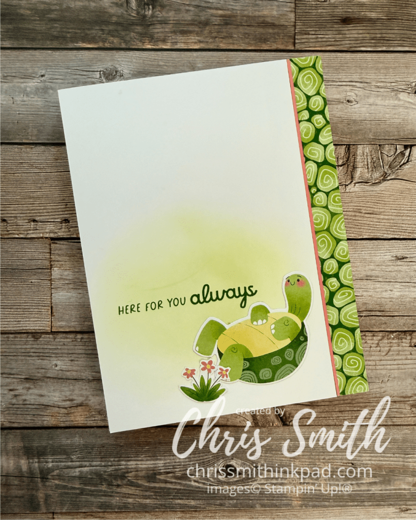
    Sometimes a simple border is enough.

    Or play around with word banners. This card makes use of the stamp set for the turtle and dies for the hat and banjo.
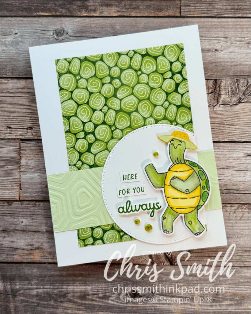
    I colored this turtle with my travel coloring kit: some pale green and yellow Blends Markers plus the watercolor pencils (without using any water. I find using pencils quite relaxing and I have so much more control over the shading.

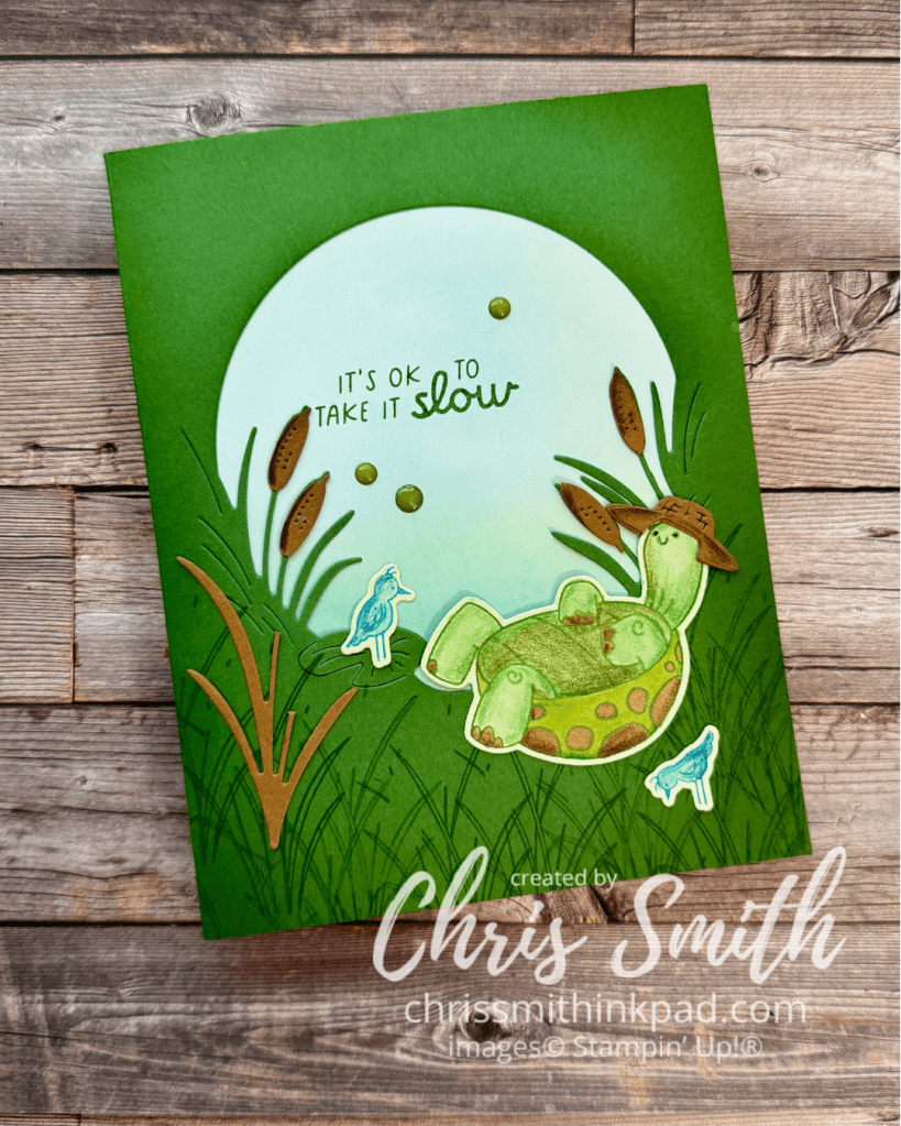
    I also like to pull out other products I have. This card incorporates some dies from Charming Duck Pond, a retired product. Maybe you have something similar that you can use to build a unique setting for your characters.
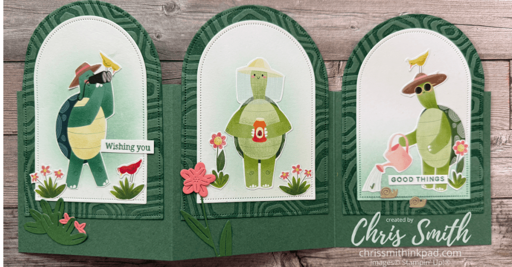
    Arch Trifold: Maybe you can recognize die cuts from Sweet Bug? I tried a few of the greens found in the DSP for this and them figured out that I liked the way the new 2026-2027 In Color, Peaceful Pine, brings the different greens of the turtles together. I inked the (coordinating but since retired) embossing folder with Peaceful Pine before embossing the card stock in order to emphasize the texture.
    One more that I made with one of the turtles that I colored while on Onstage 2025.

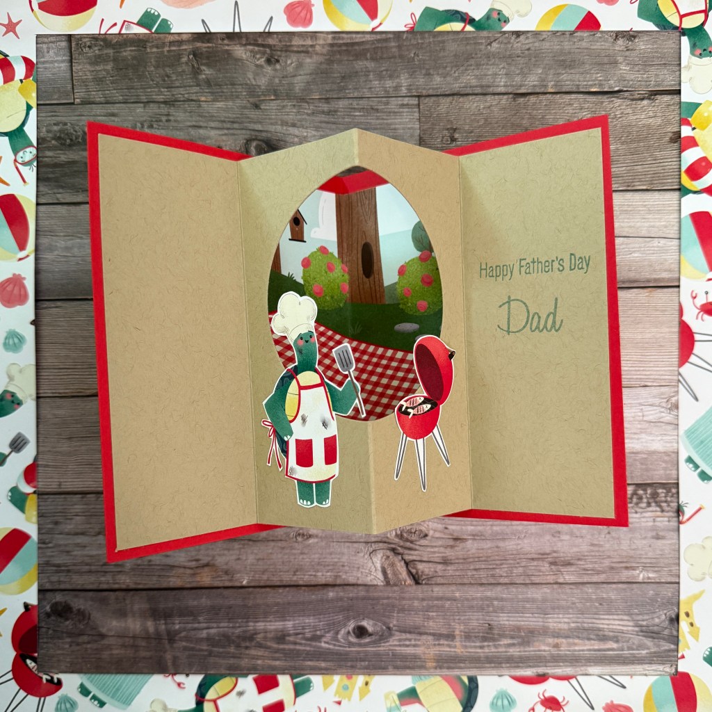
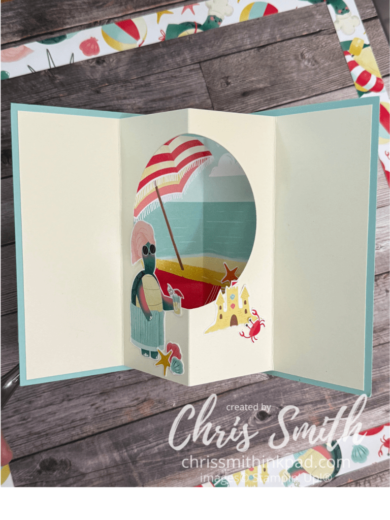
    Here are a few more turtles in one of my favorite fun fold cards. Some call it a tunnel card, others refer to it as a theater card. Regardless, I think it’s a great way to use the roughly 4″x6″ background scenes that you find in some DSP packs.

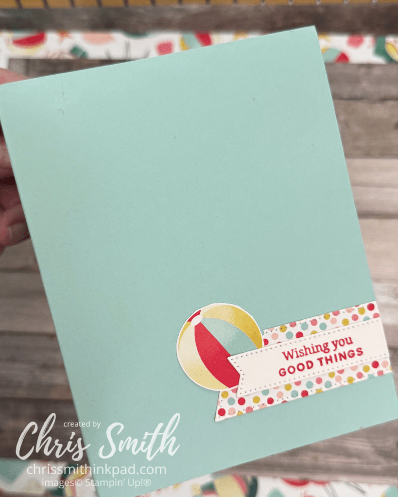
    Often when I do these tunnel cards I keep the card front very simple like I did with just a little paper and a greeting from Banner Sayings:

    Here’s another with the grilling turtle using greetings from Relaxing Waterside.

    Basically, a tunnel card is two cards, one layered inside of the other. Cutting the inside layer smaller to leave a border is optional. The inside layer is scored to divide it into 4ths and a shape is die cut into the middle two sections. Any scene that you want to appear inside the tunnel is stamped or adhered before attaching the inside card to the outside card. It’s always a fun card to try anytime you have characters. More details than this probably requires another post.

  • Around the World on Wednesday: This or That

    Can you believe it’s November already?

    This month’s Around the World on Wednesday Blog hop Theme is This or That: Wrapped in Gratitude taking special inspiration from the beautiful creations of team member, Sharon Burkert.

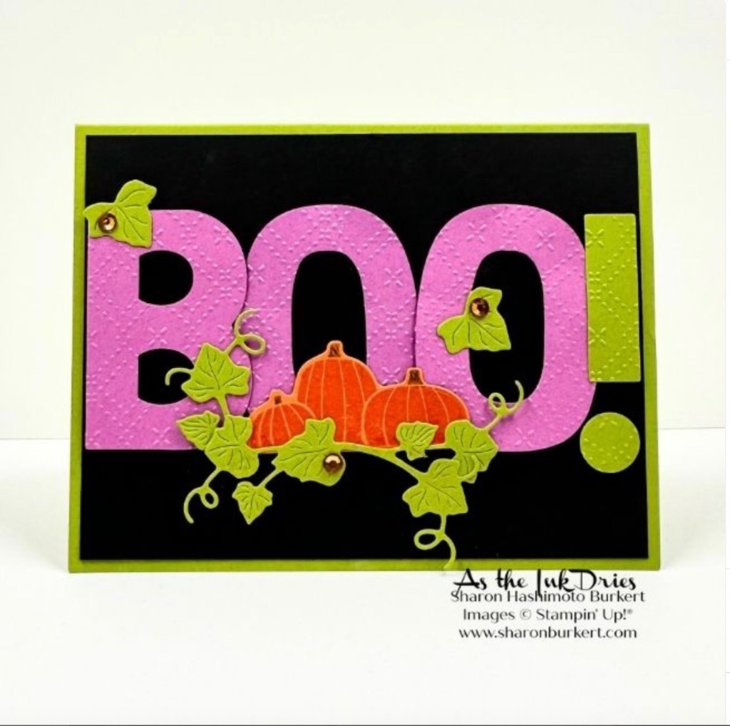
    I chose to take inspiration from this colorful Halloween card of Sharon’s that features the Party Alphabet Dies:

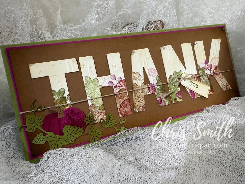
    The dies are new to me and I thought it would be fun to use the pumpkin and vine theme with them. Since I’m going for a fall gratefulness theme I worked with the big dies and Beautiful Pumpkin Bundle. I also used the Gathering Moments fall images and even pulled in a tag and greeting from the Layers of Beauty bundle. These are big dies, big enough to actually stamp on the die cuts. There are also so big that I knew my card would be a slim line card just to get the word “THANK” on it.

    • I started by stamping the rather fall like botanical images from Gathering Moments along one long side of a sheet of Very Vanilla card stock. I used Old Olive, Pecan Pie, Berry Burst. I wanted to pull in a darker echo of Sharon’s Petunia Pop and I like the way this puts a little twist on the more traditional colors. There is a bit of Cajun Craze with the mushroom image too.
    • The next time I try this I might just die cut the letters first and then stamp as I needed to add more images to the die cuts anyway.
    • Once I had the stamping on the letters done I put them all into Birch Wood embossing folder to add a bit of texture.
    • After trying a few embossed designs on the Pecan Pie layer, I decided this would look better just plain. I used a ruler to make a straight ledge to line up the letters and stated with the “A” in the middle and work out to the edges. After the fact I decided to push this a little more in the shabby chic direction by lightly brushing the letters with just a touch of Pecan Pie and roughing up the corners.
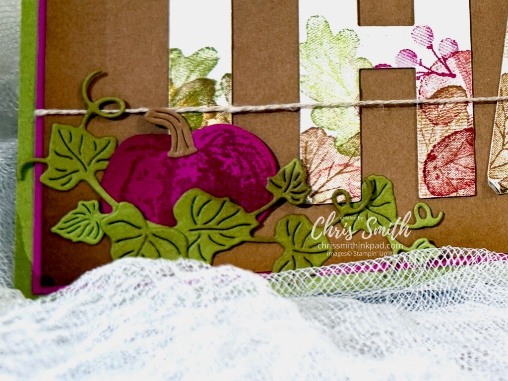
    • I tried adding a Pumpkin Pie or Cajun Craze pumpkin but in the end decided to play up the Berry Burst a little more. The image is stamped in Cajun Craze on Berry Burst card stock and then it was brushed with a little more Berry Burst after die cutting it. I like the vintage velvety look this gave it and actually ordered this bundle because I thought it would be fun to do some non-traditional pumpkins. The pumpkin vines/leaves were ie cut with Beautiful Pumpkins Dies out of Old Olive card stock and them brushed with a little Pecan Pie around the edges. Before attaching the Pecan Pie layer (3 1/4″ x 8 1/2″) to Berry Burst (3 3/8″ x 8 5/8″) I brushed those edges too.
    • Before attaching this all to the 3 5/8″ x 8 7/8″ Old Olive card baseI tied some linen thread around the THANKS layer and added a “you” tag made with the Layered with Beauty Bundle.

    Here is a close up of the pumpkin:

    This was a really fun first go at these alphabet dies and I look forward to playing with them again soon.

    I’m trying to prep for two back to back trips amid the uncertainty of US air travel right now so I ended up skipping my planned second card. – I was going tweak the colors for a less shabby chic look. But that means you get to move on to see what you will see with the others on this hop. I can’t wait to see what Teri West has in store for us.

    Jan Clothier – NZ
    Leonie Stuart – AU
    Rochelle Laird-Smith – AU
    Cheryll Miller – AU
    Danielle Kassing – NL
    Marga Bultena – NL
    Aurélie Fabre – FR
    Kelly Taranto – US
    Sharon Hashimoto Burkert
    Chris Smith – US
    Teri West – US

    Thanks so much for stopping by. I hope you enjoy the blog hop!

  • From the Archives: The Daisy Sketch

    This is a repost from my old Typepad blog. Please check the end for an updated version from 2025.

    From: NOVEMBER 20, 2023

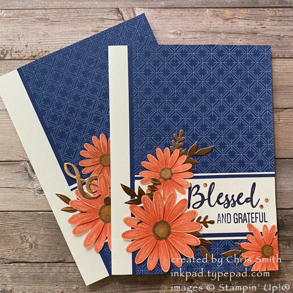
    The Daisy Sketch

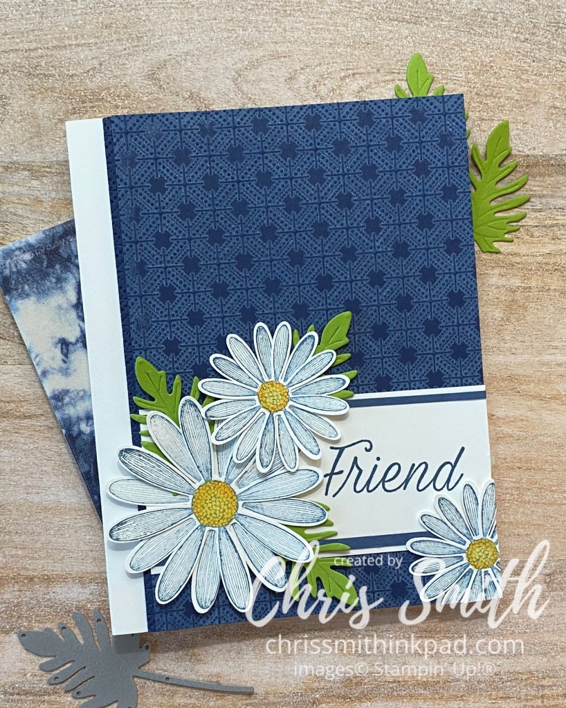
    One of my favorite sketches to use over the past few months is one I refer to as the “Daisy Sketch”. I originally started using this in 2019 with the Daisy Lane Stamp Set along with a large and medium sized daisy punch. 

    This is my initial “perfected” version, after playing with a few different colors, etc.

    It basically has:

    • a left border that is 1/2″ to 1″ or so wide with the remainder covered by DSP or a dry embossed piece.
    • an approximately 1 3/4″ wide greeting panel on the lower 1/3 or so of the card. 
    • 2 objects (daisies) on the left of the message and one on the lower right, extending off the card.
    • embellish with leaves etc as desired or indicated by the occasion.

    It was easy to adapt for a specific occasion request, for example these cards which were created n honor of November employment anniversaries for a couple of treasured church staff:

    I shared this one earlier this fall (2023) with altered colors and objects but the same basic arrangement.

    Last month, I brought it out again for when I hosted a color challenge:

    This is one that I did on a Facebook Live video earlier this month. After the video I decided to add a tiny bit of Balmy Blue Blends brushed just outside the yellow centers, along with a few more leaves…

    Here is the video.

    from my ink pad with Chris Smith

    A Favorite Card Sketch with Stampin’ Up!’s Cheerful Daisies.

    2025 Update

    Many of these products have retired since I first posted this almost two years ago but I think the sketch still works for many themes and seasons. Plus, I think they were really great products and would be so happy if you have them and pull them off your shelf for a little love! (And, I’m trying to learn how to bring forward some of my favorite old posts from my now discontinued Typepad blog.)

    Here is a much more recent card I made with some of the Beautiful Gallery Suite products from Stampin’ Up!’s current catalog.

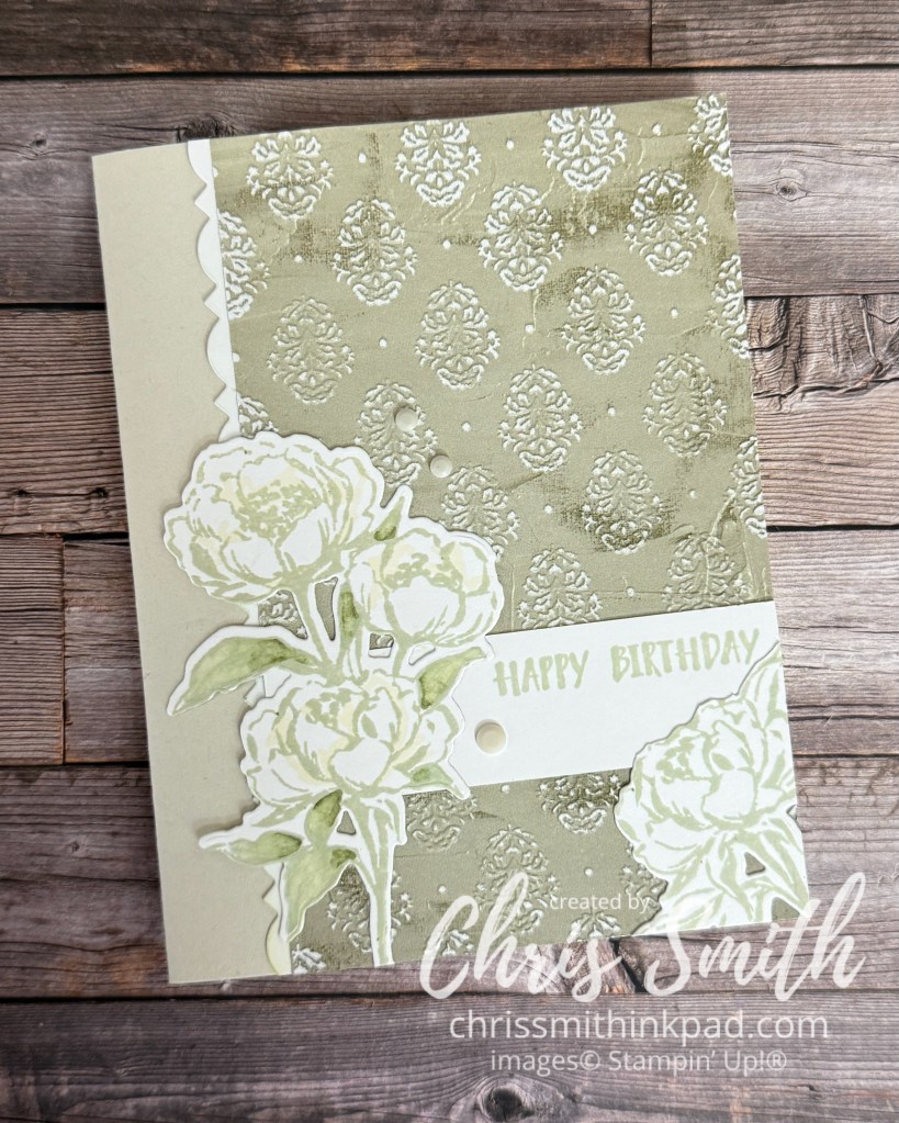
    I used the Damask Designs embossing folder to add texture to the Beautiful Gallery DSP. By lightly sanding the raised areas I revealed the white core of the paper for a little extra contrast. I love the painterly look of this paper so much I feel like I’ve been hoarding it for months.

    Here’s another I did – different sketch – with just the Beautiful Gallery papers, with a little help from Peaceful Days stamp set for the greeting.

    Such a simple card, I almost forgot to pack it when we went away for our anniversary…

    Thanks for stopping by. Please come back again to check what’s been on my crafting table!

  • Around the World on Wednesday: Remember When

    Here we are. Day 2 on the new blogging site and it’s time for our Around the World on Wednesday blog hop. I’m delighted if everything worked and you found me here. For those who are new to me, I’m Chris Smith, from the Twin Cities in Minnesota, US.

    This month we are continuing the celebration of our 5th year as a blog hop and taking inspiration from one of our Artisan members, Bree Renwick. Aside from that we have a theme of “Remember When”.

    I fully expected to take full advantage of Bree’s inspiring scrapbook pages and ordered some of our latest scrapbook stamps and “stickers” to use for this month’s hop. But then, late last month I received notice that Typepad, the blogging platform I’ve used since early 2007, was ending the platform and my 999 blog posts plus galleries would disappear after September 30. Needless to say I’ve been preoccupied evaluating what to do about it AND looking back at the posts themselves to help inform my decision making. I will save my work and find ways to bring back what I think still has relevance. And, you know what? It has been fun looking back to Remember When I first started blogging about 18 years ago.

    One of my first posts was a brief remembrance of my Grandma Edith:


    January 18, 2007

    Tribute to My Grandmother

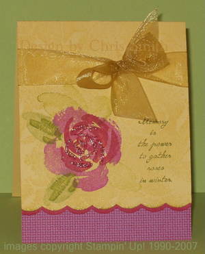
    “Memory is the power to gather roses in winter.”   I designed this card in tribute to my grandmother who died last month, a few weeks before Christmas.  She would have turned 100 next week.  Edith was a loving and generous grandmother…and she used to grow beautiful roses!  

    I drew upon one of my all time favorite SCS color challenge entries for this special card. (SCS referred to SPlitcoaststampers.)


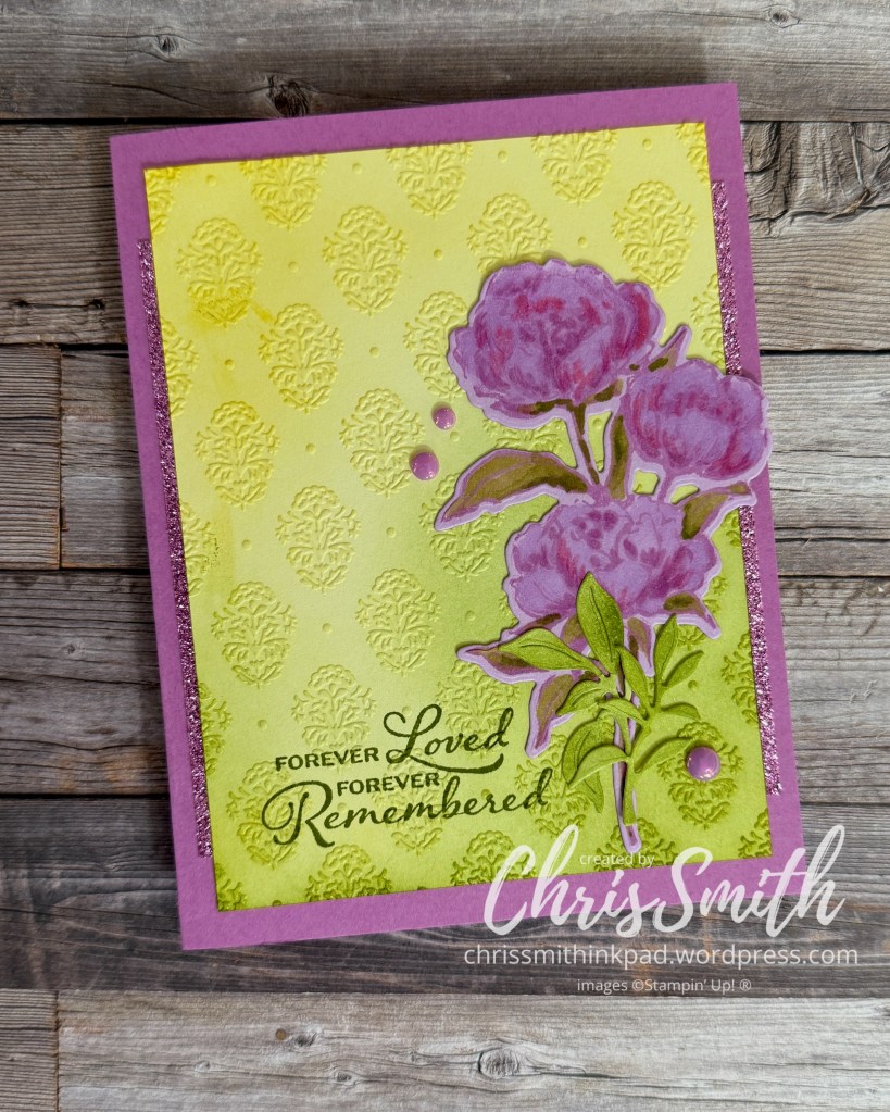
    I loved using these colors (Orchid Opulence, Rose Red, Old Olive and So Saffron) together and thought I would update this idea with current colors and stamps and borrow a sketch idea from Bree.

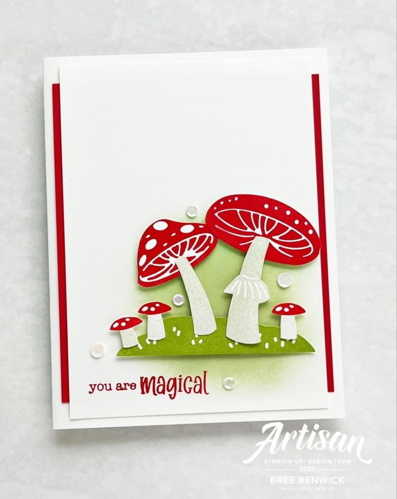
    This is a genius little sketch, especially in Bree’s crisply styled and “magical” message. It works with so many images and the layer measurements don’t have to be exact. Great for beginners or busy, preoccupied stampers like me…

    My original card used an old product called Iridescent Ice, a sparkly embossing powder. After substituting Petunia Pop Glimmer paper for the skinny borders, I realized this pretty paper has gone from Stampin’ Up!”s Last Chance List to also being discontinued. But it is pretty.

    I used Fresh Freesia, Petunia Pop, a bit of Melon Mambo along with Old Olive and Crushed Curry.

    The flower stem is stamped with Fresh Freesia on Fresh Freesia and colored with the Light Fresh Freesia, Petunia Pop and Melon Mambo Blends.

    I blended Crushed Curry and Old Olive ink on a piece of white card stock embossed with the Damask Embossing Folder and trimmed to 3 3/4″ x 5″.

    I thought the greeting from The Right Words stamp set followed the theme of the original greeting which I always loved: Memory is the power to gather roses in winter

    I really like the skinny strip of glimmer at the edges. While I think Bree layered her piece I’m stingy with my (now unavailable) Glimmer paper and just used strips.

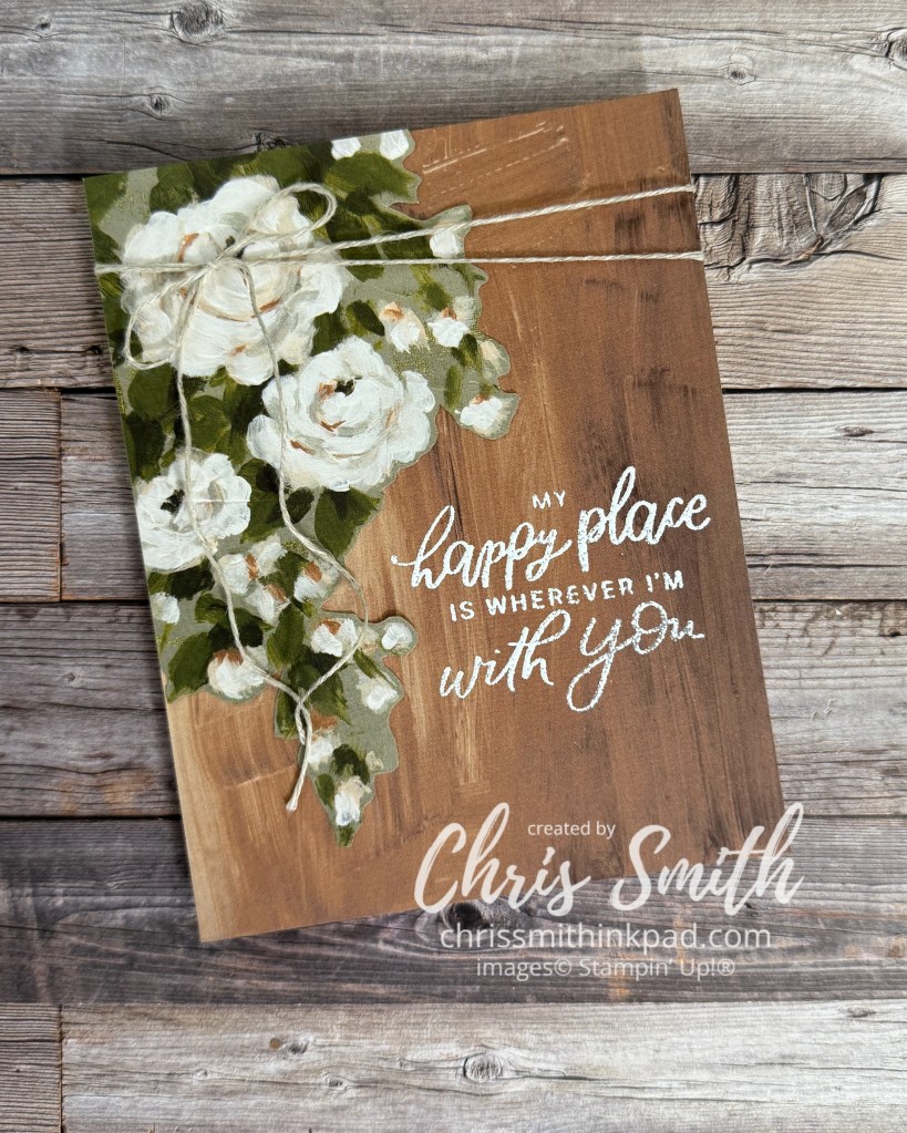
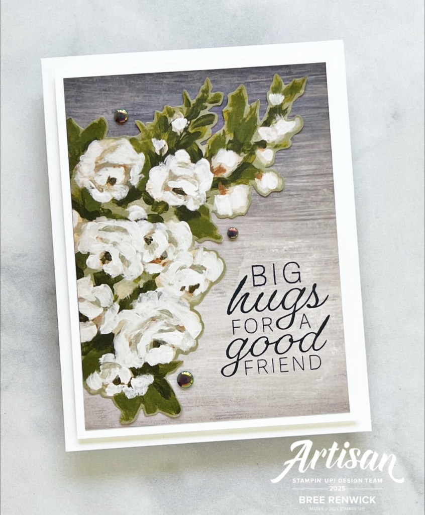
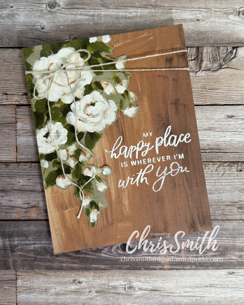
    Before I sign off I have to share one more card inspired by Bree and I think it fits with Remember When. My husband and I will celebrate our 40th wedding anniversary in a few days and I wanted to see if I could make some white roses (my wedding bouquet) look a little masculine. We’ve grown a lot of white roses together over the past 40 years so I thought it could be appropriate. Here is Bree’s:

    and here is mine:

    I made this a top fold card with a Basic Beige base. Both the fussy cut roses and the brushstroke pecan Pie layer are from the Beautiful Gallery designer series paper. I kept the layering to a minimum. The greeting is from the Peaceful Days stamp set in Stampin’ Up!’s scrapbooking line. Perfect anniversary greeting!

    Now you get to move on to Bree’s blog! I can’t wait to see how she did this month’s theme.

    Jan Clothier – NZ
    Leonie Stuart – AU
    Rochelle Laird-Smith – AU
    Cheryll Miller – AU
    Danielle Kassing – NL
    Marga Bultena – NL
    Kelly Taranto – US
    Chris Smith – US
    Bree Renwick – US
    Teri West – US
    Cheryl Hamilton – US

  • Big Blossom to Gathering Moments

    A new direction for blogging about ink

    Since early 2007 I’ve had a Typepad hosted blog – inkpad.typepad.com – which will be disappear on September 30, 2025 when Typepad closes operations. To date I have 999 posts over there. While it’s truly disappointing after so many years, when you consider that other atrocities people in our country and world are currently experiencing, I guess it’s really just small potatoes. I’ll save what I can and re-introduce some of my favorites here though I’m afraid the original links will be lost.

    In a way this kind of jives with where my stamping is heading anyway. I’m starting to refocus on old favorites in my stash and trying to resist trying every new thing. Don’t get me wrong, the new things tempt me but there are SO many older images and tools that I have loved and still want to explore. Let me know if you would like to see more ideas with old favorites too. This is really a practice post for me to get to know WordPress and see how this will all come together. Here is my very first blog post from January 3 2007: … and then a little more chatter


    JANUARY 03, 2007

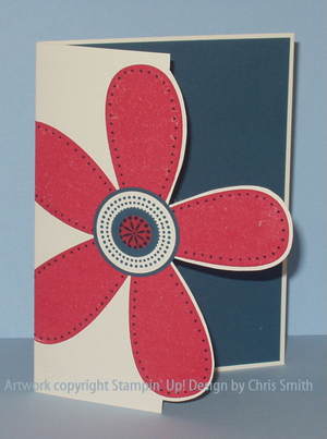
    Bib Blossom WOW swap

    Some hints:  I used my brayer to apply Ruby Red ink evenly to the blossom stamp. You can’t see it but I stamped “happy joyful birthday” from Small Sayings inside the card in Very Vanilla craft ink. When the card is closed the message is hidden by the petal.  I’m really efficient at the dots around the petals now that I’ve made 38 cards to swap with WOWswappers, a monthly swap group I’ve been in for several years.

    I knew Big Blossom was going to be fun almost as soon as I saw it. This is a card that was developing in my mind while I waited for my demonstrator Sell-a-Bration preorder to arrive.  


    Look how short it was and I even used “Bib” instead of “Big”. What a rookie!

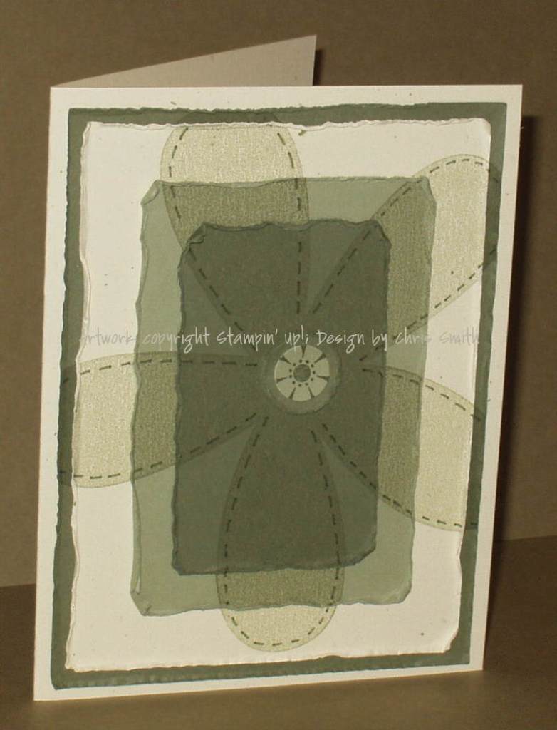
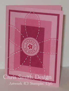
    Here are some other Big Blossom cards I posted that first month. It looks like I did have a little fun with it.

    I called the technique I developed for the first two cards Shady Layers. It used some tools that have been discontinued such as the Perfect Layers tool but it’s possible some may still find it helpful so I have converted that post to a PDF file if you would like to see it. I didn’t have the heart to delete the kind comments so be aware. If you choose to print you may want to do select pages.

    So what’s on my craft table now?

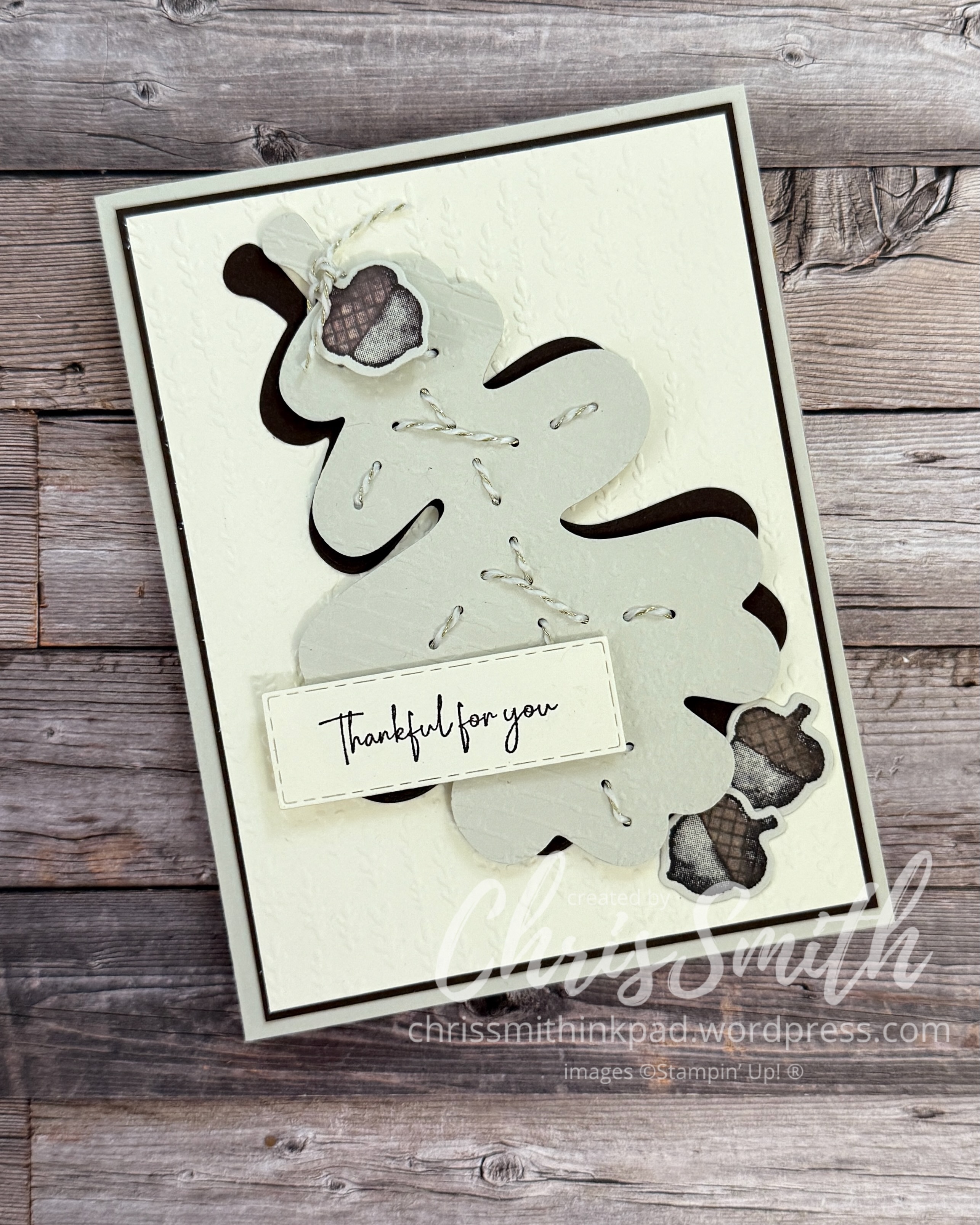
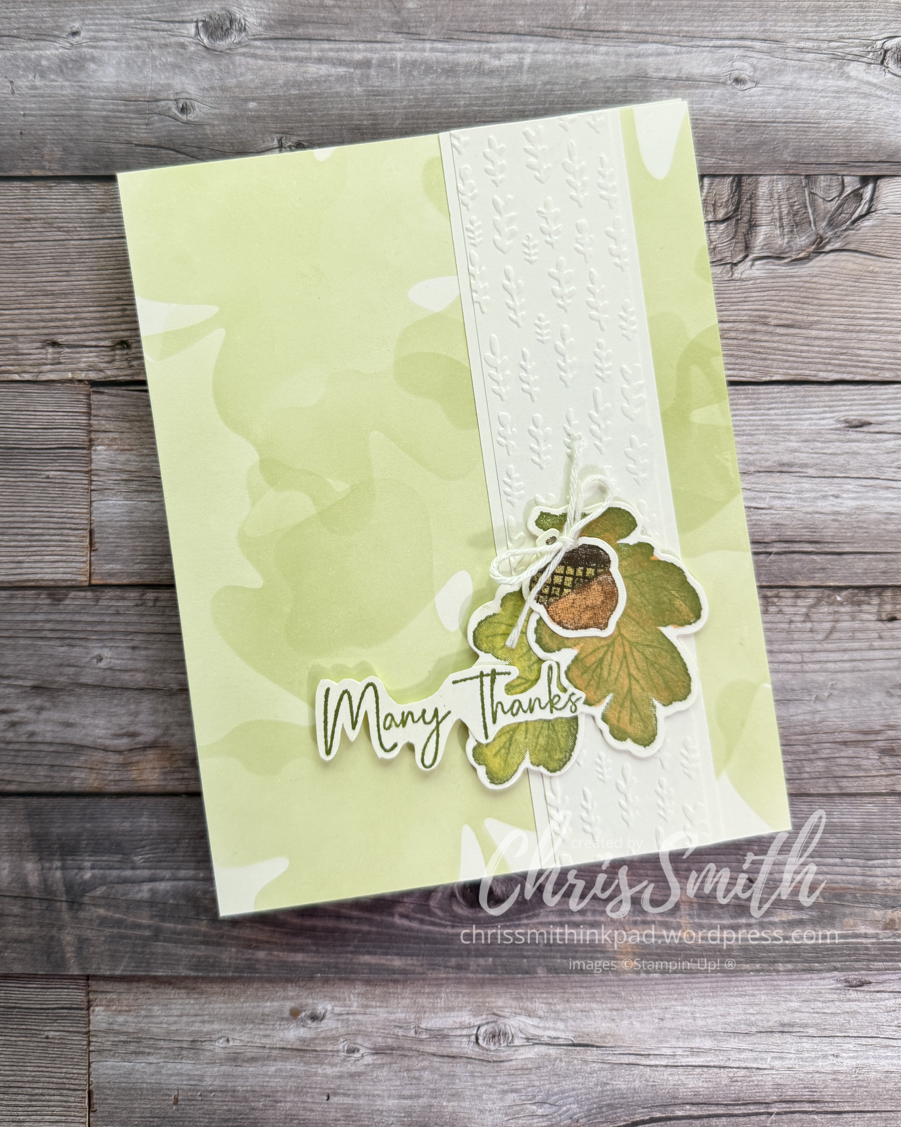
    I don’t have any recent work with large background sized stamps to share with you today but I have been playing with some pretty big leaf dies from the Gathering Moments Bundle/Gathering Together Suite.

    These two cards make use “nesting” dies that include an outline die and another large die with holes that fits into the middle. These holes can be used to make stitches OR just show through to another color.

    Or, you can use the outline dies alone. In the next photo I used it with an embossing folder and then blended a bit of Basic Beige ink around the edges. In the second card I used the “negative” of the die cut as a stencil to brush in layers of leaf prints, such as you see when leaves bleed into a city sidewalk.

    Let me know if you want to know more about any of these.